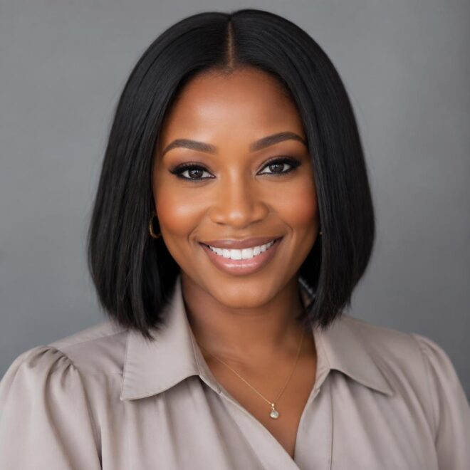


Cool skin tones are often misunderstood, usually because people get hung up on the idea that they can only wear icy blondes or stark, jet-black hair. That is a massive myth. If your skin has blue or violet undertones—the classic “cool” identifier—you can absolutely pull off vibrant fantasy colors like pink and purple. The trick isn’t whether you can wear them, but how you wear them. If you pick a pink with a warm, coral base, it will clash with your skin and make you look sallow. If you stick to blue-based fuchsias, deep violets, and cool-toned lilacs, you create a harmonious look that actually makes your complexion pop.
Most people fail when they don’t account for the undertone of the dye itself. You want colors that harmonize with the cool temperature of your skin rather than competing with it. I have seen so many people try a warm, “strawberry” pink only to find it looks muddy or separates awkwardly from their skin tone after a few washes. It is not about the intensity of the color; it is about the temperature of the pigment. When you lean into the spectrum of magenta, grape, indigo, and orchid, you are working with your skin, not against it.
This process requires a bit of prep. You cannot slap these colors over dark hair and expect a masterpiece. Because we are focusing on cool tones, that means avoiding yellow. If you have any remaining brassiness in your hair from the bleaching process, it will turn your beautiful violet into a weird, murky grey-brown. Always check your base. If it looks like the inside of a banana peel, you are not ready for a cool pink or purple. You need to tone it back to a clean, pale canvas. Let’s look at the specific color combinations that work for cool skin.
1. Deep Plum and Fuchsia Balayage
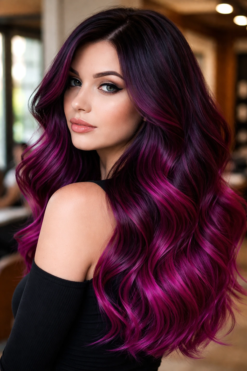
This is the entry point for anyone who wants high contrast without the maintenance of a global color. By keeping your natural root color (assuming it is cool-toned dark brown or black) and blending it into a deep plum that fades into a vivid, blue-based fuchsia, you get a look that is sophisticated and edgy. The plum provides the depth that cool skin craves, while the fuchsia adds that pop of vibrant pink without introducing any warm, orange undertones.
Why It Works for Cool Skin
The plum sits at the intersection of deep violet and blue-red, which perfectly complements the blue veins in your wrists. Because the fuchsia used here is a true “hot pink”—think bright, artificial, and cool—it won’t clash with the pink in your cheeks or the coolness in your complexion.
Color Maintenance Note
Balayage is great because you aren’t coloring the roots. However, the fuchsia will fade faster than the plum. Keep a small bottle of pink color-depositing conditioner in your shower. Apply it once a week, leave it on for five minutes, and you will keep that fuchsia vibrant without having to head back to the salon every three weeks.
2. Lilac and Cotton Candy Melt
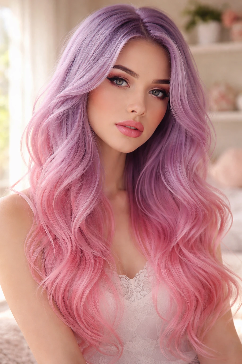
If you want a lighter, dreamier vibe, this is the way to go. You are essentially looking for an “ombre” effect where the roots are a soft, dusty lilac and the lengths transition into a bright, almost white-based cotton candy pink. It is high maintenance, yes, but the payoff is an ethereal look that feels very intentional.
The Application Strategy
You need a level 10 blonde base for this to work. If you have any gold left in your hair, the lilac will turn into a swampy green or a muddy grey. Start with a violet-based toner on your damp, bleached hair before you ever touch it with the fashion colors. This creates the “cool” foundation that allows the pink and purple to sit purely on top.
Pro Tip
Use a bonding treatment during the bleaching process. Since you have to lift your hair to that near-white level, your hair structure is going to be stressed. A bond builder keeps the cuticle smooth, which is the only way to make pastel pinks look glossy rather than like dry, frizz-prone straw.
3. Smoky Amethyst Root Smudge
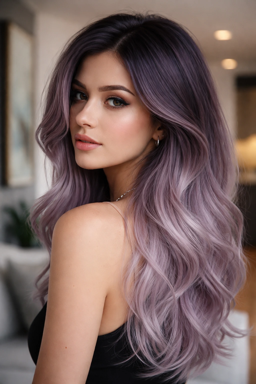
Sometimes you don’t want neon. You want something muted, sophisticated, and slightly mysterious. A smoky amethyst root smudge involves taking a deep, cool-toned charcoal purple at the roots and blurring it out into a lighter, muted lavender towards the ends. It feels like you’ve been living in that color for a while, in the best way possible.
Why It’s Perfect for Cool Skin
The “smoky” or “ashy” quality is the secret here. It mirrors the silver and grey notes that often accompany cool skin tones. By avoiding high-saturation colors, you prevent the hair from overpowering your features. It’s a very soft look that doesn’t scream for attention, yet it looks incredibly polished when paired with silver jewelry or cool-toned makeup.
How to Style
This color looks best with some texture. A straight, flat look can sometimes make “smoky” colors look like an accident. Use a sea salt spray or a curling wand to add waves. The movement helps the root-to-end blend look intentional and seamless.
4. Electric Magenta and Indigo Peek-a-boo
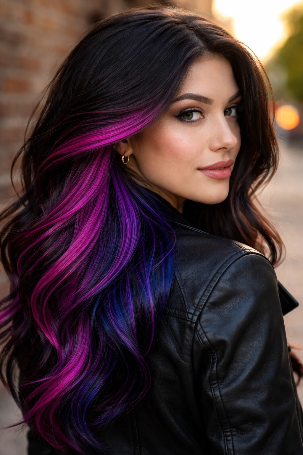
Peek-a-boo color is a classic for a reason. You color the underneath sections of your hair while keeping the top a more natural color, or even just a darker shade of the same spectrum. For cool skin, I love the combination of a sharp, electric magenta and a deep, true indigo.
The Contrast
When you wear your hair down, you get little flashes of indigo. When you pull it up into a ponytail, the magenta is suddenly front and center. It’s a great way to experiment with bright, saturated colors without committing to having them frame your face 24/7 if you aren’t sure you’re ready for that much intensity.
Color Care Warning
Indigo is a notorious stainer. It will stain your pillowcase, your shower curtain, and your white t-shirts for the first few washes. Always rinse your hair with cold water—ice cold—to lock the cuticle down tight after you wash. Never use hot water on fashion colors; it opens the hair shaft and lets the color run out faster than you can pay for it.
5. Cool-Toned Pastel Orchid
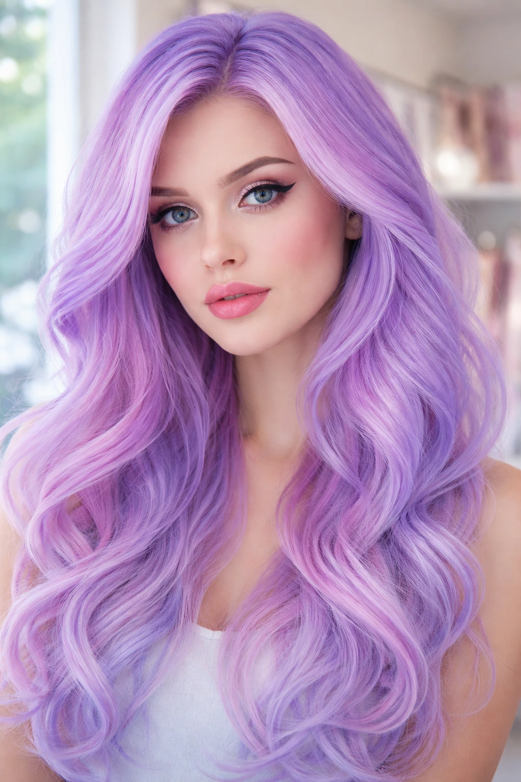
Orchid is that perfect middle ground between pink and purple. It isn’t quite lilac, but it isn’t quite magenta. By ensuring you get a cool-toned orchid—meaning one with a heavy blue base—you can avoid the “Easter egg” look that often happens with warmer pastels.
Getting the Tone Right
When you are at the supply store looking for dyes, read the bottle. If it says “warm,” “golden,” or “peach,” put it back. You want to see words like “violet-based,” “blue-violet,” or “true violet.” Even better, look at the dye in the bowl. If it looks like a soft, bruised purple rather than a sunny, warm violet, that is your target.
What to Avoid
Do not try to achieve this by just diluting a dark purple. If you take a standard dark purple and mix it with a ton of conditioner, you will get a milky, washed-out color that often looks patchy. Start with a dedicated pastel dye, or mix a tiny dot of vibrant indigo into a heavy amount of white conditioner.
6. Neon Berry and Violet Ombré
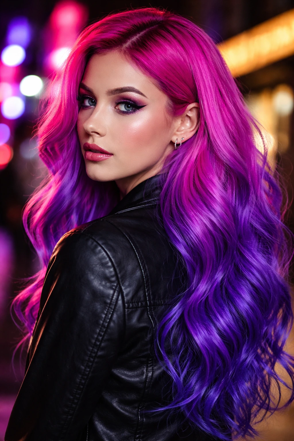
If you like bold, high-contrast hair, this is it. Think of the color of a blackberry, but dialed up to neon levels of intensity. The roots are a deep, saturated violet that bleeds into a sharp, neon berry pink. It’s loud, it’s fun, and it is unapologetically cool-toned.
Why This Works
The reason this works for cool skin is the intensity. By keeping both the purple and the pink in the same deep, “berry” family, you create a cohesive look that is visually stunning without being disjointed. You aren’t mixing a warm pink with a cool purple; you are mixing two shades of the same cool-toned spectrum.
Maintenance Reality Check
Neon colors are chemically intense. They will fade. In fact, the “neon” part of the name is a bit of a lie—it will look neon for about two weeks, then fade to a vibrant magenta. Embrace the fade. It’s part of the process.
7. Dusty Mauve and Ashy Lavender
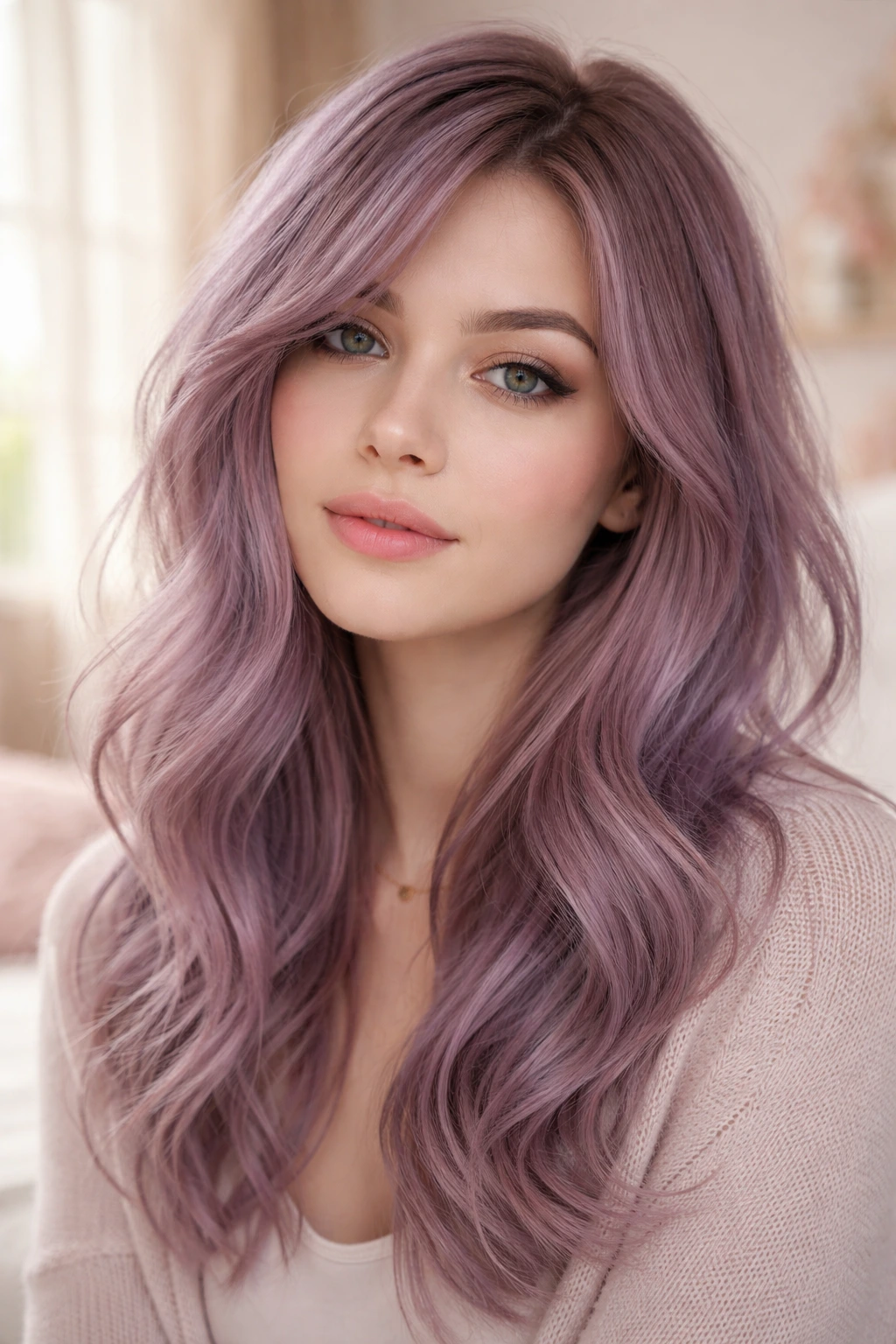
This is the “grown-up” version of pink-purple hair. It is not vibrant or neon; it is soft, grey-toned, and slightly faded. It’s essentially a mauve-purple with strong grey undertones. It is incredibly flattering on pale, cool skin because it mimics the natural flush of the skin without being harsh.
The Mixing Technique
To get that “dusty” look, you need to mix your fashion color with a little bit of silver or grey dye. It sounds counterintuitive to add grey to pink, but it kills the brightness and gives it that sophisticated, lived-in feel.
Why It’s a Great Choice
This is a low-maintenance color compared to the others. Because it starts out looking slightly “faded,” as it actually fades, it just gets lighter and prettier. You don’t get that awkward transition from “vibrant” to “washed out” because you are starting in the middle.
8. Deep Berry with Icy Pink Highlights
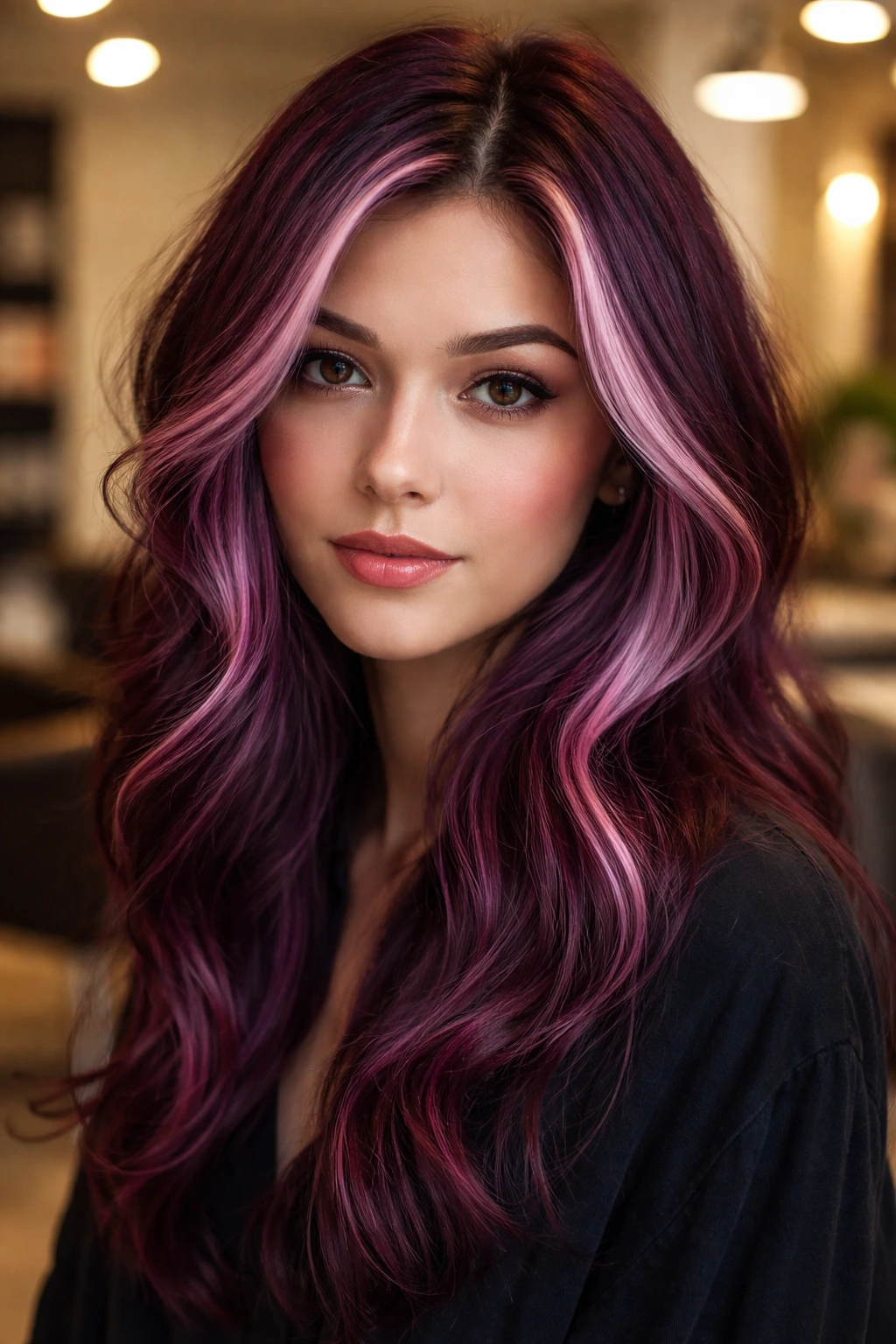
Think of this as a “lowlight” approach. You base the hair in a deep, dark berry-purple—almost a shade away from black—and then paint in some very thin, very bright, icy pink highlights. It adds dimension, texture, and a modern feel to what could otherwise be a flat, dark color.
The Placement
Focus the icy pink highlights around the face. This creates a “money piece” effect but keeps it subtle. Because the base is so dark and cool, the icy pink stands out significantly, acting as a beacon that draws attention to your eyes and face.
Stylist Advice
When you ask for this at a salon, be specific about “cool” highlights. If they use a bleach that lifts to a warm, buttery blonde, those highlights will turn a salmon-orange color when the pink fades. Ensure they tone those highlights to a crisp, platinum white before applying the pink color.
9. Jewel-Toned Plum and Magenta Dip-Dye
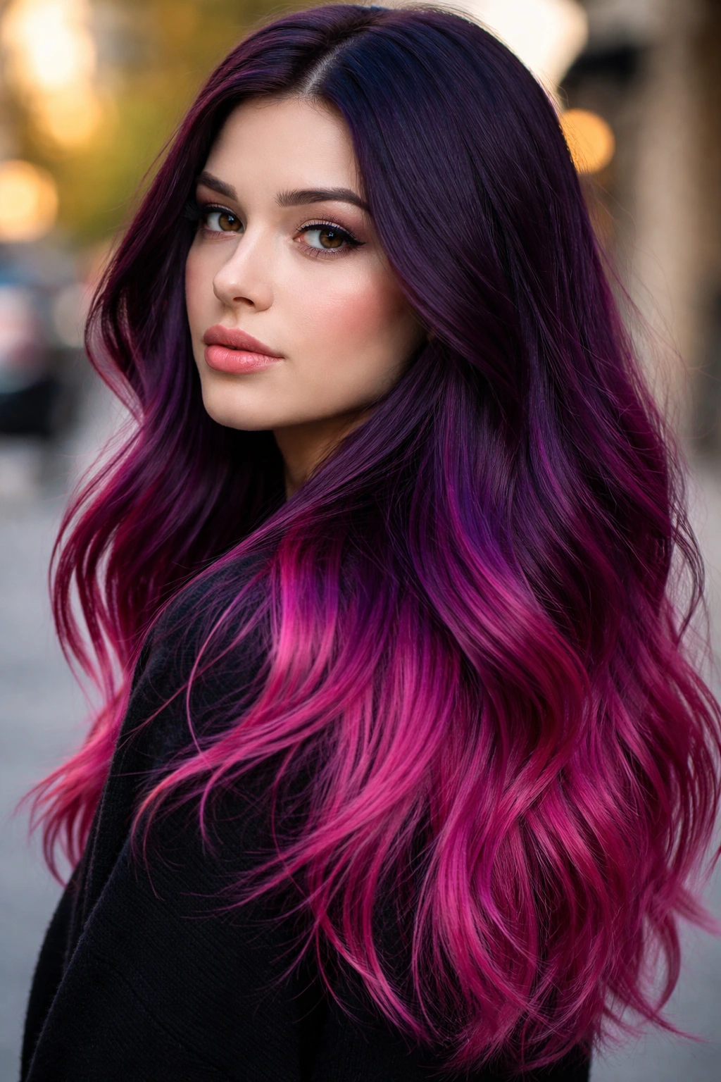
Dip-dye is back, but it’s not the harsh, chunky version we saw years ago. This is a blended, soft-transition dip-dye. You take your hair from a rich, jewel-toned plum at the roots and mid-lengths, and then abruptly shift to a vibrant magenta at the ends.
Managing the Transition
The key to a good dip-dye is the fade. If you have a hard line of demarcation, it looks like you grew out your hair and didn’t touch up your roots. You want a “blur” zone of about two inches where the plum and the magenta overlap.
Why Jewel Tones?
Jewel tones—like ruby, sapphire, and amethyst—are naturally cooler. They have a depth and saturation that make them less likely to shift warm as they wash out. They are the safest bet for anyone worried about their pink-purple hair looking “too warm.”
10. Violet-Base Fuchsia Money Piece
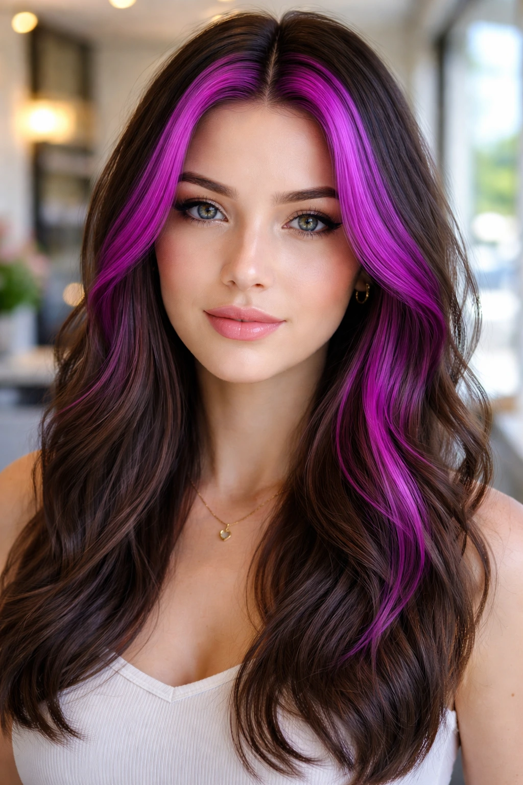
Sometimes you don’t want to color your whole head. A “money piece” is that two-inch section of hair right at the front, framing your face. If you do this in a cool-toned fuchsia—a fuchsia that has a clear blue undertone—it can make your whole face appear brighter and more awake.
The Cut
This style looks best when paired with curtain bangs or long, face-framing layers. The pink sits right next to your skin, so the undertone of the dye matters more here than anywhere else. If you pick a fuchsia that’s too red, it will clash. If you pick a fuchsia that’s too purple, it might look like a bruise. Look for a true “barbie” fuchsia, but verify it’s blue-based.
Versatility
The best part? If you hate it, it’s just the front pieces. You can cut it off, color over it with a dark brown, or let it grow out. It is the lowest-commitment way to test drive these colors.
11. Muted Rose and Cool Slate Purple
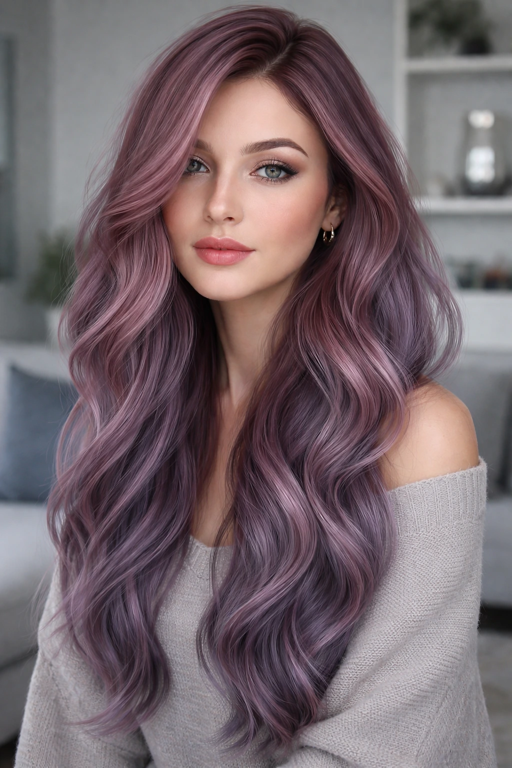
This color combination is for the minimalist. It’s not about looking like a unicorn; it’s about having a soft, muted look that feels like a natural hair color—if natural hair came in muted jewel tones. You take a dusty rose and combine it with a slate-purple (a purple with a heavy grey/blue base).
The Aesthetic
This pairs beautifully with dark, silver-toned clothes. It is a very “cool” color palette in every sense of the word. Because both colors are muted, they don’t fight for attention. They blend together into a singular, cohesive shade that is very gentle on the eyes.
Application Tip
Since these are muted colors, they tend to be darker than pastels. You don’t need a level 10 bleach for this. A level 8 or 9 (a light buttery blonde) is usually enough, because the dye is saturated enough to cover the remaining yellow pigments.
12. Midnight Purple with Magenta Accents
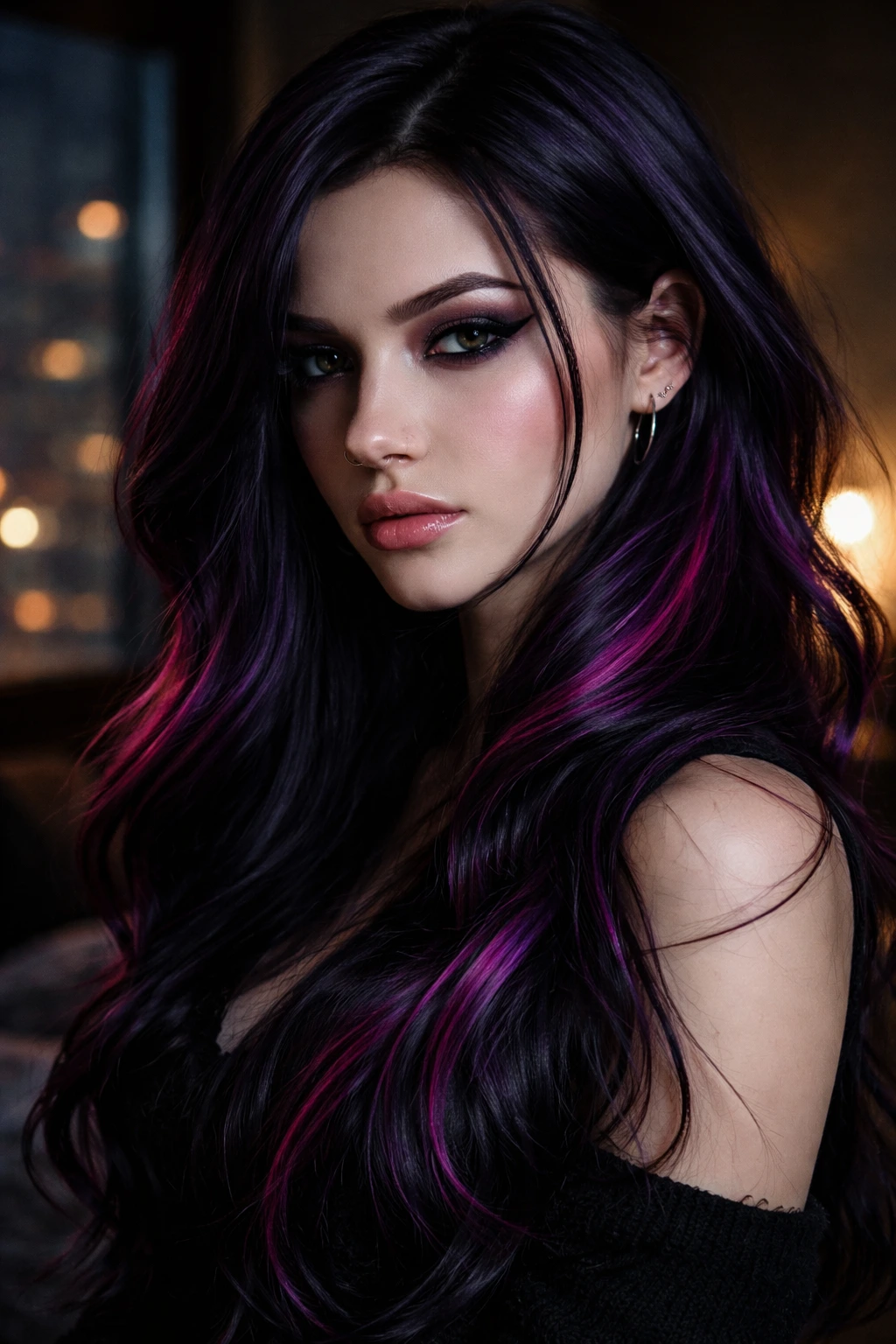
“Midnight” implies something very dark, almost black, but with a strong purple undertone. It’s the color of the night sky right before the sun comes up. Adding a few strategically placed magenta accents creates a look that is goth-adjacent but very modern.
Why This Works for Cool Skin
Midnight purple is extremely flattering on cool skin. It provides a stark contrast against pale skin, making you look porcelain and defined. The magenta accents add a touch of whimsy, but because they are “accents” and not the main event, they don’t have to be perfect.
How to DIY
If you are doing this at home, color the whole head midnight purple first. Rinse it, dry it, then go back and color a few tiny sections with the magenta. Using a dark base first acts as a safeguard. If the magenta bleeds a little bit, it’s just blending into the dark purple anyway.
13. Icy Lavender and Soft Rose Gold
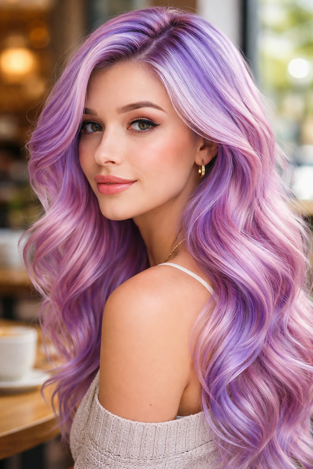
Wait—is rose gold warm? It can be. But if you take a “cool” rose gold—one that has been toned to remove the copper—and pair it with an icy, silver-lavender, you get a beautiful, shimmering mix that is perfectly suited for cool skin tones.
The “Cool” Rose Gold Distinction
Standard rose gold has orange in it. You do not want that. Ask for a “violet-pink” rose gold. It should look like a muted, antique pink. When paired with the icy lavender, the overall effect is a metallic, cool-toned blend that catches the light in a really interesting way.
Styling Tip
Because these are light, metallic colors, they look best when the hair is healthy and shiny. Use a gloss treatment or a clear top-coat glaze after you color. It will lock in the shimmer and make the hair look like spun silk.
14. Rich Blackberry and Hot Pink
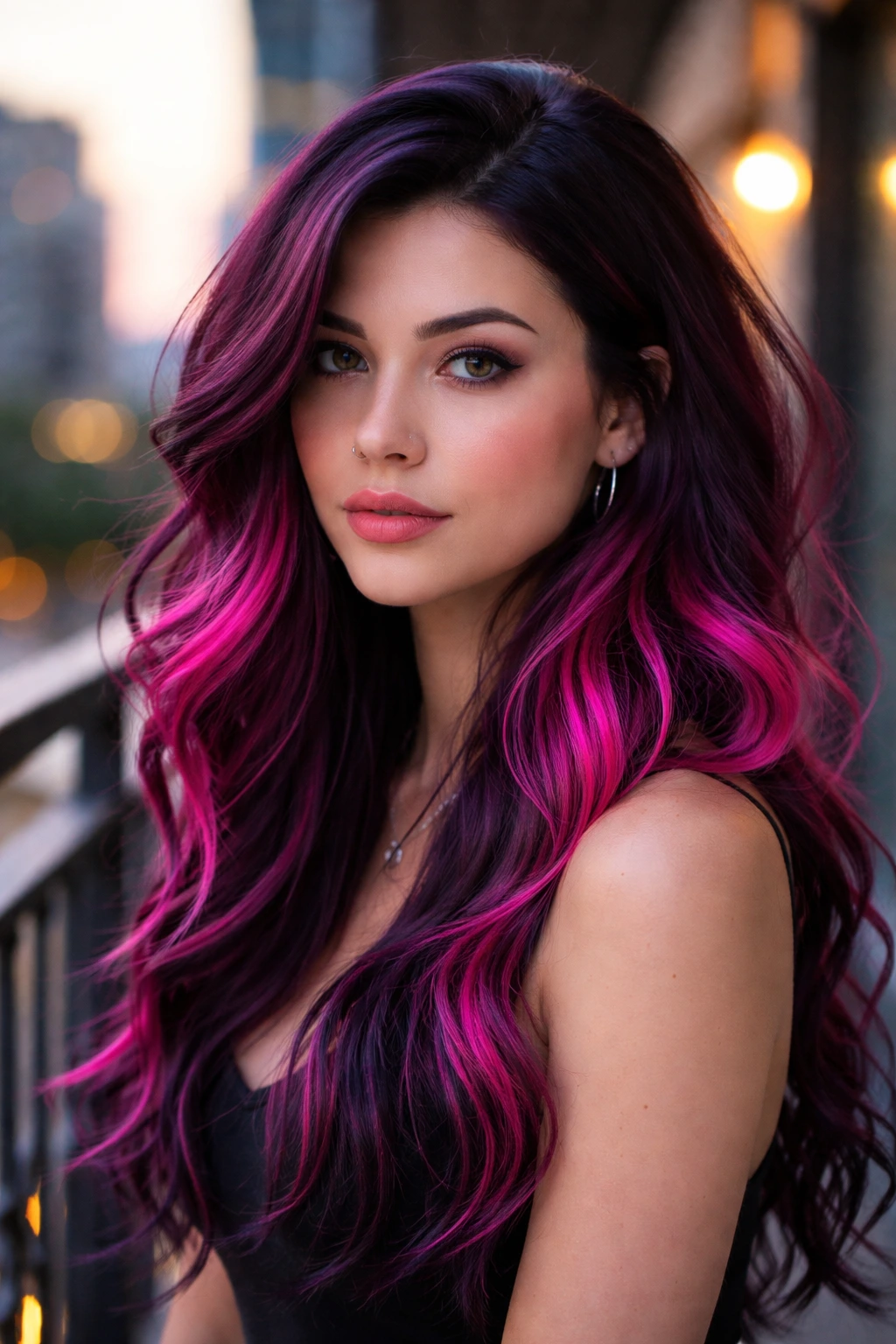
Blackberry is a staple. It’s that deep, juicy purple that borders on black but clearly has violet in it. Pairing it with a sharp, hot pink makes for a very bold look. This is high-impact hair.
The Color Theory
Blackberry is naturally cool-toned (it’s a dark violet). Hot pink is also cool-toned (it’s a bright magenta). Together, they are a powerhouse for cool skin. They provide enough depth to make your features pop without the risk of looking “washed out” that you get with pastels.
Maintenance Note
Deep, saturated colors like blackberry tend to bleed a lot. Be prepared for purple water in your shower for at least two weeks. This isn’t a sign the color is failing—it’s just the excess pigment coming out. Rinse until the water runs clear, and don’t use a white towel on your hair!
15. Pastel Plum and Bubblegum Swirl
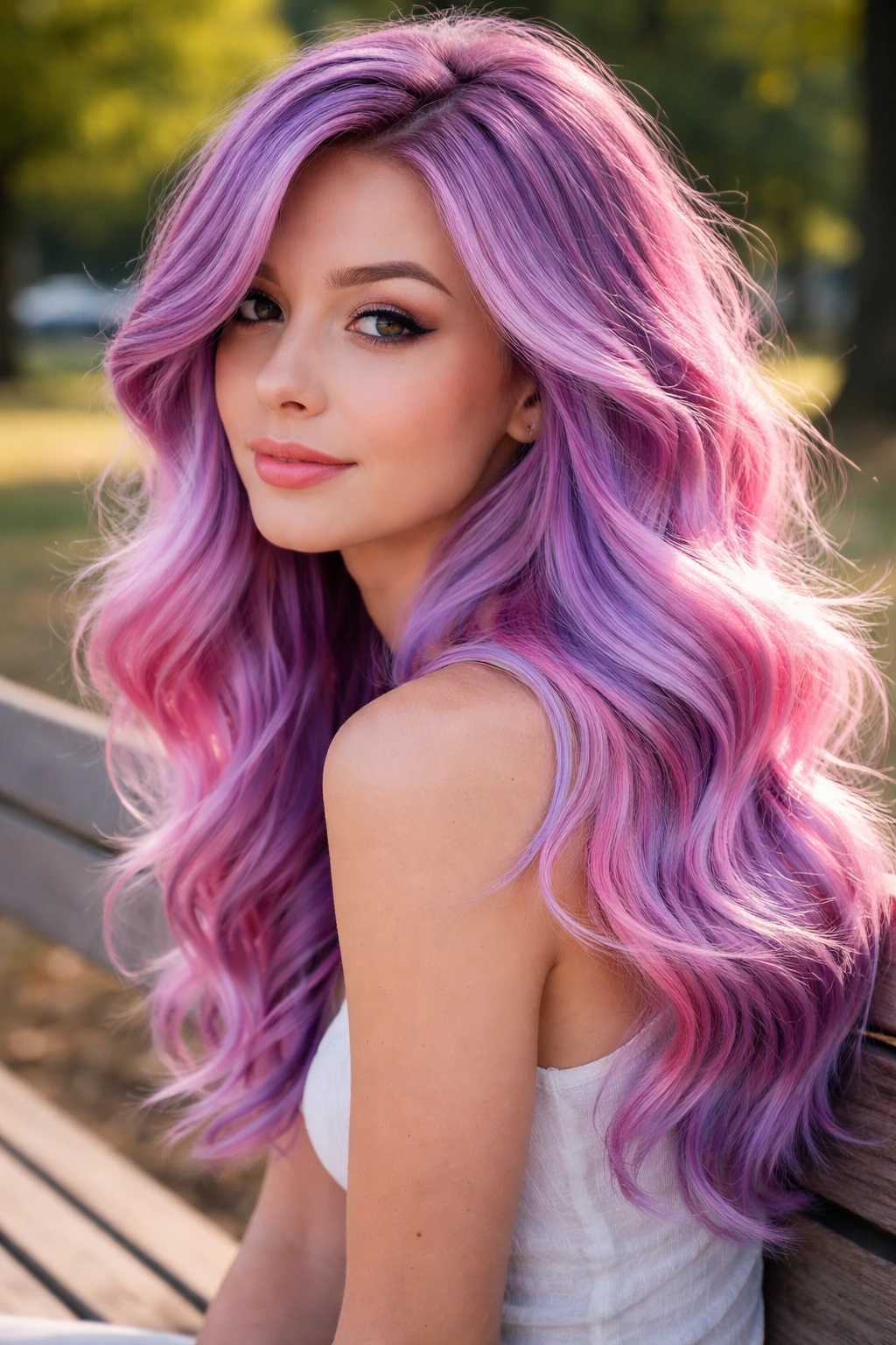
This is a marbling technique. You aren’t doing a block color or an ombre; you are literally swirling the two colors together on the hair shaft. Imagine the look of a marbled ice cream cone, but in hair form.
How to Achieve It
You need to section your hair. Apply the pastel plum to one strand, the bubblegum pink to the next, and then use your fingers (wearing gloves!) to gently rub them together so the lines are blurred. It requires patience and a good eye for how the colors sit next to each other.
The Result
The result is a soft, blended look that is constantly shifting as you move your head. It’s very artistic and tends to look better the messier it gets. This is a great choice if you have a lot of texture or layers in your hair.
16. Dark Grape with Neon Pink Tips
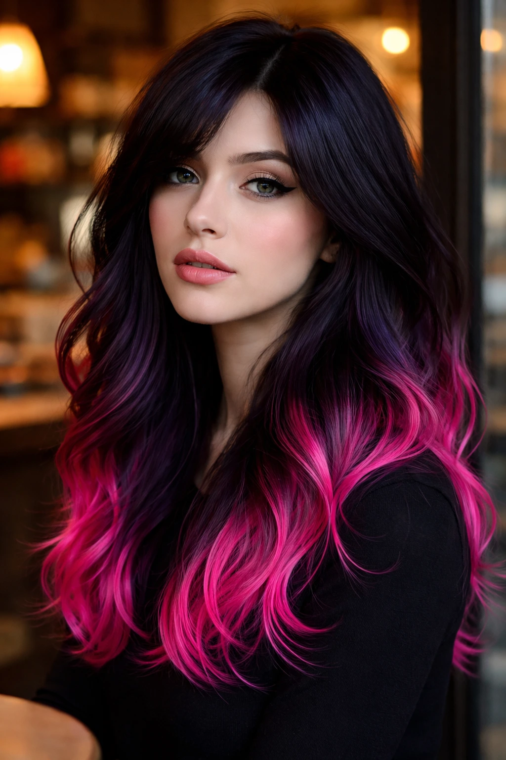
Dark grape—a vibrant, medium-dark purple—is a classic. It’s not quite as dark as midnight purple, but it’s definitely not pastel. Putting neon pink tips on dark grape hair is a fantastic way to add a bit of fun without coloring your roots.
The Contrast
Neon pink is visually “heavy.” It grabs the eye immediately. By placing it only on the tips, you control where the focus is. It draws the eye down, which can elongate the face—a nice trick if you want to create a slightly slimmer look.
Why This is “Cool”
Neon pink is often ignored in favor of pastels or deep reds, but a true blue-based neon pink is the ultimate cool-toned color. It has no business being in the “warm” category. It works perfectly with the blue undertones of your skin.
17. Lavender-Grey with Fuchsia Lowlights
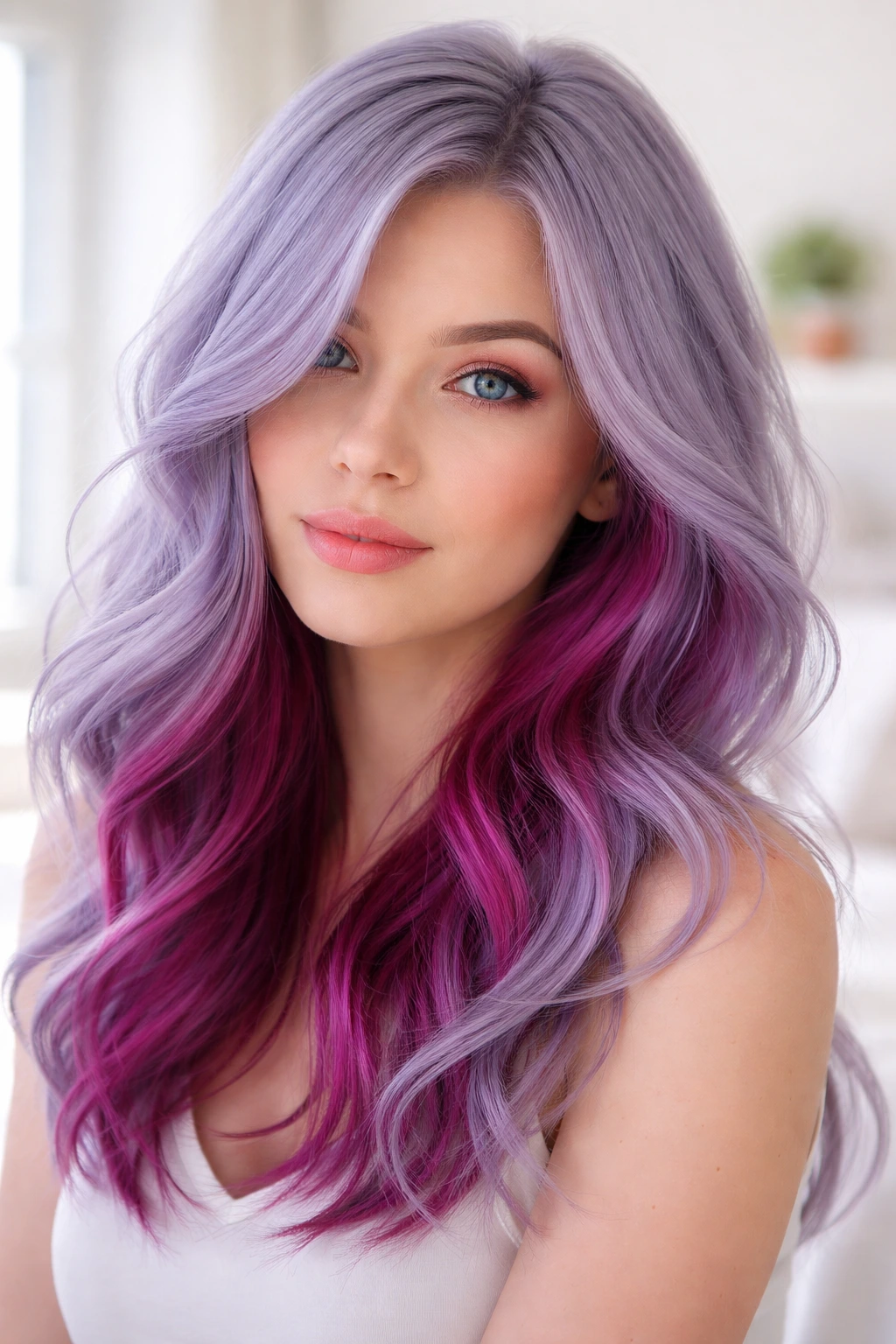
Lavender-grey is one of those colors that everyone loves but is terrified to try. It’s hard to get, but when you do, it is stunning. Adding fuchsia lowlights—hidden pieces of bright pink—adds depth and prevents the lavender-grey from looking like “granny hair.”
The “Lavender-Grey” Challenge
You need a perfectly platinum base for this. Any yellow will turn the lavender-grey into a murky, muddy greenish-brown. If your hair is not light enough, do not attempt this at home. Get it lightened to a pale blonde first.
Why Lowlights?
Lowlights are hidden. They give you that “secret” burst of color. When you walk, when the wind blows, you get these flashes of fuchsia. It’s sophisticated, but with a hidden, edgy side.
18. Vibrant Orchid and Magenta Gradient
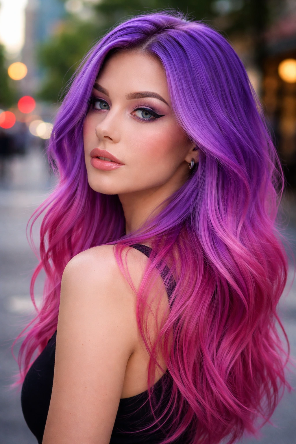
A gradient is the smoothest version of an ombre. It’s a literal melt where you can’t tell where one color ends and the other begins. Vibrant orchid at the roots melting into a bright magenta.
Why It’s Cohesive
Since orchid is already a mix of pink and purple, it acts as the perfect bridge between a pure purple root and a pure pink end. It creates a seamless color wheel transition that is incredibly pleasing to look at.
Styling Tip
Because this color is so vibrant, keep your makeup cool-toned. A cool-toned berry lip stain works perfectly. Avoid orange or coral lipsticks, as they will clash with the cool intensity of the hair.
19. Cool Magenta with Hints of Deep Plum
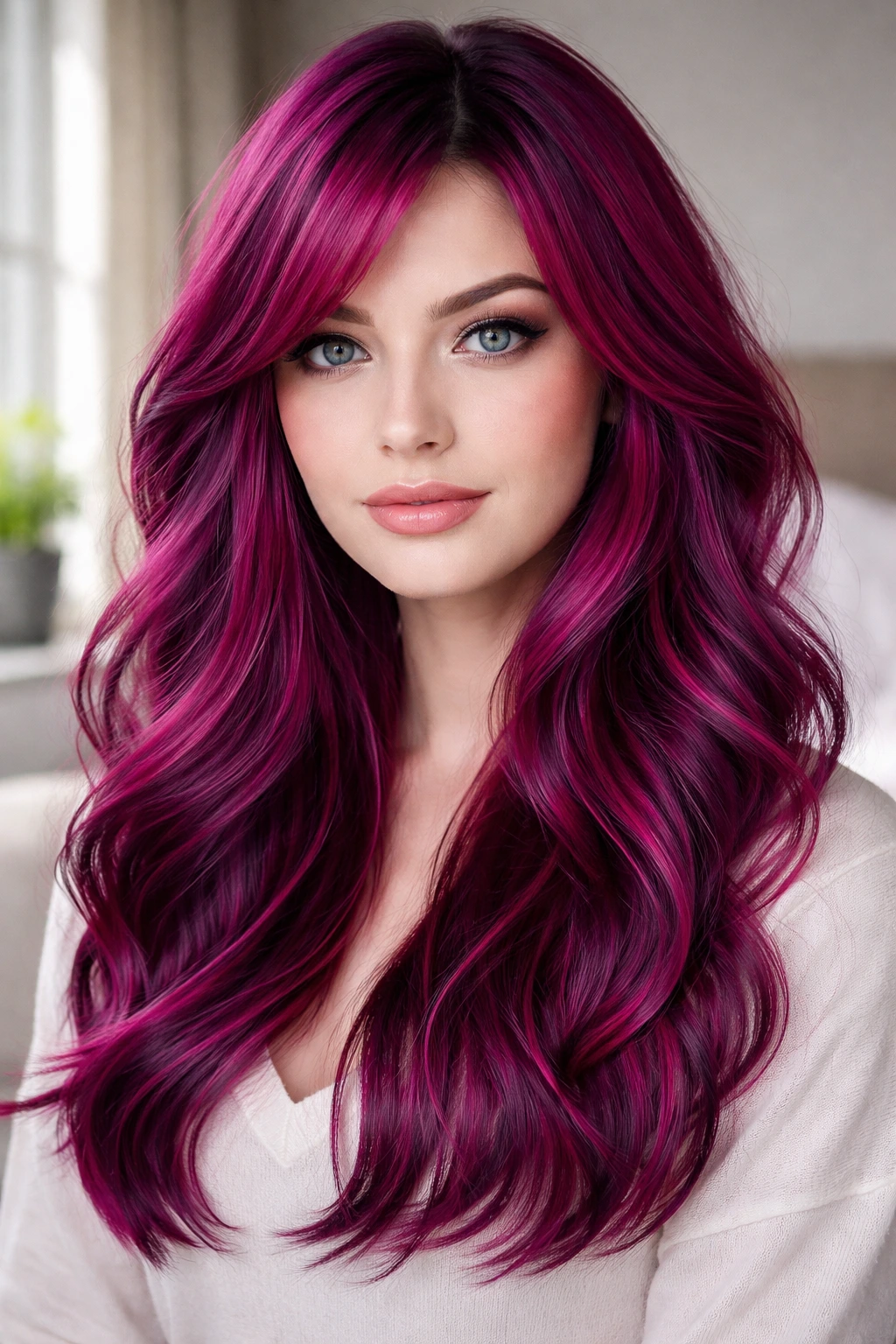
Instead of going for a 50/50 split, make magenta the main event. Color the hair a vibrant, cool-toned magenta, and then weave in thin, almost invisible ribbons of deep plum throughout.
The Dimension
Magenta on its own can look flat. It’s a very solid, heavy color. By adding those thin plums, you break up the surface area. It creates light and shadow within the hair, making it look much thicker and healthier than it would if it were just one flat, solid color.
The Vibe
This is a very “chic” look. It’s bold, but not cartoonish. It’s very wearable for everyday life, even in more conservative settings, because it stays within a single, unified color family.
20. Frosted Pink and Violet Ash
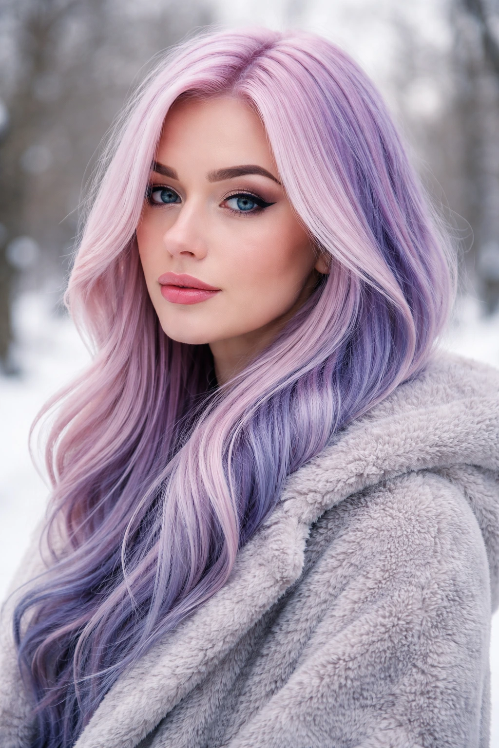
This is the ultimate winter-inspired look. “Frosted” means there is a silvery, white-blonde quality to the pink. It is a very pale, very metallic-looking pink. Pair it with an ash-violet, which is a purple with no red in it—just blue and grey.
The Effect
The combination feels “cold” in the best way. It is sleek, icy, and very high-fashion. It looks amazing with cool-toned skin because it doesn’t try to look like a “natural” hair color. It leans into the fantasy, creating a striking, high-contrast aesthetic that is undeniably cool.
Final Maintenance Warning
Frosted colors are the hardest to maintain. They wash out in a single shampoo if you aren’t careful. Use a color-depositing shampoo specifically made for “silver” or “cool pink” tones to keep that frosted, metallic finish alive for more than three days.
Final Thoughts
At the end of the day, picking a pink or purple color for cool skin isn’t just about what looks “pretty” in a photo—it’s about understanding the temperature of your own complexion. You have a cool undertone for a reason; work with it. If you grab a hair dye box and see words like “copper,” “golden,” or “warm,” walk away. Look for the “cool,” “ash,” “violet-based,” or “blue-based” labels every single time.
Taking the time to prep your hair—getting that base light enough so the color doesn’t turn muddy—is the most important step you can take. You can buy the most expensive, highly-pigmented dye on the market, but if you put it over a yellow, brassy base, you will be disappointed. Trust the process, take your time with the bleaching and toning stages, and don’t be afraid to mix a little bit of blue or violet into your conditioner to keep your color fresh between salon visits. Your hair is an accessory, and with the right shade of pink or purple, it is an accessory that will make your skin look more vibrant than ever.