

Pastel rainbow hair color ideas look cleanest on cool skin tones when the shades lean icy, not sugary. Blue-based pink, lavender, periwinkle, mint, and silver all play nicely with cool undertones, while yellow-heavy peach or warm coral can pull the whole look off balance.
That does not mean cool skin tones are stuck with one kind of pastel. The real trick is the canvas. Hair needs to be lifted pale enough that the color stays translucent, not muddy, and the toner has to knock out the gold that lives under bleach. If the blonde is too dark or too warm, even a gorgeous pastel can start looking tired fast.
Placement matters too. A full-head wash, a money piece, a peekaboo panel, and a soft melt all tell a different story, even when they use the same family of shades. That is the part people forget, and it is why one head of pastel hair can look airy and expensive while another looks busy for no good reason.
Here are 18 pastel rainbow hair color ideas for cool skin tones, with the kind of details that actually help when you sit down in the chair.
1. Icy Rose Quartz for Cool Skin Tones
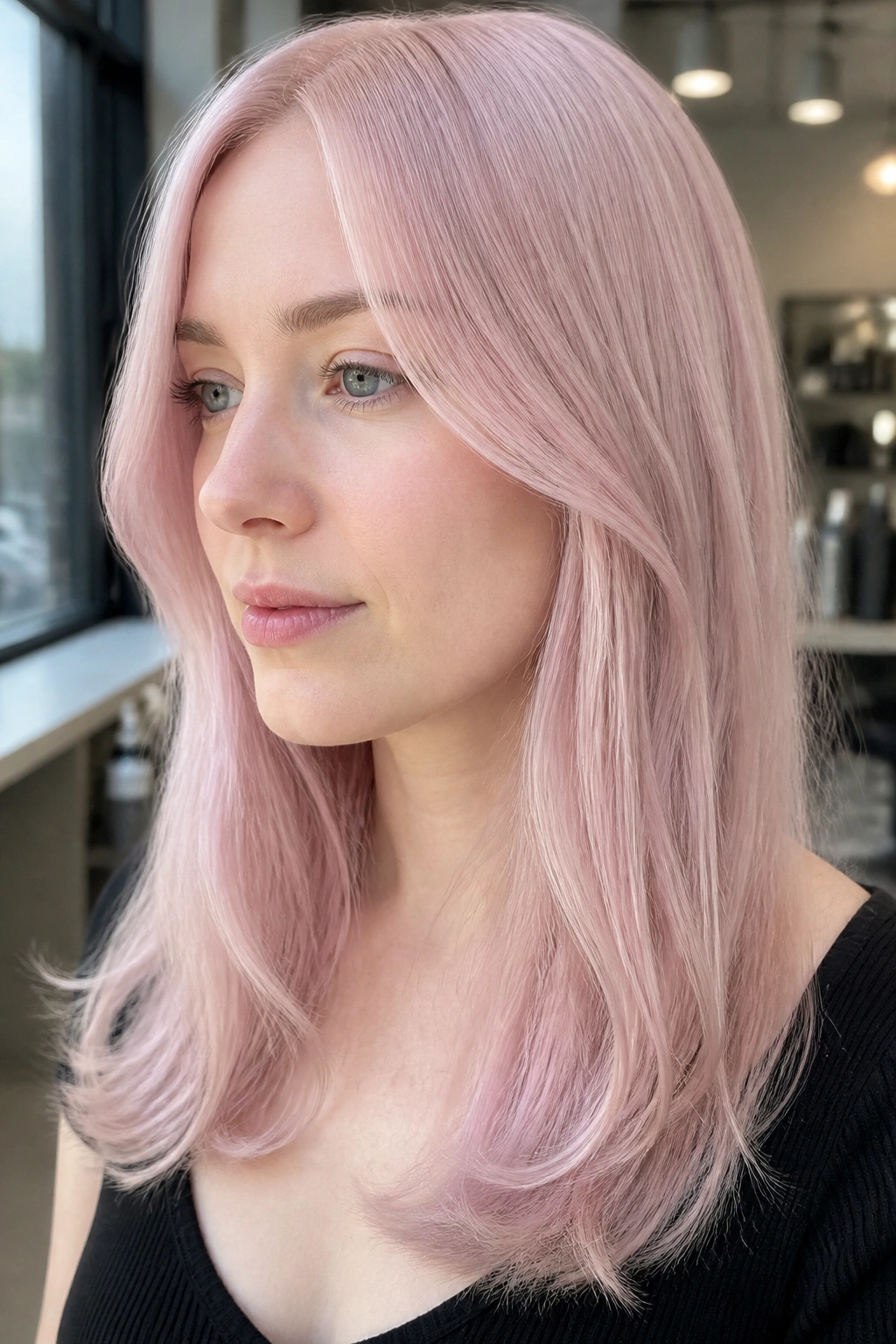
Icy rose quartz is the pastel pink I trust when someone wants softness without drifting into bubblegum territory. The blue-white cast in the pink keeps it crisp, so it sits close to cool undertones instead of fighting them.
Why this pink works
Rose quartz looks best when the pink is sheer and the blonde underneath is pale enough to show through. If the base is too yellow, the shade turns strawberry and loses that clean, frosted finish.
Ask for a blue-based pink toner over a level 9 or 10 blonde. A tiny root shadow helps too, especially if your natural color is darker and you want the grow-out to look intentional instead of abrupt.
- Best on straight hair, loose waves, or a blunt bob
- Fades into soft blush instead of dull beige
- Pairs well with silver hoops and cool-toned makeup
- Needs purple shampoo only if the base starts to yellow
Tip: If you want the pink to stay airy, skip heavy curl creams that leave a yellow film on the hair.
2. Lavender Milk with a Soft Root Shadow
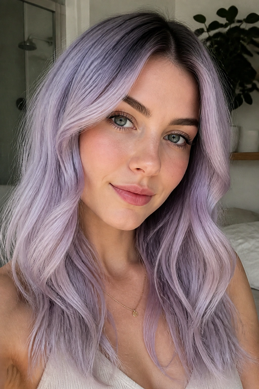
Lavender milk is the pastel shade I reach for when someone wants the safest possible yes for cool skin tones. It is gentler than violet, cooler than lilac, and it never looks as sugary as pink can on the wrong base.
The reason it works is simple: lavender already lives on the cool side of the color wheel. On skin that reads pink, beige, or rosy, it makes the complexion look calmer and a little clearer around the edges.
A soft root shadow keeps the whole thing from looking flat. I like a smoky root that melts into the lavender mid-lengths, because it adds depth without making the color feel heavy.
What to ask for
- A pale blonde base lifted to level 9 or 10
- A muted lavender overlay, not a saturated purple
- A 1-inch shadow root if you want easier grow-out
- Gloss refreshes every few weeks to keep the finish silky
Short version: this one is pretty, but not fussy. That is why it works.
3. Mint Frost and Silver Ends
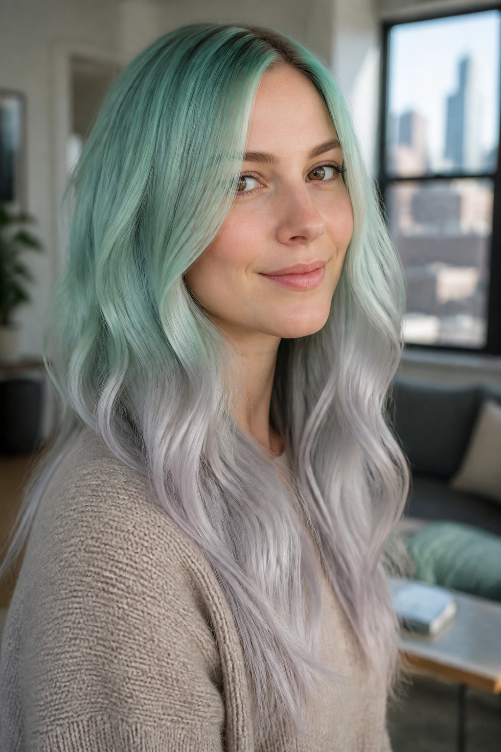
Why does mint look so crisp on cool skin tones? Because the best version is never neon. It is gray-green, almost frosted, with enough silver in it to keep the shade from turning candy-bright.
That little bit of smoke is the whole trick. Bright mint can get loud fast, but mint frost stays wearable because the cool gray base echoes the undertone in the skin and keeps the color from shouting.
How to wear it without going cartoonish
Go for a pale mint near the mids and let the ends drift into silver. The silver breaks up the green and gives the style a cold, shiny finish that looks sharper in soft waves than it does pin-straight.
This shade also looks smart on layered cuts. The different lengths catch the color unevenly, which makes the mint feel airy instead of blocky.
A good ask is “mint with a smoky silver finish, no neon.” That phrase saves everyone time in the chair.
4. Powder Blue All-Over Gloss
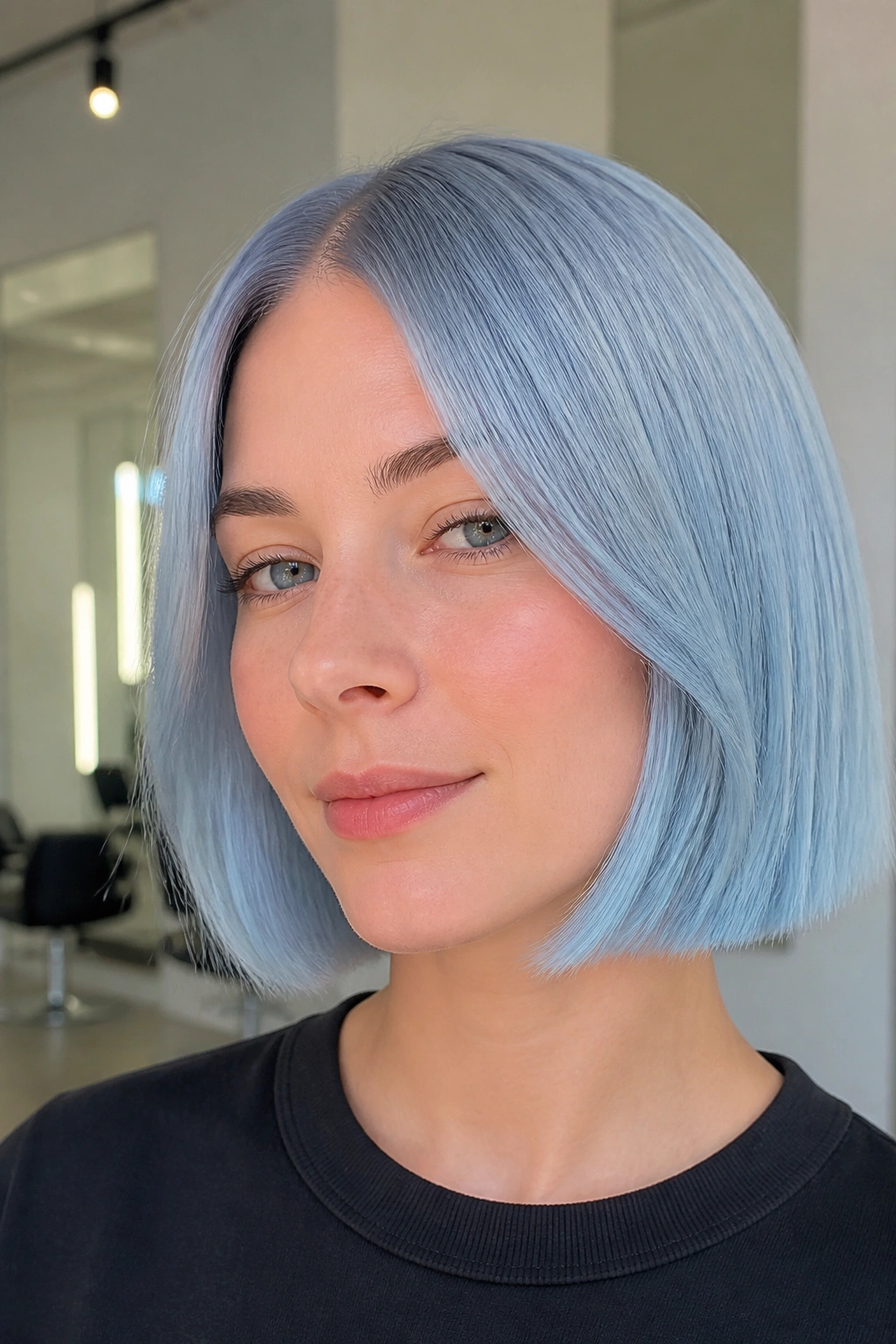
Picture a chin-length cut in powder blue. Clean part, soft wave, almost no contrast at the root. That is the version that feels polished on cool skin, not costume-y.
Powder blue works because it behaves like a haze rather than a solid block of color. The blonde underneath shows through enough to keep the blue soft, and that transparency is what makes it flattering on fair or cool-toned complexions.
The catch? It needs a very pale canvas. If your hair is still warm, powder blue can slip into greenish territory. No one wants that.
- Best on pixies, bobs, and shoulder-length cuts
- Needs a level 10 base for the cleanest finish
- Fades into icy denim instead of muddy gray if cared for well
- Looks best with a light texturizing spray, not a heavy cream
A clear gloss between color sessions helps the blue look wet and fresh. Not glossy in a fake way. Just shiny enough that the shade still feels alive.
5. Periwinkle Veil Balayage for Cool Undertones
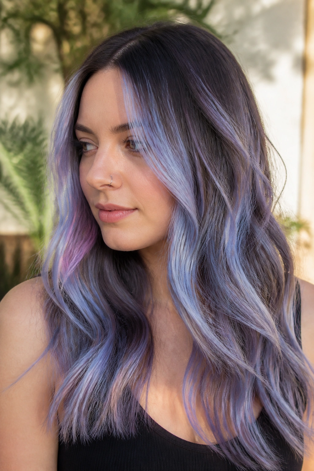
Periwinkle sits between lavender and blue, which is exactly why it flatters cool undertones more reliably than baby blue alone. It has enough violet in it to feel soft, but enough blue to keep the shade from leaning warm.
Balayage gives periwinkle room to breathe. Instead of coating every strand, the color sits in painted ribbons, so the darker base underneath creates depth and keeps the pastel from washing out the face.
What makes it different from lavender
Lavender reads a little dreamier. Periwinkle reads cleaner. There is more edge to it, and that edge is useful when your skin already runs cool and you do not want the hair to blend into your complexion.
It is a smart choice if you want movement on long hair. Loose curls show the blue-violet shifts better than a straight blowout, and the color looks different from every angle, which is half the fun.
Bring a photo with soft blue-violet ribbons, not a solid block. That wording matters more than people think.
6. Silver Lilac Melt
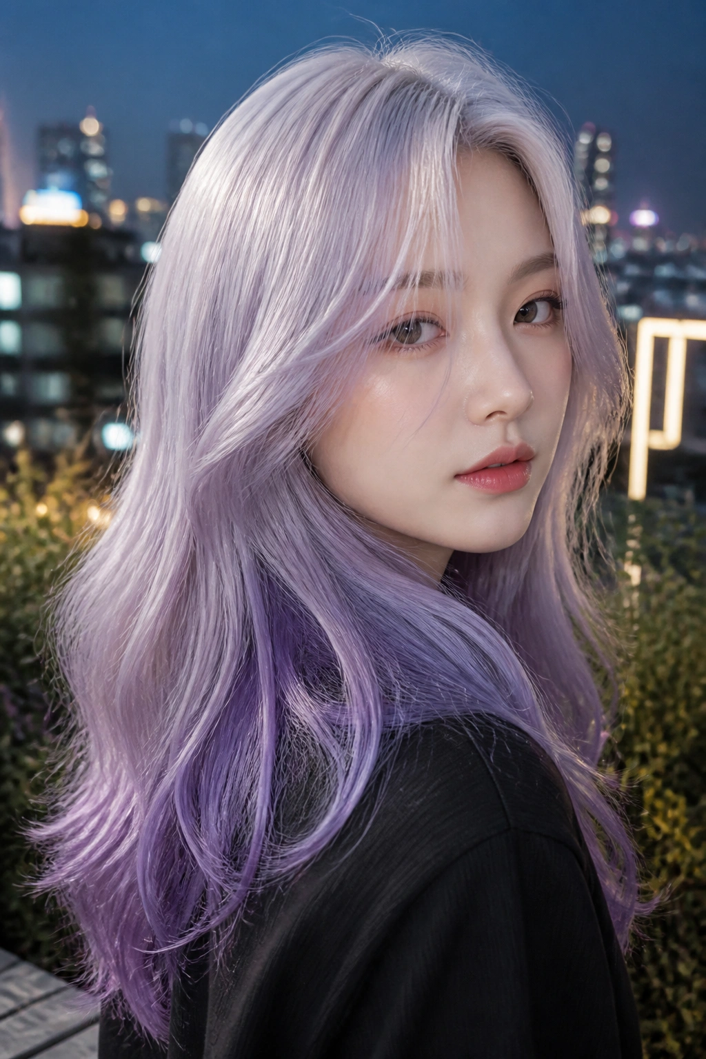
Silver lilac is one of those shades that looks expensive without trying to look expensive. The silver at the top keeps it icy, the lilac through the mids softens the whole thing, and the fade at the ends feels deliberate instead of washed out.
The best version starts on a pale, almost white-blonde base. From there, the color should melt, not stripe. Hard lines can make this shade look busy, and lilac does not need help being dramatic.
This one shines on longer cuts because the melt has room to travel. On a short crop, it can look choppy if the transition is too fast. On longer hair, it feels smooth and cloudlike.
A small warning. Silver lilac needs toner upkeep more often than people expect, because the silver part can slide yellow before the lilac fades. That is annoying, but manageable.
A purple mask once in a while helps. So does cool water rinse after washing.
7. Blueberry Sorbet Face-Framing Pieces
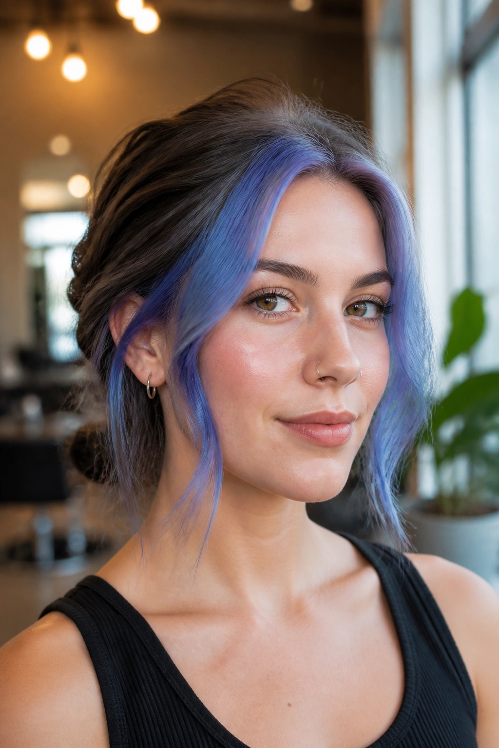
Blueberry sorbet is the kind of pastel rainbow hair color that gives you a lot of payoff without painting the whole head. A few bold, cool-toned pieces around the face are enough to wake up a haircut and make cool skin look brighter.
How to place the brightness
Put the strongest blueberry pieces at the temples and just in front of the ears. Those are the spots that catch the eye first, and they sit close enough to the face to do the flattering work.
The shade should read more berry-blue than pure navy. Too dark, and it stops feeling pastel. Too light, and it can drift into washed-out denim.
- Best on medium to dark blondes who want contrast
- Works on lobs, shags, and layered cuts
- Easy to hide when you tie your hair back
- Grows out softer than a full-head pastel
A face-framing placement also means the rest of the hair can stay neutral or softly toned. That makes maintenance easier, and frankly, that matters when the color is supposed to feel playful, not punishing.
8. Seafoam Smoke on a Lob
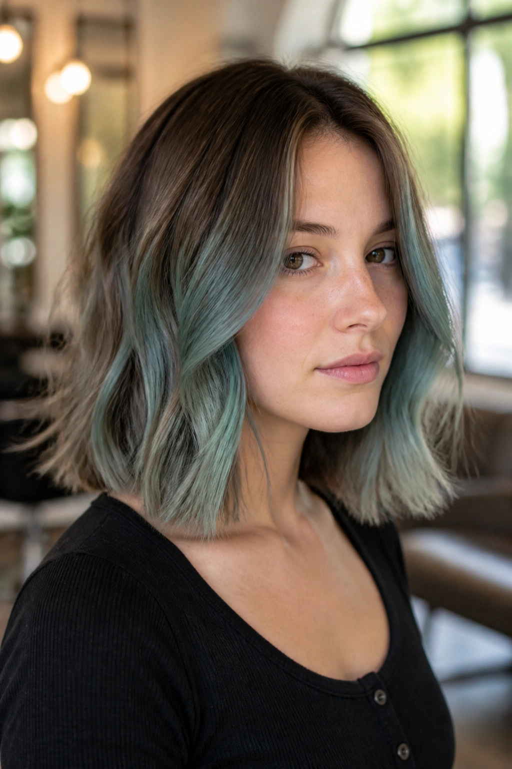
Seafoam works when it is dirty, in the best sense. Not grimy. Muted. A little gray, a little blue-green, and enough smoke in the formula to keep it from tilting toward aquarium neon.
On cool skin tones, that smoke is doing the heavy lifting. It quiets the green and lets the blue do more of the work, which is why seafoam can look unexpectedly chic on pale or rosy complexions.
A lob is the right haircut for it because the shape keeps the color from spreading too far. Seafoam on very long hair can feel overwhelming if the shade is too saturated. On a shoulder-length cut, it reads sharp and airy.
Loose texture helps. Seafoam loves movement, and the color looks better when a few pieces flip or bend around the jawline.
If you want to keep it from drifting warm, use a color-safe shampoo and avoid anything labeled “clarifying” unless your stylist tells you to. That stuff can strip faster than you’d think.
9. Orchid Mist with Curtain Bangs
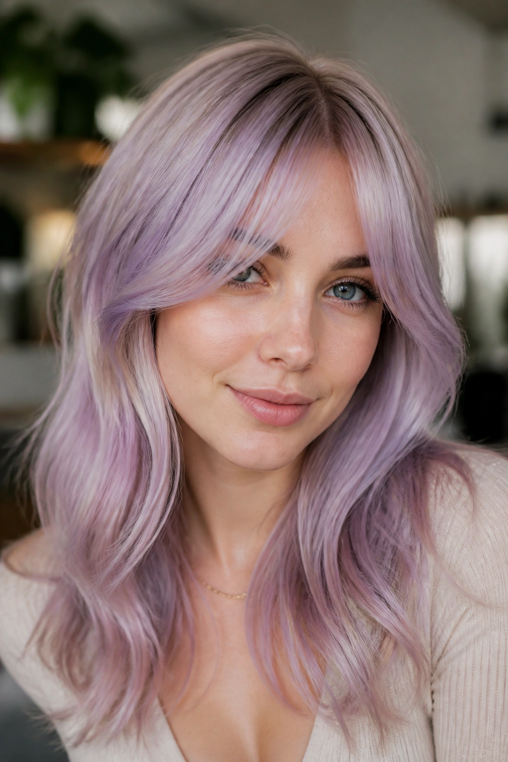
Orchid mist is a soft violet-pink that works because it never lands in one place for too long. On cool skin, it looks like color fogged over a pale blonde base, which is a lot more flattering than a flat purple block.
Curtain bangs make it even better. They put the most visible part of the color right where the face opens up, and that little sweep can make the whole style feel lighter.
Why does this combination work so well? Because curtain bangs break up the color. The fringe gives orchid mist movement, and movement keeps pastel hair from looking like a wig on the wrong day.
The key is keeping the orchid muted. If the pink becomes too warm, the cool-skin effect weakens. If the violet is too deep, it stops reading pastel and starts feeling plum.
Soft bend, middle part, air-dried texture. That is the lane here. It is prettier when it does not look overworked.
10. Cotton Candy Split Dye
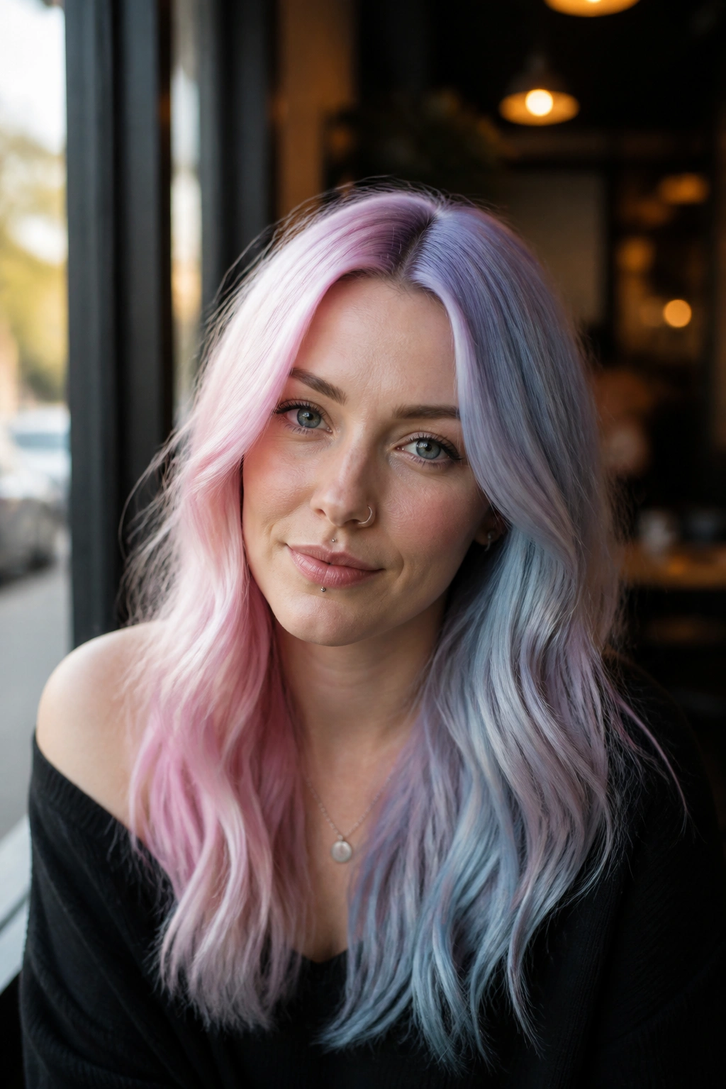
A split dye sounds bold, and it is, but the pastel version can still look surprisingly graceful on cool skin tones. One side in blue-pink cotton candy, the other in lilac or ice blue, and suddenly the whole head has a playful edge without going full neon.
The trick is balance. Both halves need the same level of pale blonde underneath, or one side will look louder than the other. That is where split dye gets messy fast.
I like this look on people who wear sharp lines in their clothes. A crisp part and a strong hair cut help the color feel deliberate. If the cut is too soft, the two sides can blur together in a way that loses the point.
Good details to ask for
- Equal lift on both sides before color goes on
- A blue-based pink, not warm pink
- A cool lilac or icy blue to pair with the second half
- A clean center part for the strongest effect
It is not subtle. That is the whole appeal.
11. Opal Prism Color Melt for Cool Skin Tones
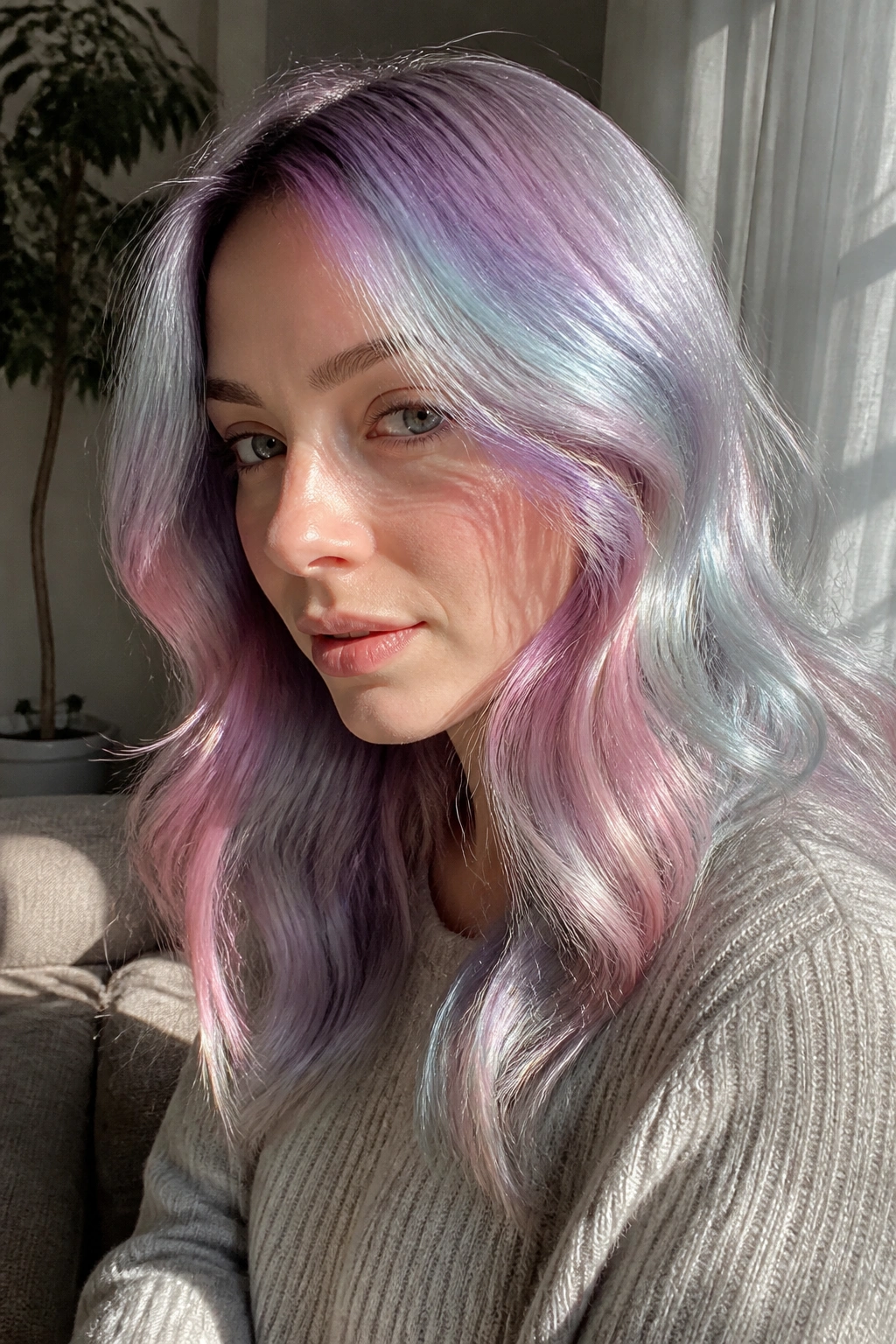
Unlike a rigid rainbow stripe pattern, opal prism hair feels sheer. The color shifts from lavender to pale blue to pink to silver, but the shades are softened so much that they almost blur into one another.
That softness is why it flatters cool skin. Hard rainbow colors can fight a cool complexion if the warm shades get too loud. Opal prism keeps the spectrum on the icy side, so the whole thing looks dreamy rather than loud.
The best part is how forgiving it is. If one color fades faster than another, the finish still looks intentional because the whole point is a shimmer of color, not perfect blocks.
This style works well for people who want something more artistic than a single pastel shade but less obvious than a split dye. It also hides regrowth better than you might expect, especially if the roots stay a smoky beige or silver.
Bring this one to a colorist with the phrase “iridescent, cool-toned, and sheer.” That tells the story fast.
12. Frosted Teal Balayage
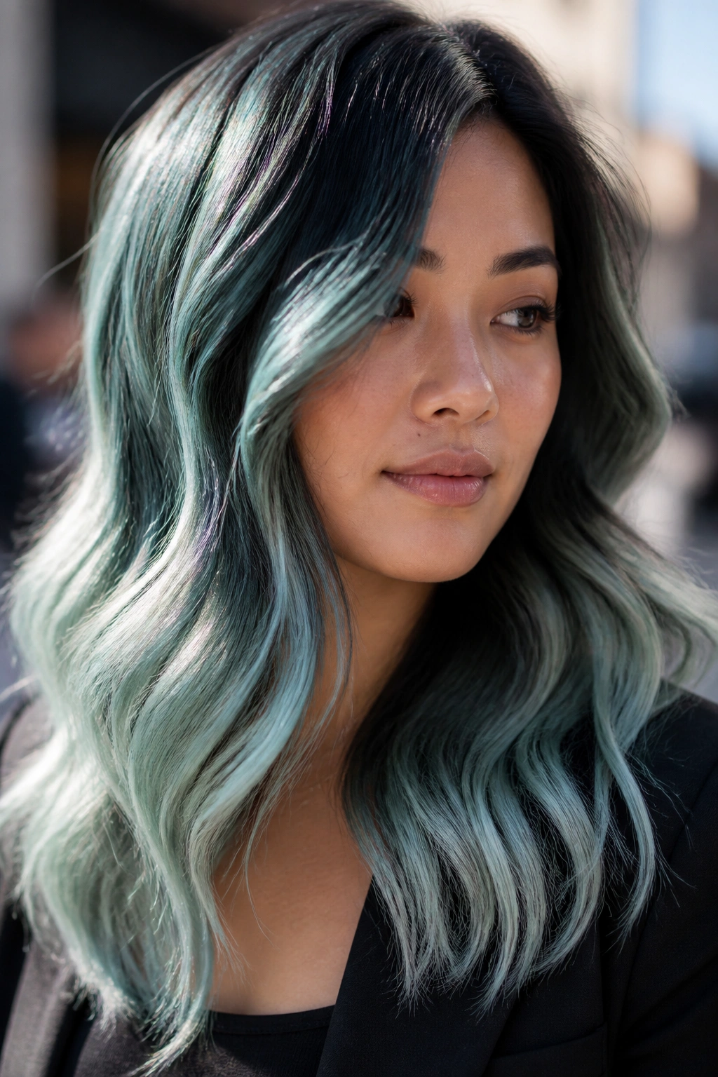
Teal can go wrong in a hurry, which is why I prefer the frosted version. Pull the green back, push the blue forward, and add a silver cast so it stops looking tropical and starts looking sharp.
On cool skin tones, frosted teal has real bite. It makes pale complexions look cleaner and gives rosier skin a little contrast without dragging warmth into the face.
Balayage keeps the teal from taking over. Painted pieces through the mids and ends are enough, especially if the hair has a wave pattern. The lighter ribbons catch more light, and the color looks layered instead of flat.
I like this one on thicker hair. The density gives the teal room to show up properly. On fine hair, the shade can disappear unless the base is very pale.
A blunt cut is fine, but soft texture is better. The edge of a wave helps the teal look smoky, and smoky teal is the whole point.
13. Mauve Cloud Money Piece for Cool Undertones
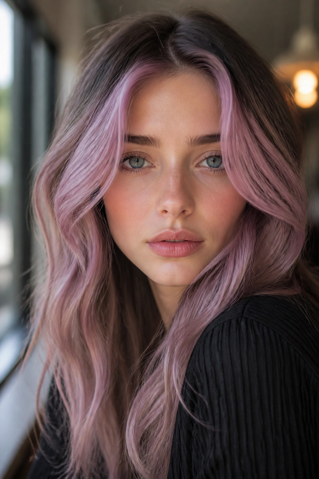
A mauve money piece is a smart move when you want the front of the hair to do the talking. It frames the face, pulls attention upward, and brings a soft pink-violet wash right where cool skin benefits from it most.
Why the money-piece placement matters
The front section always reads louder than the rest, even when the color itself is quiet. That means mauve can be used as an accent instead of a full commitment, which is useful if you want pastel color without turning the entire head into maintenance.
This is also one of the more forgiving pastel rainbow choices for deeper roots. You can leave the lengths darker or neutral and keep the color money piece bright. The contrast gives the pastel more punch.
- Works well with waves, ponytails, and half-up styles
- Needs careful toner if the front pieces pull yellow
- Looks strongest when the mauve leans dusty, not berry-bright
- Can be repeated every few weeks without redoing the whole head
A good colorist will soften the edge just a bit so the money piece doesn’t look pasted on. That tiny blur matters.
14. Pastel Denim Underlayer
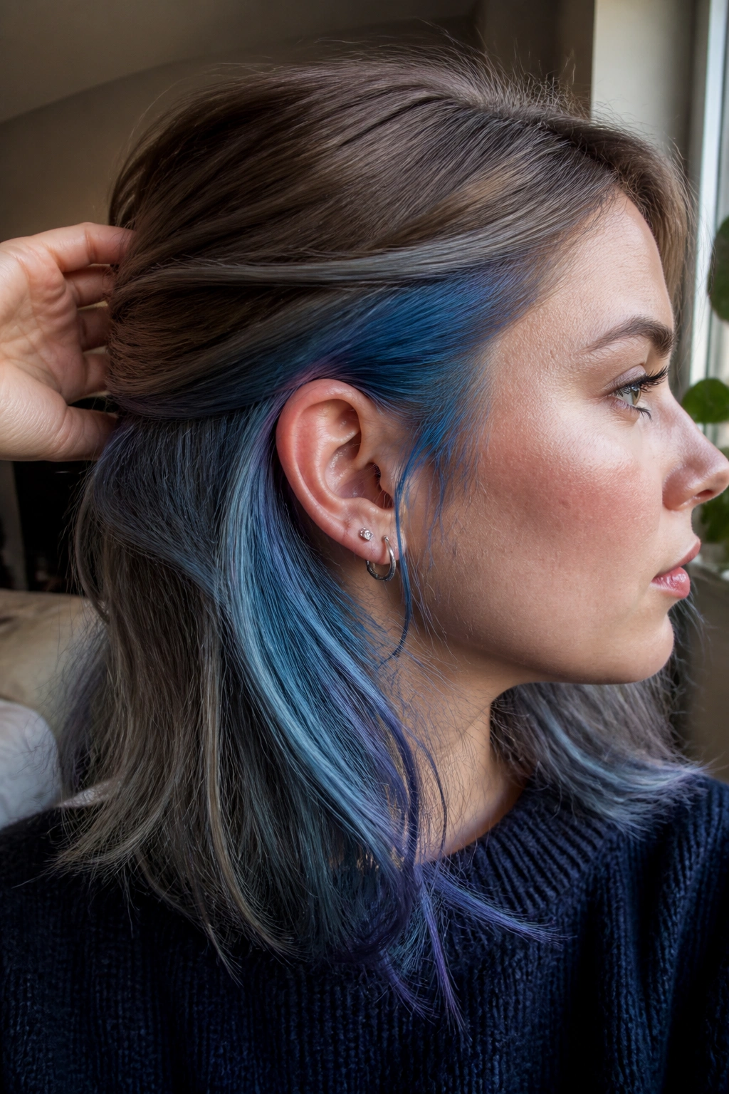
Pastel denim is one of my favorite answers for someone who wants color but does not want to see it every second of the day. The underlayer hides under the top section, then flashes through when the hair moves or gets tucked behind the ear.
Denim blue works on cool skin because it is already leaning icy and gray. It has none of the heat that can make a pastel look sweet in the wrong way.
The underlayer placement also buys you time. Since the color is partly hidden, fading is less obvious. That means the hair can look decent longer between refreshes, which is a nice break from the usual pastel hair schedule.
Best ways to wear it
- Half-up styles that show the lower section
- Loose braids that reveal the denim threads
- Sleek ponytails with a visible color band underneath
- Layered cuts with movement at the ends
If you want something wearable but still distinctive, this is a strong choice. It has personality, and it does not demand the whole room.
15. Pink-to-Blue Ribbon Highlights
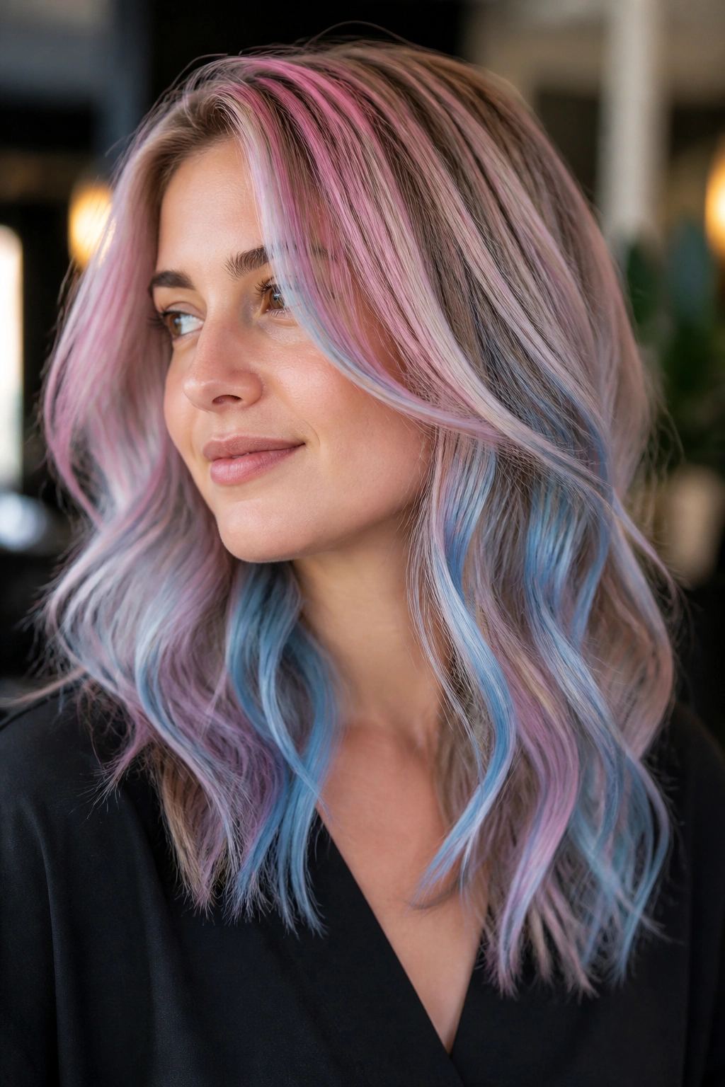
Ribbon highlights feel lively because they refuse to sit still. Thin strands of pink drift into blue, or blue into pink, and the result is more fluid than a simple block color.
That movement is useful on cool skin tones. The pinks stay flattering because they are blue-based, and the blues keep the whole look from turning sweet. Together, they land in that sweet spot between playful and polished.
A mid-length cut is ideal here. The ribbons have enough surface area to show, but not so much that the pattern gets lost. Waves help even more, since the color catches on the bends and reads like streaks of light.
What to ask for
- Fine foils instead of chunky panels
- A cool pink at the front
- A pale blue through the mids and ends
- Soft blending between the two shades so the transition doesn’t look striped
This is one of those looks that rewards movement. Walk, turn your head, toss the hair over one shoulder — the color changes every time.
16. Holographic Silver Ends
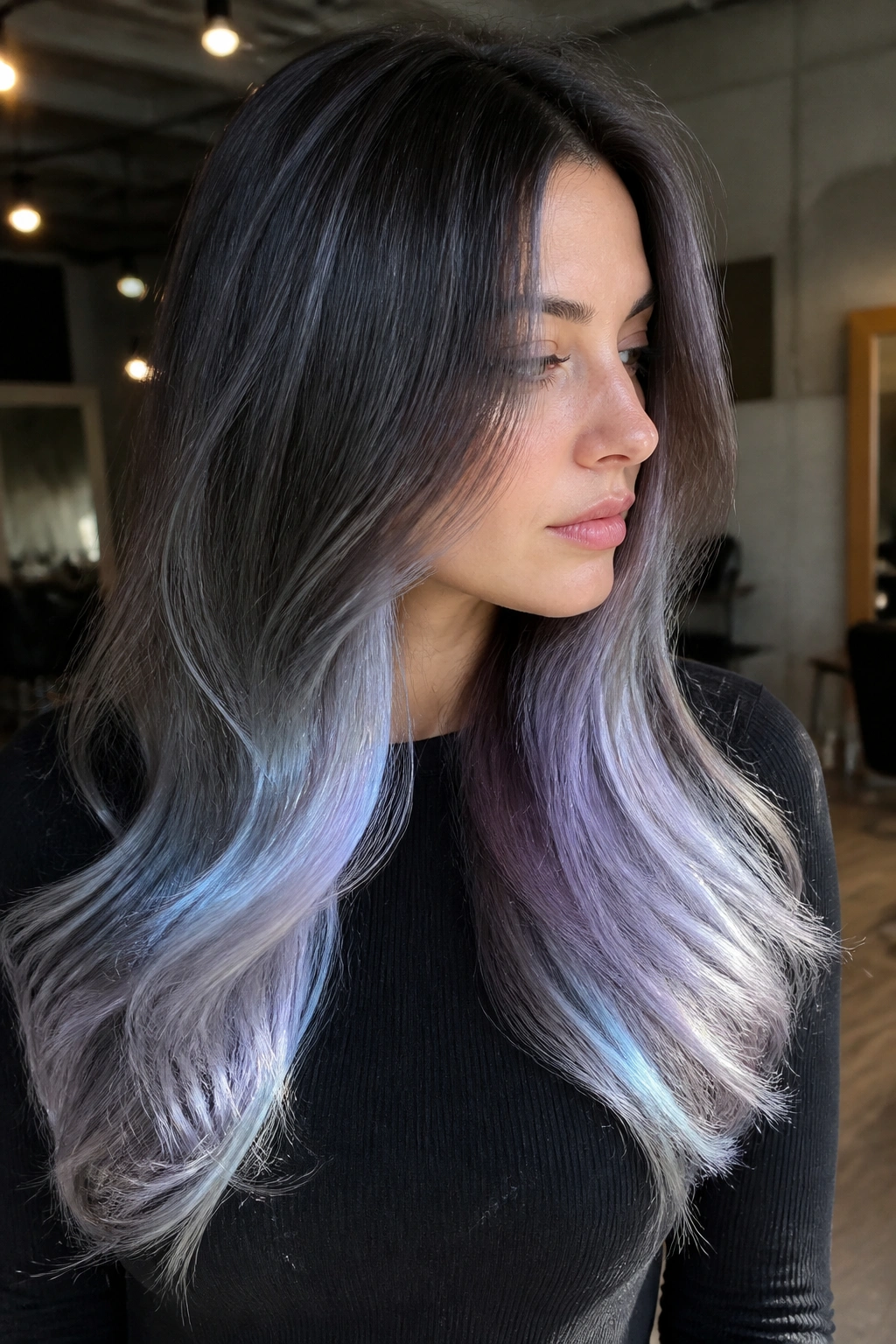
Holographic silver ends are for people who want the cleanest possible top and the coolest possible finish at the bottom. The crown stays pale, neutral, or softly toned, while the ends shift between silver, lilac, and a whisper of blue depending on the light.
Unlike rainbow roots, silver ends keep the face calm. That is a big deal if your skin is cool and you do not want too much competing color near the cheeks and forehead.
The style works best on longer hair or layered cuts with enough length to show the gradient. Short hair can do it, but the effect is stronger when the fade has room to stretch.
It also pairs well with blunt edges. A straight hemline gives the silver something to hang off, and that sharp line makes the finish feel deliberate rather than soft-focus.
A bit of shine serum on the ends helps, but use a light hand. Too much product can make silver look dark, and the whole point is keeping it bright.
17. Winter Rainbow Peekaboo Panels
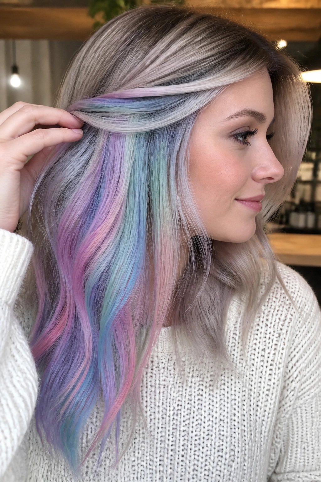
Winter rainbow peekaboo panels are the friendly version of full rainbow hair. The color lives underneath, hidden by the top layer, and only shows when the hair moves or is pinned up.
For cool skin tones, the best palette is icy lavender, pale blue, mint, blush pink, and soft silver. Keep every shade pale. That is where the winter feeling comes from. Bright rainbow panels can get loud too fast.
This is a good choice if you need something more office-safe or simply want color that feels private. You can wear it tucked away most days, then show it off with a braid, a claw clip, or a half-up twist.
The color placement also gives you a little room to play. One side can lean bluer, the other pinker, and the panels still feel balanced because they are partially hidden.
It is one of the better options for someone who loves pastel hair but gets bored fast. You see it in pieces. That keeps it interesting longer than a full wash of one shade.
18. Aurora Pastel Melt for Cool Skin Tones
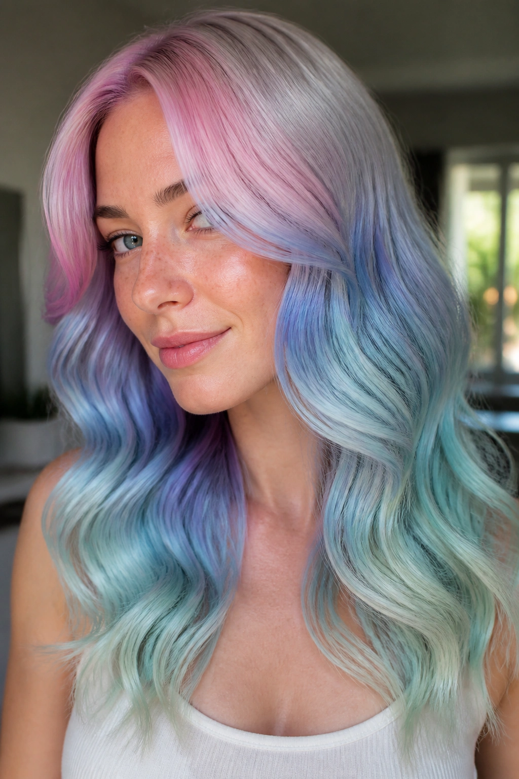
What makes an aurora melt so useful is the way it moves. Instead of a strict rainbow order, the colors blend from icy pink to lavender, pale blue, mint, and silver in a soft wave that feels closer to light than paint.
That style flatters cool skin because the whole palette stays inside the same temperature zone. No yellow-heavy detours. No peachy surprise in the middle. Just cool pastel shifts that keep the face looking calm and fresh.
I like this look best when the colorist leaves the roots soft and the ends slightly brighter. That gives the melt a little lift, which helps the pastel shades show up without becoming blunt or chalky. The finish should feel airy, not dense.
How to keep it from turning muddy
- Start with a pale blonde base, ideally level 10
- Ask for blue and violet to lead the palette
- Keep mint and pink secondary so they do not dominate
- Use cool water and a sulfate-free shampoo to slow fading
This is the one to choose if you want the full pastel rainbow idea without looking like every shade is fighting for space. It has the most movement. It also has the easiest visual exit, which matters when you want color that can soften out over time and still look good.