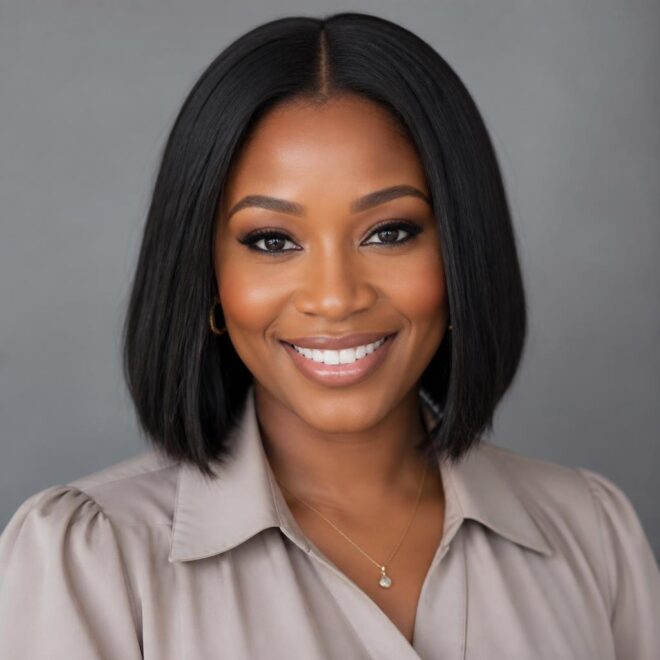


A round face can wear blue beautifully when the color is placed like contour, not confetti. The smartest blue highlights for round faces pull the eye up, down, or diagonally — anywhere but straight across the widest part of the face.
That one detail changes everything. A cobalt streak at cheek level can make the face read wider; the same cobalt pushed below the cheekbone, or broken into thin ribbons near the crown, can feel sharper, longer, and more balanced. Blue also behaves differently from softer blondes and browns. It can look airy and icy on a level 10 base, deep and moody on dark hair, or almost denim-soft when the pigment is muted.
Placement wins.
And because blue is such a flexible color family, the options go way beyond neon streaks. You can go subtle with babylights, hide the color under layers, build it into a money piece, or let it melt into ends that move when you walk. The right choice depends on where your face is widest, how much upkeep you can stand, and whether you want the blue to whisper or show up from across the room.
1. Blue Highlights for Round Faces That Start Below the Cheekbone
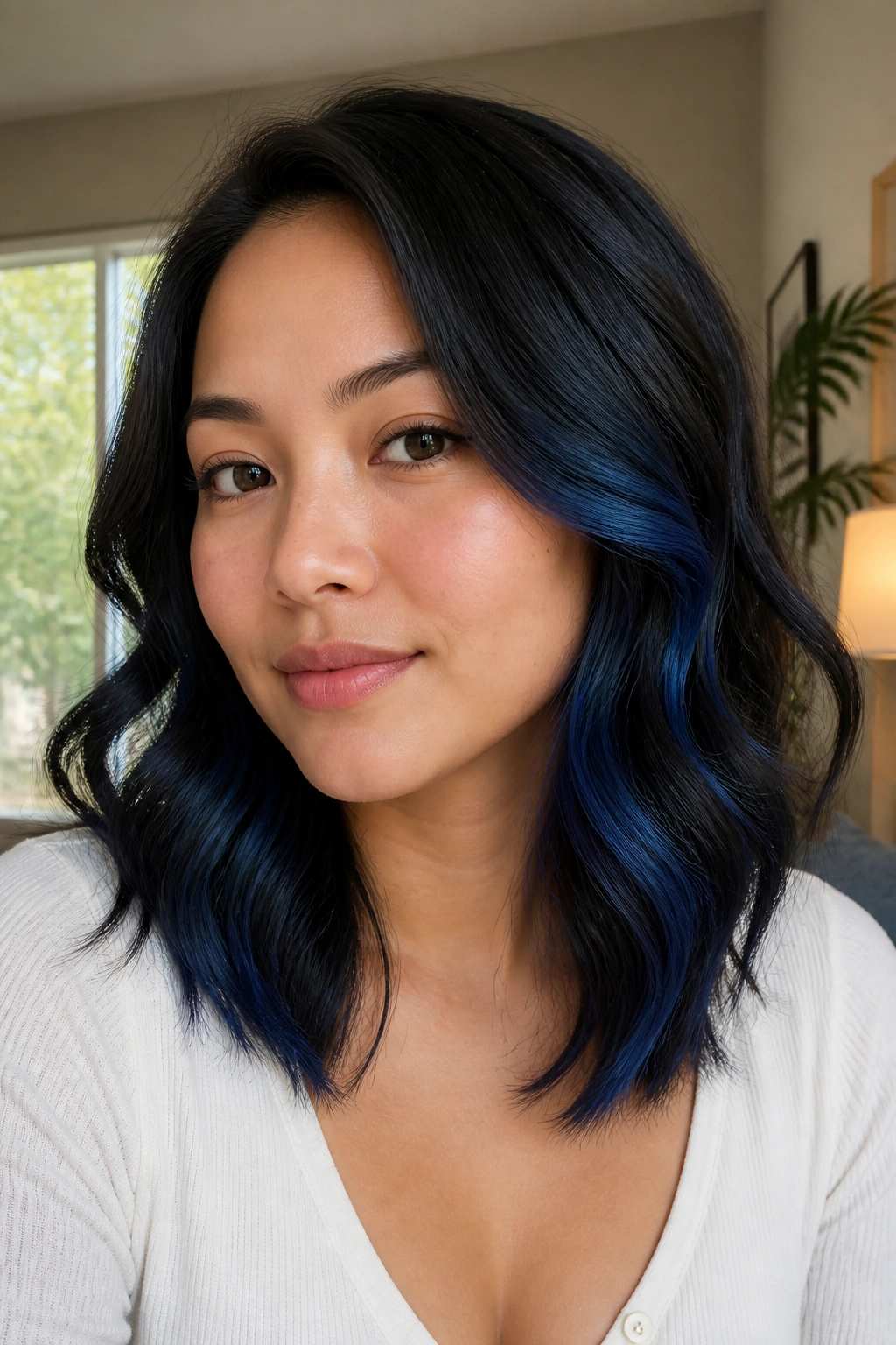
The cleanest way to flatter a round face is to let the bright pieces begin below the cheekbone, not across it. That small shift keeps the eye moving downward, which gives the face a longer read without making the color feel fussy.
I like this placement on lob-length hair and anything longer, because the blue sits in the part of the hair that moves first. Ask for two to four thin ribbons on each side, each no wider than 1/4 inch, with the brightest point starting just under the cheekbone and feathering into the mid-lengths. If your hair is dark brown, the blue will usually need a pale blonde base first; if it is already light, a cobalt or sapphire gloss can take without a huge bleach job.
A soft root shadow helps here too. Keep 1 to 1.5 inches of depth at the top so the face does not get framed by one hard stripe of color.
Best for: shoulder-length cuts, soft waves, and anyone who wants blue that feels polished instead of loud.
2. A Cobalt Money Piece With Dark Roots
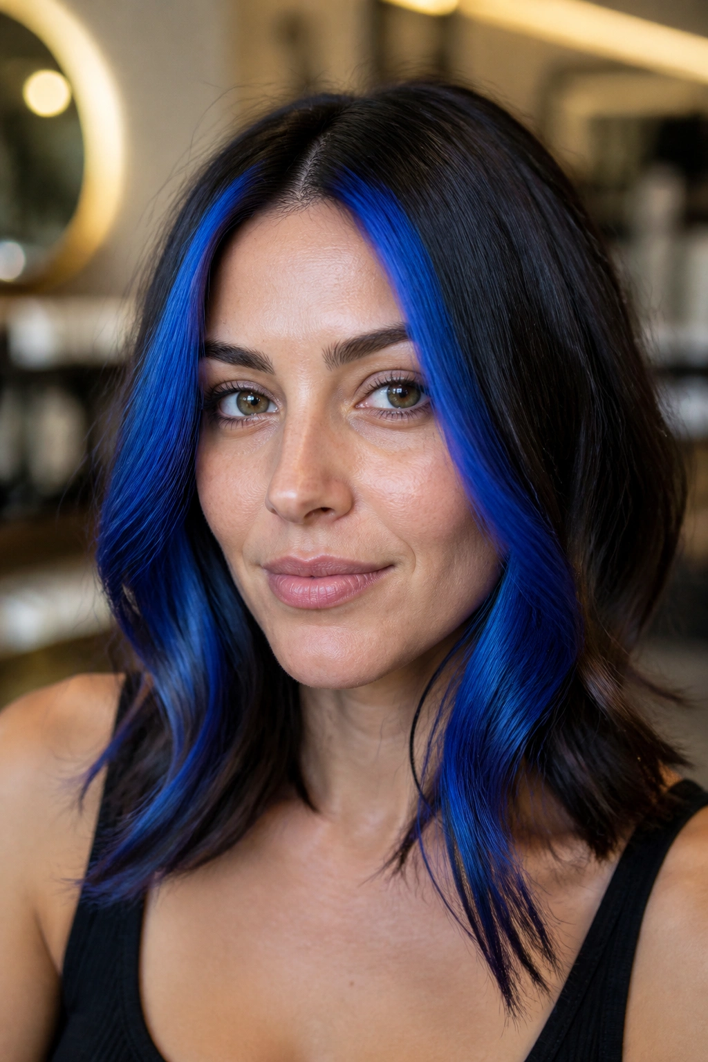
A cobalt money piece can look bold and expensive on a round face if the roots stay darker. That contrast creates a vertical line right where the eye lands first, which does more for face shape than a big pale block ever will.
The trick is width. Keep the bright front section fairly narrow — think 1 to 1.5 inches on each side, not a thick curtain of color. If the blue starts right at the hairline and spreads too far back, it can puff out the width of the face. A dark root, even just an inch of shadow, reins that in fast.
What I’d ask for at the salon:
- A cobalt or electric-blue money piece with a soft root melt.
- Brightness concentrated from eye level down to the collarbone.
- Face-framing pieces that are thinner near the temple and fuller toward the ends.
- A gloss finish so the blue reflects light instead of looking flat.
That last part matters. Flat blue can feel heavy near the face. A glossy finish keeps it moving.
3. Peekaboo Blue Underlayers at the Nape
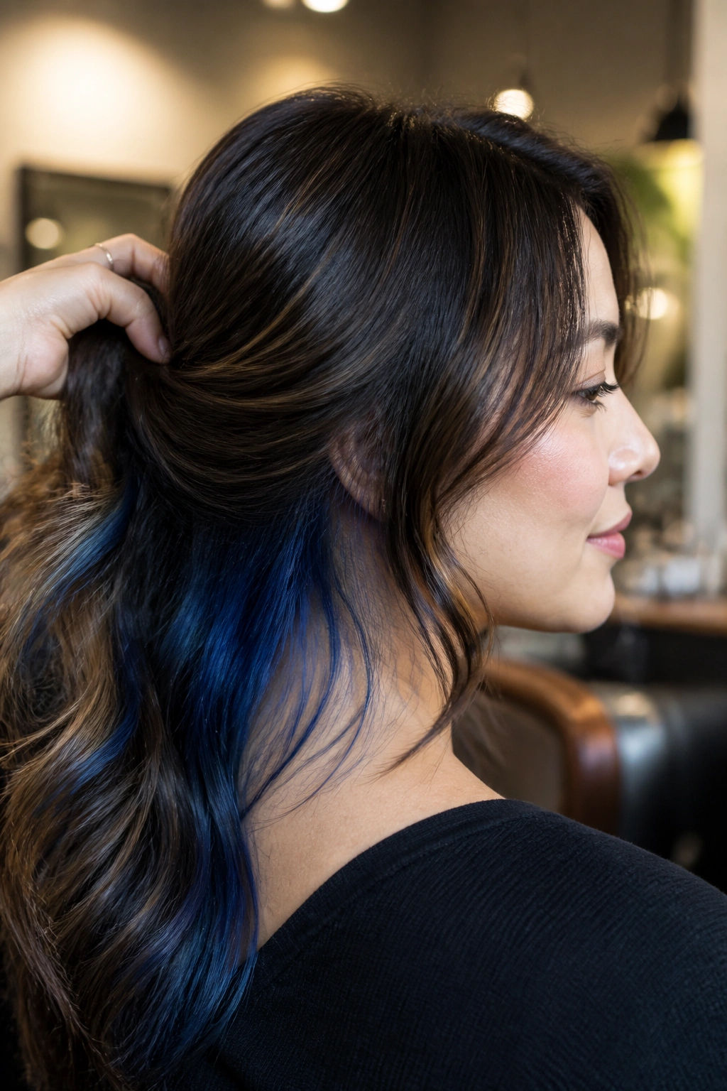
Peekaboo blue is for the person who wants color that appears when the hair shifts, not all at once. On a round face, that hidden placement is a gift. It keeps the sides clean and lets the blue live lower, at the nape and underlayers, where it adds interest without crowding the cheeks.
I’ve always liked this on shags, lobs, and longer layered cuts. A short ponytail shows it. A half-up style shows more. Loose hair hides most of it, which makes the color feel like a private detail instead of a headline. If your job or dress code is strict, this is the easiest way to get blue in the hair without living with it in your face every day.
The other benefit is shape. Because the visible color sits lower, the face reads longer. No hard line across the cheek. No band of brightness at the widest point.
A few thin slices under the top layer are enough. Ask for 3 to 6 hidden panels, each placed so they peek out only when the hair moves.
4. Diagonal Sapphire Strips Through Long Layers
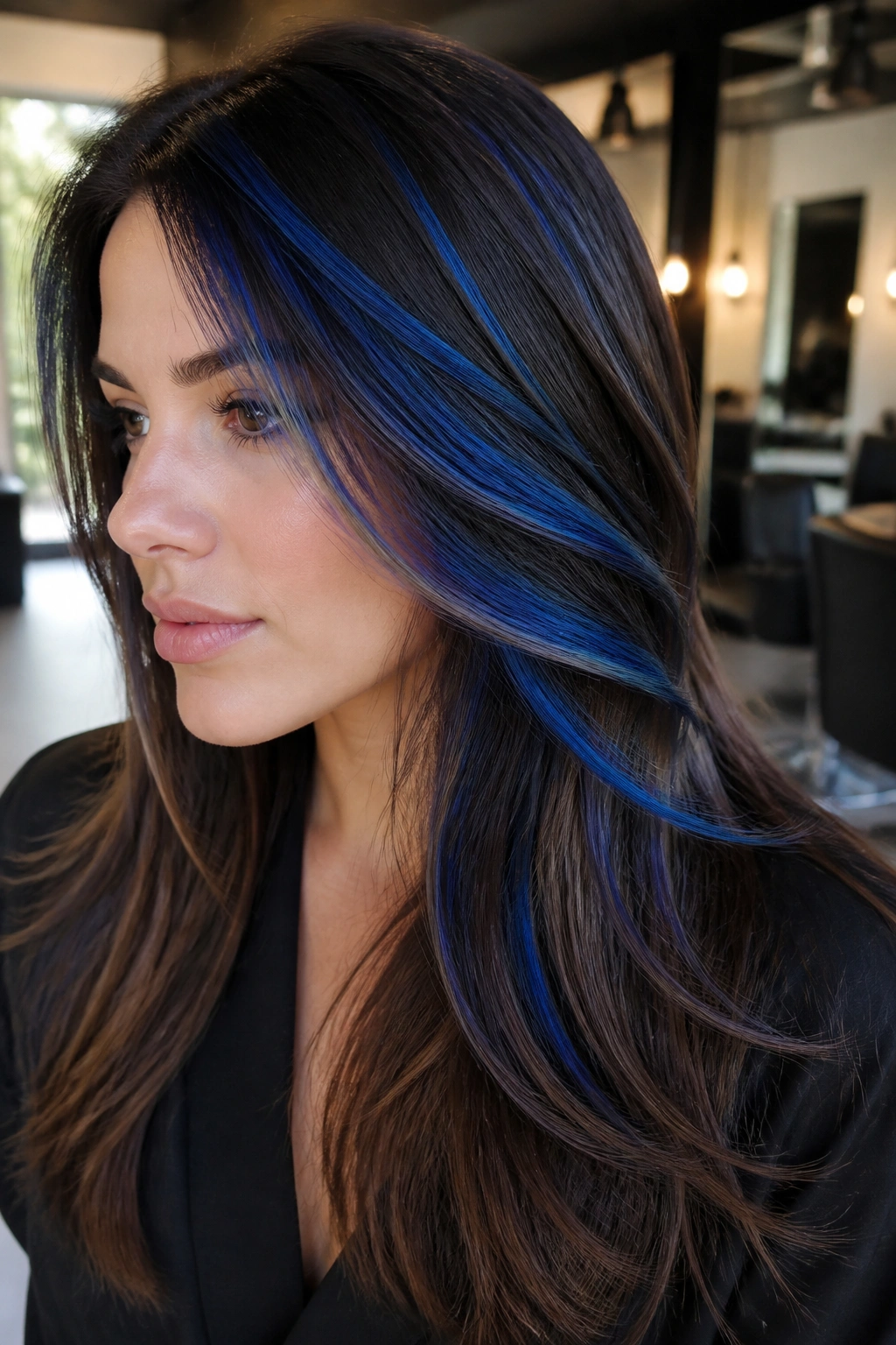
Straight-across highlights can be brutal on a round face. Diagonal ones are kinder. They pull the eye on a slant, and that tiny angle keeps the blue from turning into a wide stripe.
Why the diagonal matters
A 45-degree foil angle is one of those salon details that sounds small but changes the whole mood. Instead of wrapping the face in a horizontal bar, the color slides from upper outer hair toward lower inner lengths. That movement creates length. It also keeps the blue from sitting evenly at cheek level, which is the one zone I’d avoid if the goal is a slimmer read.
Best cuts for the placement
Long layers take this placement best, especially U-shaped cuts and soft butterfly layers. The blue can follow the shape of the haircut instead of fighting it. On blunt cuts, diagonal strips can still work, but they need to be softer and more spaced out, or the line starts looking too obvious.
If you want the style to feel less sharp, ask for sapphire pieces that are 1/4 to 1/2 inch wide, with a few darker strands left between them. That broken-up contrast keeps the face from looking boxed in.
5. Icy Blue Micro-Babylights Around the Part
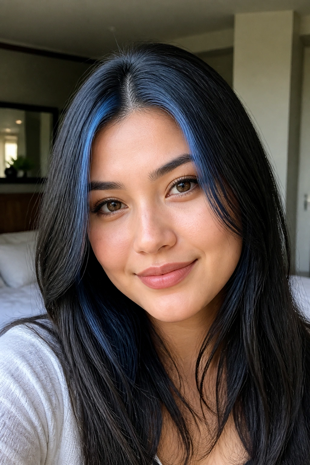
Tiny babylights around the part line do a sneaky good job on round faces. They lift the eye upward, which gives the top of the head more presence and makes the face feel a little longer. A thick blue stripe can overwhelm fine hair; micro-babylights fix that.
I’m talking about slices no wider than 1/8 inch, placed close to the part and scattered rather than stacked. On straight hair, that kind of detail looks almost like shimmer. On wavy hair, it breaks up the surface enough that the blue never reads like a helmet. I prefer this with icy blue or pale denim tones because the softness suits the fine placement.
One small detail helps a lot: move the part by about 1/2 inch off center. Not dramatic. Just enough to keep the shape from looking too symmetrical.
Placement like this works especially well if your face is fuller at the cheeks and you do not want a heavy color story near the jawline. The highlight lives higher, the face looks longer, and the blue feels quietly sharp.
6. Teal Ends on a Long Bob
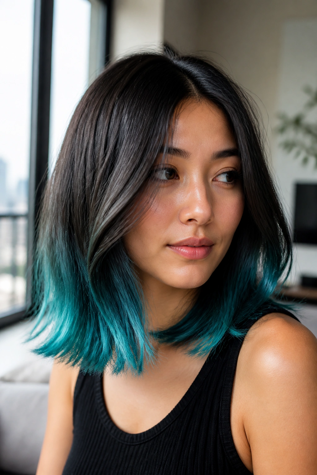
Teal ends are a smart choice if you want blue without bringing the color close to the face. The whole point is to keep the top and sides calmer, then let the brightness live in the bottom third of the hair. On a round face, that lower placement helps the silhouette read longer.
A long bob is ideal because it gives the color room to breathe. If the cut sits at the jaw, I’d push the teal a little lower so the brightest area starts below the chin. That keeps the eye from stopping at the widest part of the face. It also lets the ends swing with movement, which gives the color some life.
Unlike all-over blue, this version does not need to shout. The roots stay natural, the mid-lengths stay soft, and the ends carry the fun part. That contrast is what makes it work.
If you have straight hair, the teal can look sleek and graphic. If you have waves, it softens into a more blended finish. Either way, it is one of the easier ways to wear blue and still keep the face open.
7. Blue Highlights for Round Faces With a Shadow Root
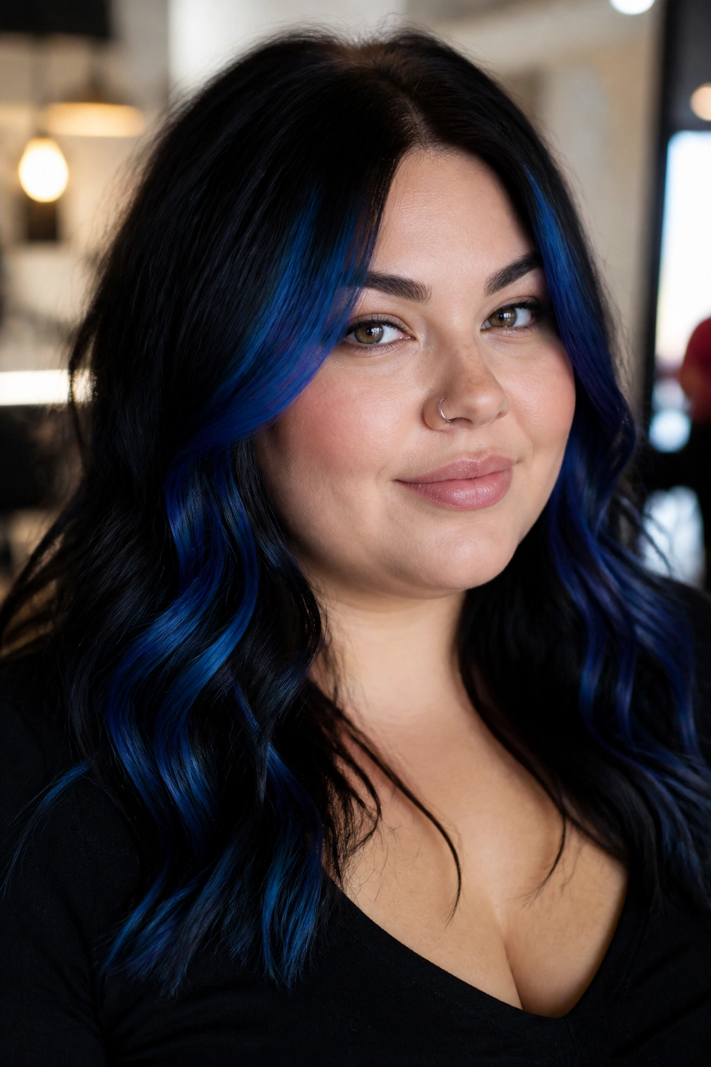
A shadow root is one of the best tools for a round face. The darker top area creates lift and depth, while the blue lives lower and longer, which helps the face read less circular. It sounds simple. It is simple. And it works.
How to ask for the blend
Tell the colorist you want a root that is 1 to 2 shades deeper than the rest of the hair, with blue painted from around the eye line downward. That keeps the brightest area away from the sides of the face. If the blue starts too high, the whole shape can feel top-heavy.
Where to keep the blue brighter
I like the brighter color to sit through the mid-lengths and ends, especially if the haircut has layers. A soft sapphire or denim tone is easier to blend than a harsh electric blue, and it usually wears better between salon visits. If your hair is very light, the blue can be more vivid; if it is darker, a deeper navy or cobalt has more staying power.
This is one of those styles that looks calm from a distance and detailed up close. Good sign.
8. Denim Blue Ribbon Highlights on Waves
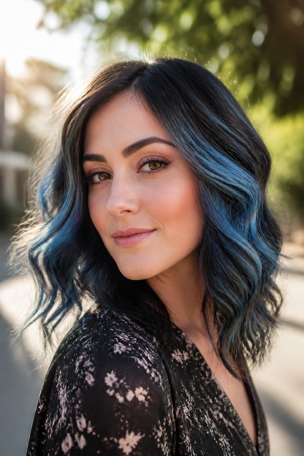
Denim blue has a nice trick up its sleeve: it gives you blue without the harshness of a pure vivid shade. On wavy hair, that softness matters. The movement of the wave breaks the color into pieces, which keeps the face from feeling boxed in by one continuous stripe.
I’d ask for broad ribbons, not tiny threads, but I would still keep them spaced out. Think 3 to 4 painted ribbons on each side, each separated by darker hair so the blue reads as texture rather than a solid block. One ribbon can begin near the temple and slide down past the cheekbone. Another can tuck under a layer and only show when the hair swings.
A good denim placement usually does three things:
- Starts above or below the cheek width, never right on it.
- Uses darker hair between the lighter pieces.
- Ends lower than the jawline so the eye keeps moving.
Waves love this because they make the denim look lived-in. Straight hair can do it too, but the finish will look cleaner and a little more graphic.
9. Electric Blue Streaks Through Curtain Bangs
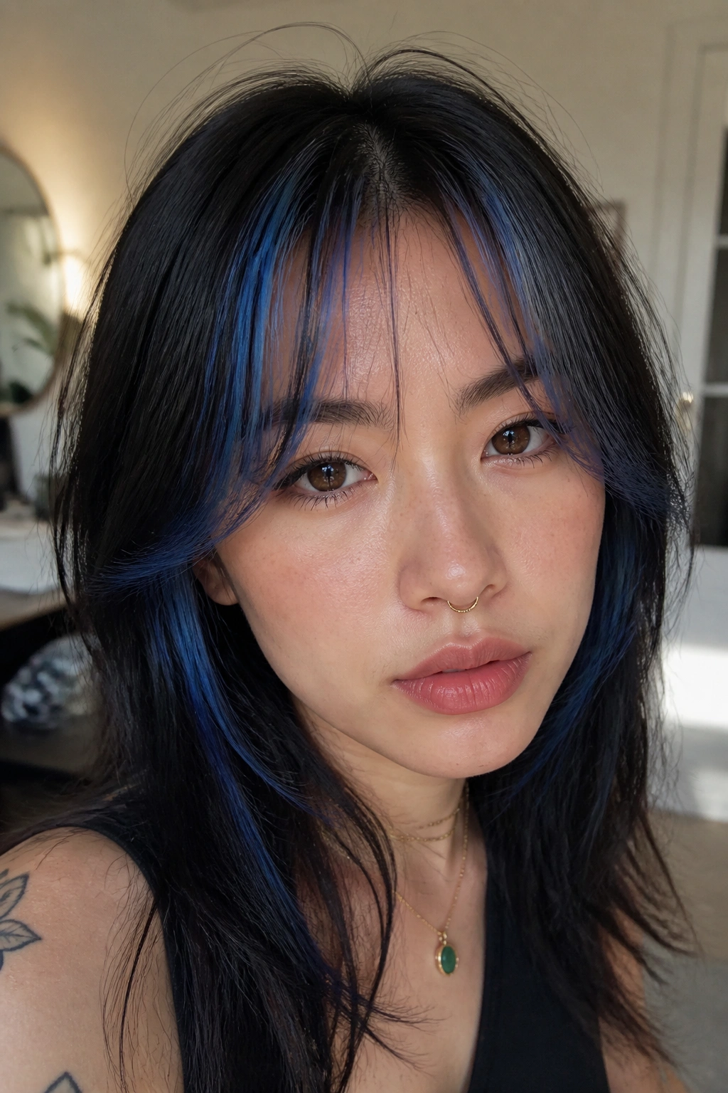
Curtain bangs can handle electric blue, but only if the streaks stay feather-thin. A thick blue fringe can cut a round face in half. Thin streaks, though, bend with the bangs and open the face instead of closing it off.
What to watch for
The front sections should be sliced, not blocked. I’d keep the brightest pieces to 1/16 to 1/8 inch, and I would not color the whole bang area. A few lights around the bend of the curtain bang are enough. If the blue starts too close to the inner brow, it can crowd the face. If it lives at the outer sweep, it creates a soft edge that feels much easier.
The rest of the hair can stay darker or more muted. That contrast makes the bangs feel intentional without turning them into a helmet. You can also ask for the blue to fade into a softer teal by the ends, which takes some of the edge off.
This one is not for someone who wants low drama. It is for someone who likes a front section that talks back a little.
10. Blue Panel Highlights at One Temple
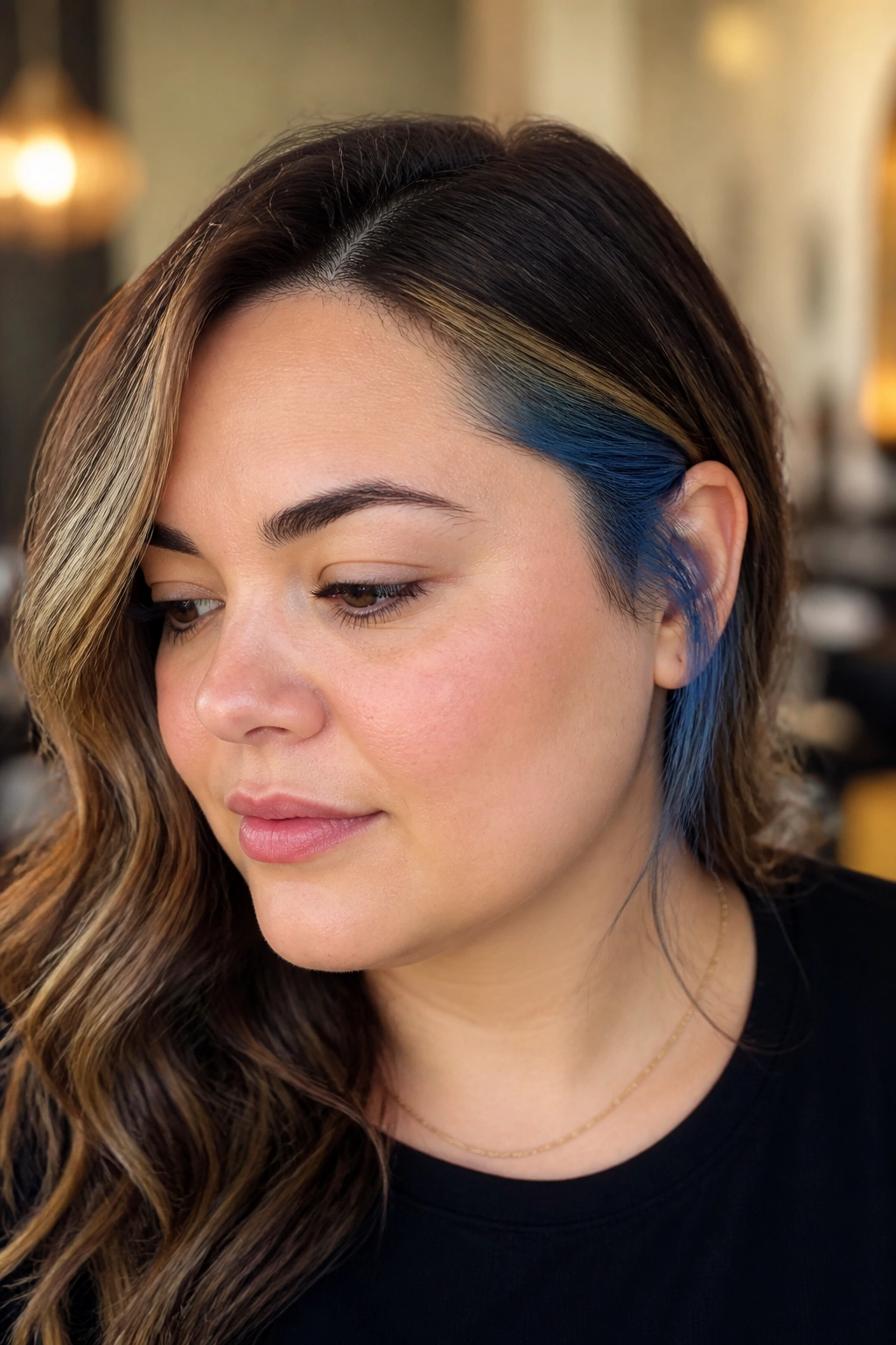
Asymmetry is a round face’s friend. A blue panel on one temple breaks the mirror effect that often makes a round face look wider than it is. You do not need to color both sides evenly to get balance; sometimes the slight imbalance is what gives the style shape.
I like this when the hair is parted a bit off center, maybe 1 to 1.5 inches to one side. The stronger temple gets a deeper panel of sapphire or cobalt. The opposite side gets either a thin whisper of color or none at all. That difference keeps the eye moving across the face instead of stopping in one spot.
The panel itself should be clean, not chunky. A wide block can feel blunt. Two narrower pieces, placed at the temple and just behind it, are usually enough.
This idea looks especially good with shoulder-length cuts and layered lobs. The hair moves, the blue flashes, and the face gets a little more length without looking overworked.
11. Smoky Steel-Blue Lights on Curly Hair
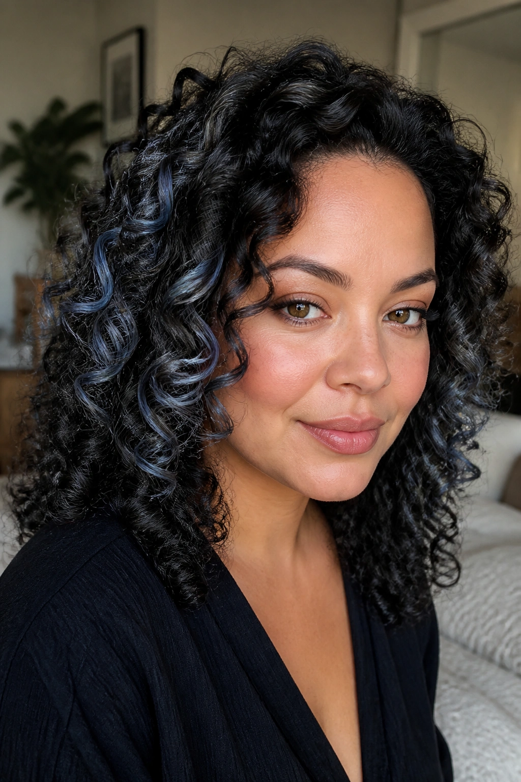
Can curls wear blue without turning into a color blob? Yes. They just need the lights painted where the curl bends, not in a flat band across the head.
How to place it on 3A to 3C curls
Think in individual curls, not in rows. A few steel-blue ribbons placed around the face can define the curl pattern and make the face read taller. I’d keep the highlight on the outside curve of the curl, then leave some darker hair between the lighter pieces. That keeps the color from filling the whole cheek area.
What to skip
Skip a thick highlight at cheek height. On curly hair, that one move can widen the face fast. Keep the blue a little higher at the temple or a little lower at the chin, and let the curls themselves do the shaping.
A smoky steel-blue tone works better than a bright electric one here, mostly because it blends into the curl pattern instead of sitting on top of it. It is also easier to live with between refreshes. If your curls are dry or porous, a gloss every few weeks can keep the blue from turning chalky.
12. Sapphire and Silver Mix for a Cool Halo
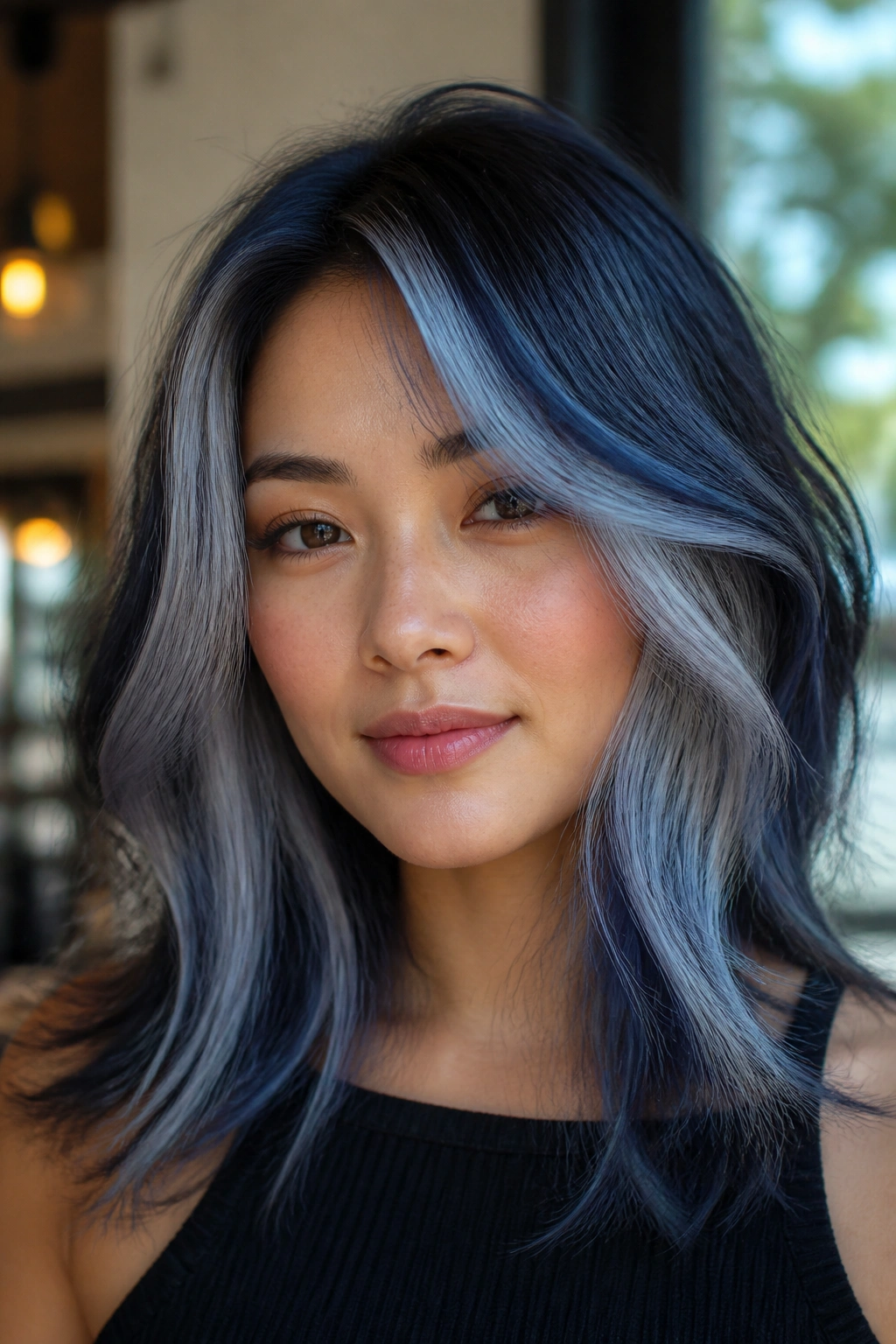
A single blue tone can go flat on a round face. Mixing sapphire with silver gives the hair a halo effect that feels lighter at the edges and deeper underneath, which helps the face look less full through the middle.
This works best if the silver pieces sit around the upper layer and the sapphire hides a little lower. The contrast between the two keeps the eye traveling. It also stops the blue from becoming one solid band. On finer hair, that kind of mix can make the style look thicker than it really is. On thicker hair, it keeps the surface from feeling heavy.
I’d choose this if you want a cooler, brighter finish but do not want neon. It is also a good fix for hair that lifts unevenly, because the silver can soften any spots that went too pale while the sapphire gives the rest of the head some weight.
The face-framing pieces should still stay thin. That is the part people skip, and then they wonder why the style feels wide. Thin front pieces. Fuller depth underneath. Easy enough.
13. Melted Blue Ombré Starting Below the Chin
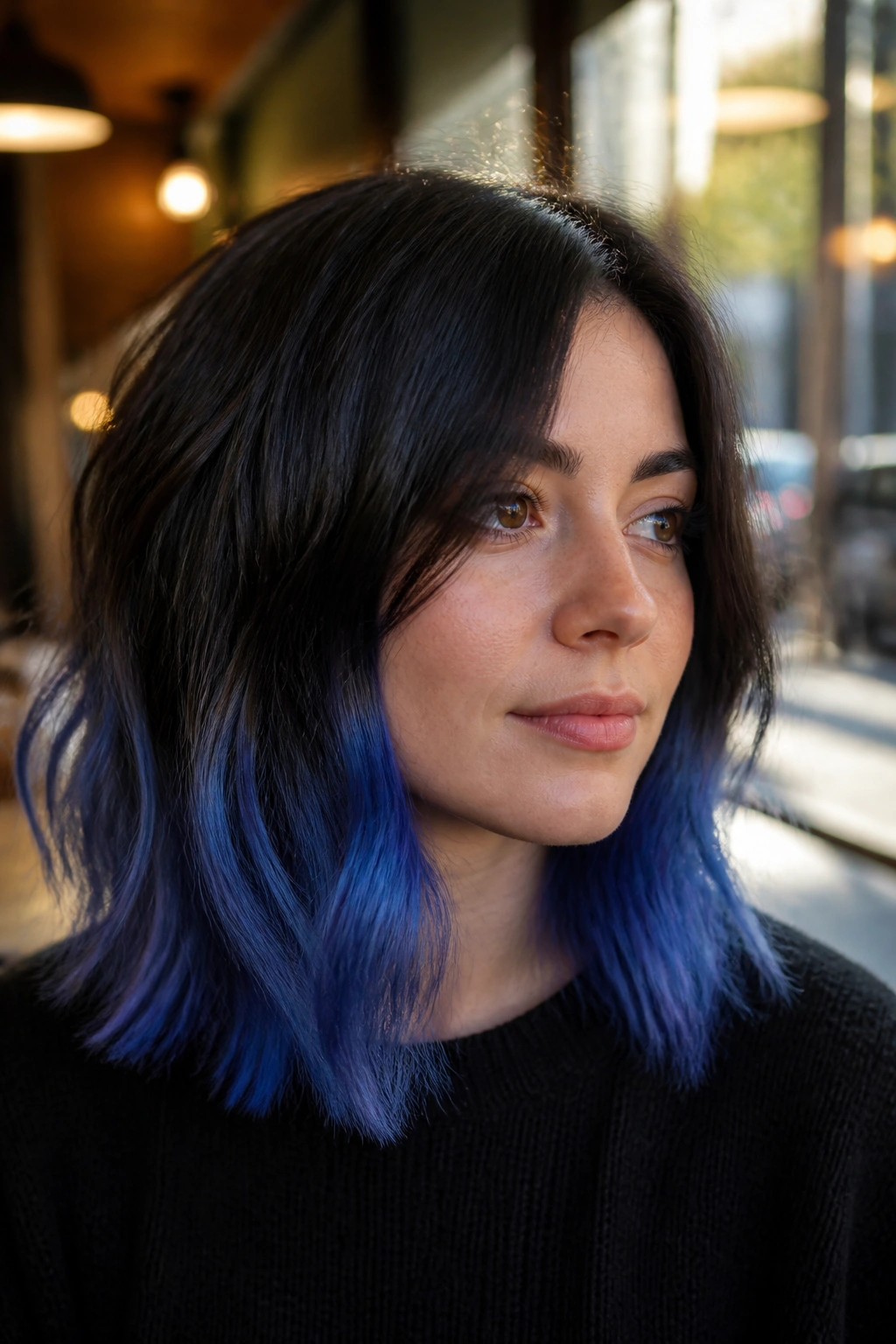
A blue ombré works for round faces because the color gets stronger where the face ends, not where it is widest. Starting the melt below the chin keeps the cheeks visually clean and lets the blue build down the length of the hair.
I prefer this on hair that reaches the shoulders or longer. Short cuts can make ombré feel abrupt; longer lengths give the gradient room to fade properly. You want the top to stay darker or more neutral, then let the blue gather into cobalt, denim, or midnight tones through the lower half.
The gradient itself should not look striped. If you can spot a hard line from six feet away, the blend is too blunt. The best versions shift gradually over 3 to 5 inches of hair, with the brightest ends sitting right where the hair moves the most.
This placement does three useful things:
- Keeps brightness away from the widest part of the face.
- Lets the color show more when the hair swings.
- Gives long hair a stronger shape from top to bottom.
There is a reason this one never feels tired. It is plain good geometry.
14. Blue Highlights on a Shag With Texture
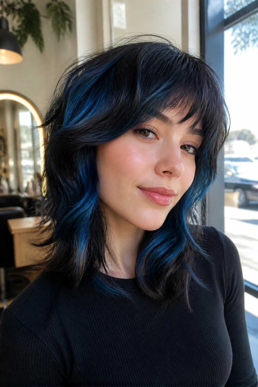
A shag can take more blue than people expect. The layers are already broken up, so the color does not need to do all the work. Blue just needs to follow the haircut and sit where the texture is strongest.
Why shag layers love blue
On a shag, I would choose piecey highlights instead of broad panels. The blue should land on the top layers, a few face-framing strands, and a couple of hidden bits underneath. That gives the haircut movement without making the color feel pasted on. If the shag has razor-cut ends, even better — the blue catches those edges and makes the texture look sharper.
Where the brighter pieces go
Keep the brightest pieces near the crown and the outer edges of the layers, not as a thick stripe through the cheeks. That keeps the face open and the haircut lively. A soft cobalt or indigo can work well here, since shag layers already bring enough drama on their own.
This is one of the few styles where a bit of mess looks right. Too neat, and it loses the point.
15. Midnight Blue Accent Pieces Around the Crown
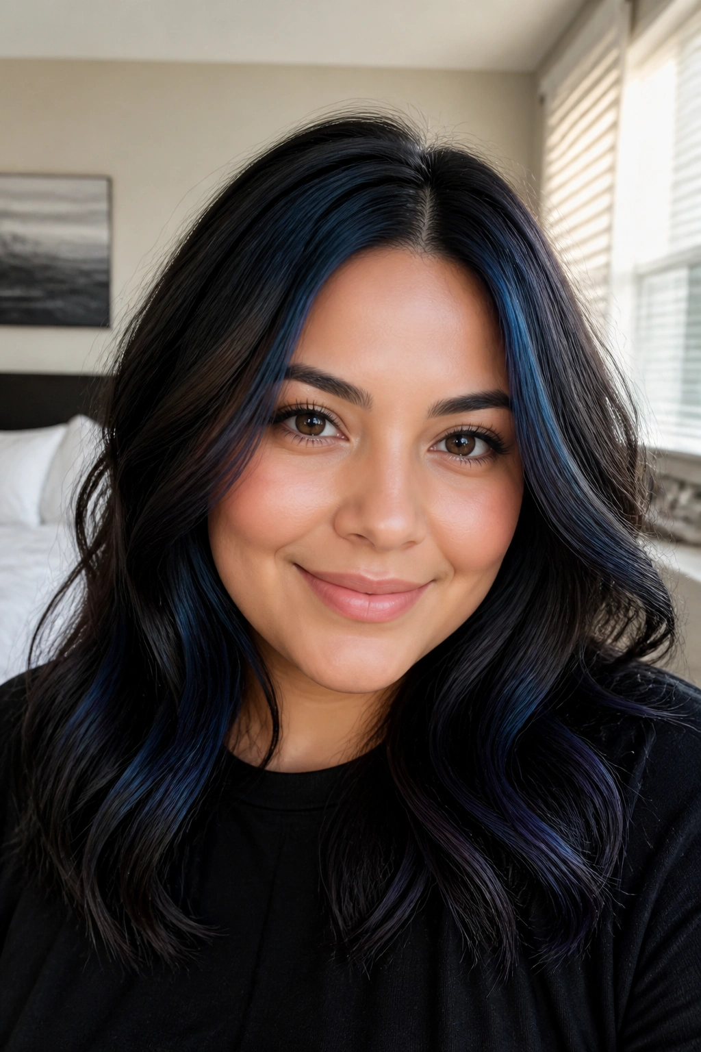
The crown is a good place to put blue if your goal is to lengthen a round face. Brightness up top pulls the eye upward, which is the opposite of what a wide horizontal band at the cheek does. Midnight blue is especially nice here because it gives depth without requiring a big, obvious lightening job.
I like this as a series of 4 to 6 accent pieces placed around the part and slightly behind it. Keep each piece fairly thin, around 1/4 inch, and let the surrounding hair stay darker. The contrast should read as movement, not a patchwork quilt.
The pieces I’d keep
- One brighter strand near the highest point of the crown.
- One or two slices just off the part.
- A soft blue bit behind the fringe or front layers.
- Darker hair around the ears so the face does not spread sideways.
The nice thing about midnight blue is that it wears quietly. In low light, it looks almost black. In daylight, it turns blue enough to matter. That range suits a round face because it adds shape without making the whole style loud.
16. Bold Blue Peekaboo Layers in Braids and Updos
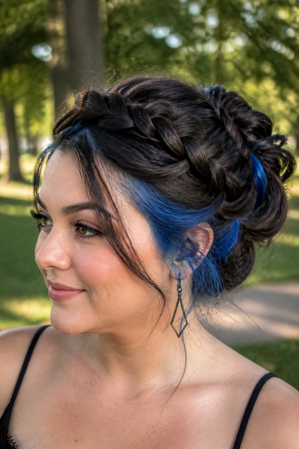
What if you want the color to show only when the hair is styled? Hide it under the top layer. Peekaboo blue underneath braids and updos can be a clever move for round faces, because the everyday look stays sleek while the styled look opens up with long vertical lines of color.
This works best when the blue is placed in the lower layers, around the nape and back sides of the head. A braid exposes the color in narrow strips. A bun lets the blue peek out at the base and along the twist. A ponytail gives you a cleaner reveal. All of those styles lengthen the shape of the head, which helps balance a round face.
If you want enough color to show in braids, ask for 6 to 8 thin slices instead of a single panel. Thin slices move better and create a more broken, dimensional reveal. A chunky hidden block can look too heavy once it is styled up.
This is the kind of color that feels fun when you need it and quiet when you do not. Handy. Honestly, more color should work like that.
17. Frosted Aqua Highlights on Straight Hair
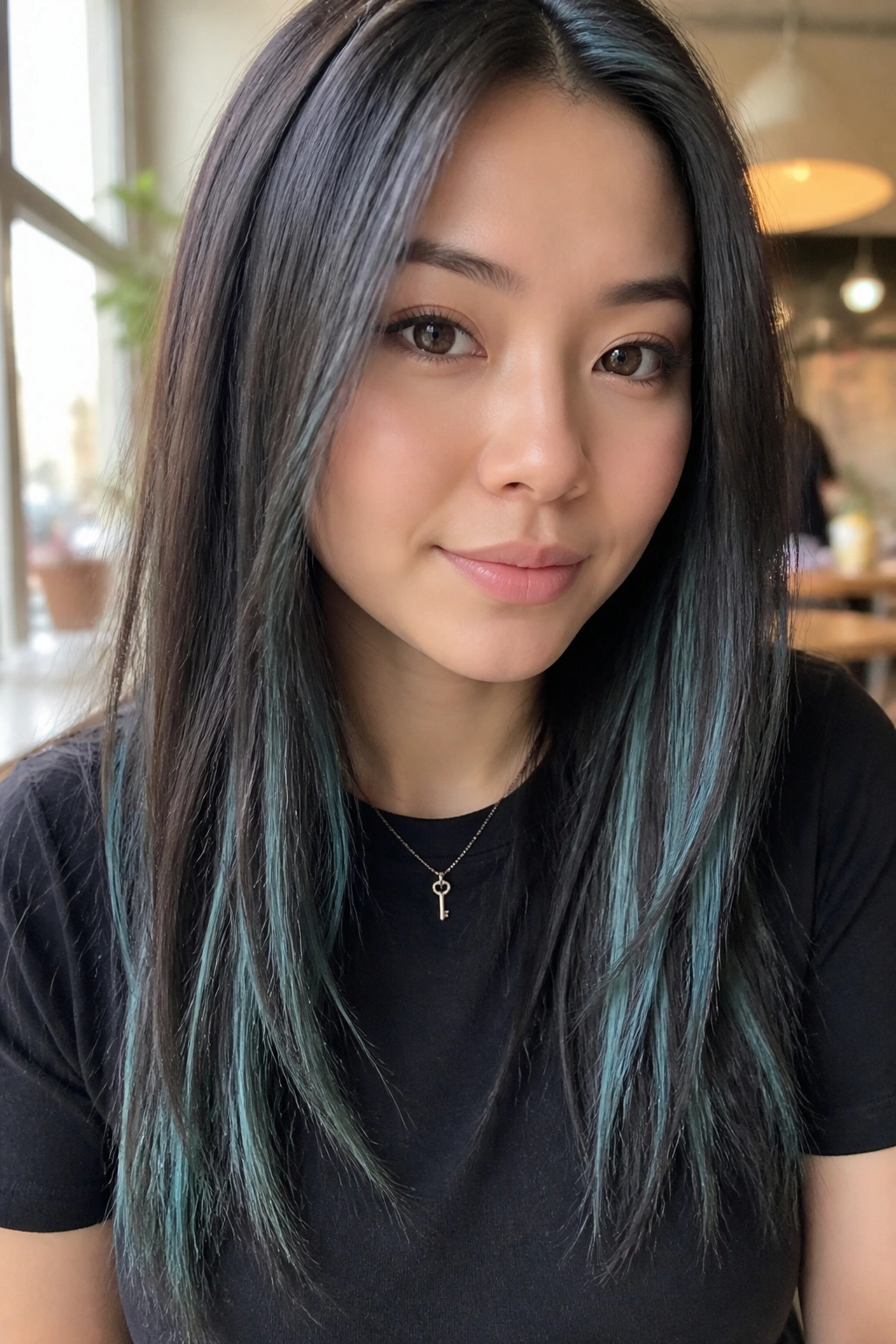
Straight hair is honest hair. Every line shows. That is why frosted aqua has to be placed with care on a round face, or the color starts reading as a band instead of a lift.
Why it stays readable
Thin slices are the whole game here. I would keep the highlights around 1/8 inch wide and scatter them so they do not line up across the cheeks. On a blunt cut, the safest place is often the lower third of the hair, with one or two finer pieces near the part for brightness at the top. If the aqua sits right across cheek level, it can widen the face fast.
The icy tone also matters. Aqua is lighter and airier than navy or cobalt, so it can soften the edges of a straight cut. It reads clean in daylight and has enough coolness to feel crisp without looking harsh.
If you want a simple rule, use this one: keep the brightest aqua off the widest part of the face. That single choice solves half the problem.
18. Blue Highlights for Round Faces With a Custom Asymmetrical Map

A custom map beats any one-size-fits-all formula here. Round faces do not all widen in the same place. Some are fuller through the cheeks. Some carry width lower at the jaw. Some are broad only because the haircut is too even. The highlight placement should answer the face, not the other way around.
Start by marking three zones: the temple, the cheekbone, and the area just below the chin. Then decide where the blue should be brightest. If the cheeks are the widest point, keep the front brighter pieces lower and thinner. If the jaw is soft, raise a little light toward the temple and crown. If the hair is thick, you can handle more contrast. If it is fine, the blue should stay broken into small pieces so it does not swallow the shape.
I like this approach because it lets the face shape breathe. There is no need to force the same placement on every client with a round face. A good color map respects the cut, the density, and the way the hair falls when you shake it out.
Bring photos, sure. Better yet, bring photos and point to where the color starts, not only what shade it is. That saves everyone a headache.
Final Thoughts
Blue gets a lot easier once you stop thinking about the shade first and start thinking about the line it makes on the face. On a round face, that line should usually move downward, upward, or sideways at an angle — never straight across the cheeks.
My best advice is boring, but it saves bad hair days: ask your colorist where the blue begins, how wide the brightest pieces are, and whether the roots will stay soft enough to keep the face from feeling boxed in. Shade matters. Placement matters more.
And if you only remember one thing, make it this: a well-placed blue ribbon does more for a round face than a louder color block ever will.