

Blue-black highlights can make a round face look sharper, longer, and a little more expensive-looking — if the placement is smart. That last part matters more than the shade itself. A bright stripe parked across the widest part of the cheeks can widen the face; a cool ribbon that starts below the cheekbone and falls past the jaw does the opposite.
I’ve always liked blue-black because it gives you depth without the flat, hard look that plain black can have. In daylight, the blue reads like ink, oil sheen, or a dim sapphire flash. Indoors, it can look almost black. That shift is the fun part, and it’s also why the placement has to be thoughtful on round faces.
The goal is not to throw brightness everywhere. It’s to build lines the eye wants to follow. Vertical movement, diagonal pieces, narrow ribbons, deeper root shadows — those are the tools that make the face look a touch slimmer and the hair look more alive at the same time.
1. Soft Blue Black Face-Framing Ribbons
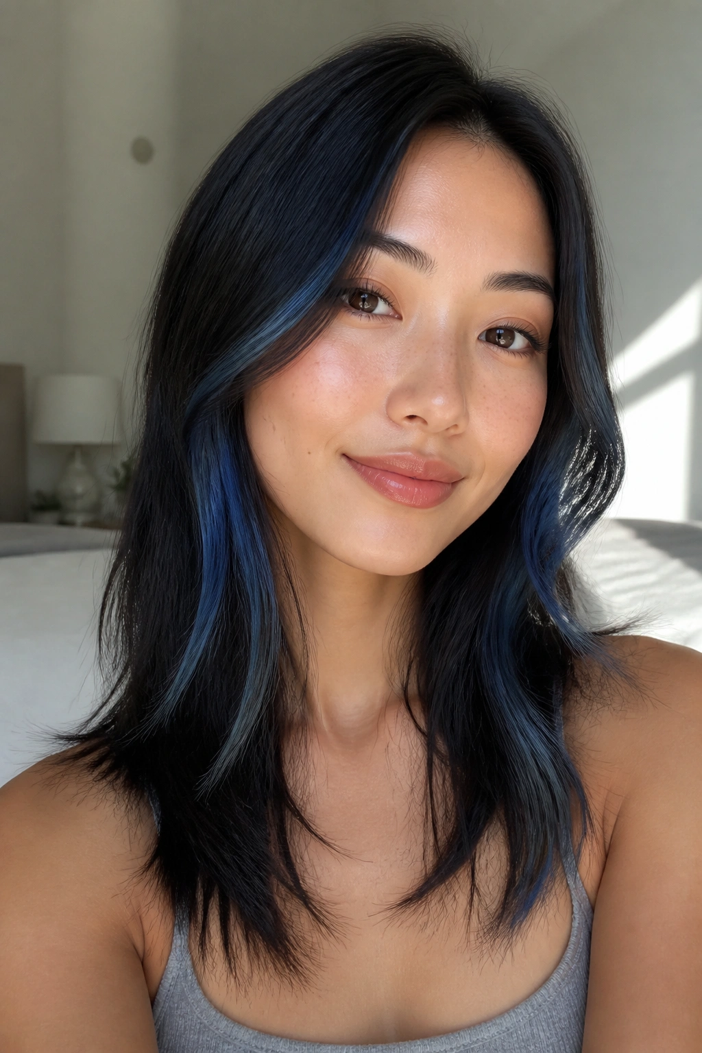
Thin ribbons near the cheeks are the easiest place to start with blue-black highlights for round faces. They give you movement without drawing a bright horizontal line across the widest part of the face.
Keep the first ribbon narrow and let it start a touch below the cheekbone. When it falls past the jaw, the eye follows the length instead of the width. That little shift matters.
Why it flatters round faces
- Use 1/8 to 1/4 inch sections at the front.
- Keep the brightest point just below the cheekbone.
- Let the ribbon taper as it reaches the collarbone.
- Ask for a cool gloss over the lightened pieces so the blue stays clean.
Small pieces do more than big ones. They feel softer, and they age better as the color grows out.
2. The Midnight Money Piece
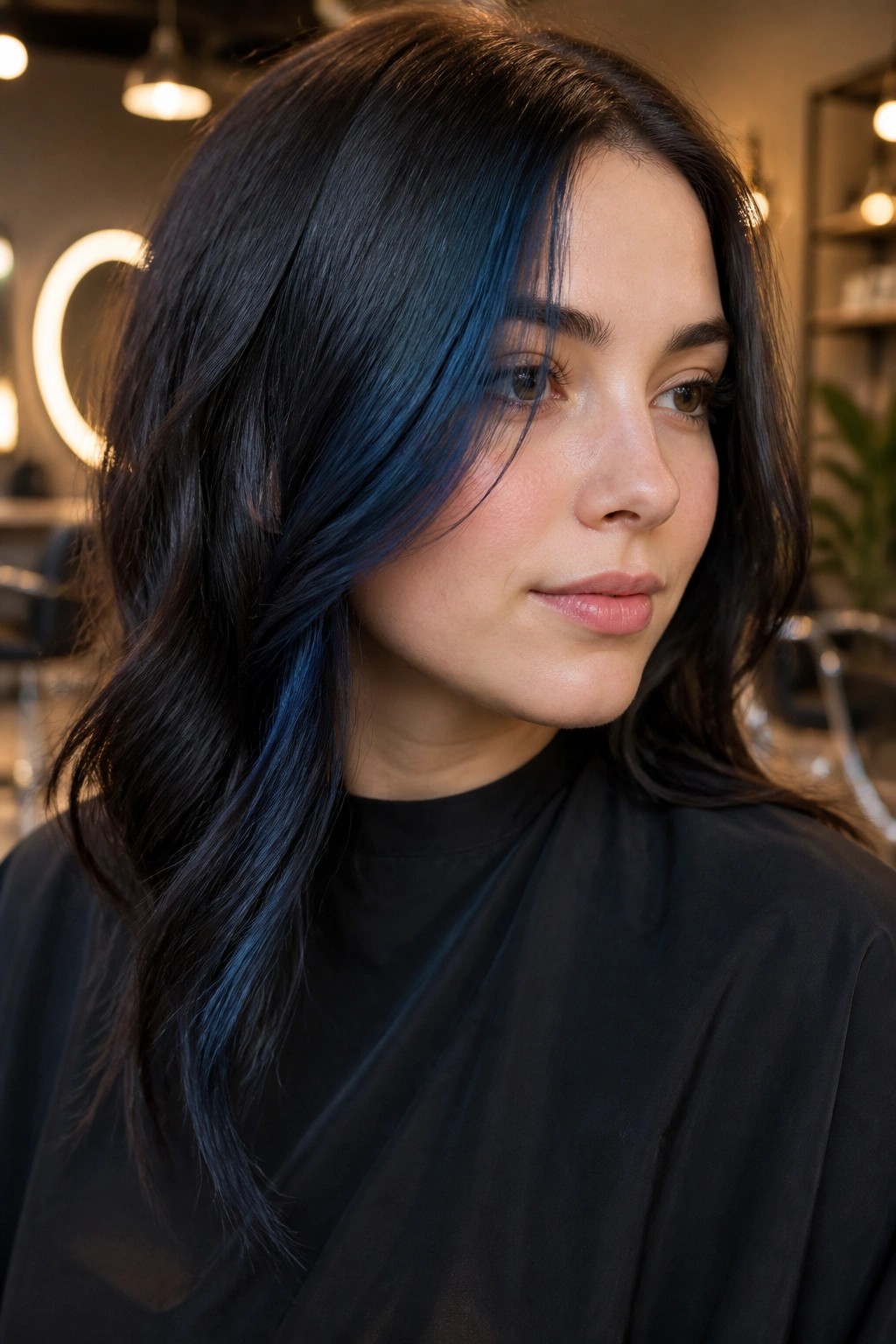
A midnight money piece works when you want the front to matter. On a round face, the trick is to keep it off-center and a little longer than the shortest face-framing layers.
I like this look when the client wants a visible hit of color but doesn’t want the whole head shouting. The blue-black shade stays moody, and the narrow front strip gives the face a cleaner edge. If the piece is too wide, it can make the cheeks look fuller. Too short, and it sits like a bar across the face. Neither is the goal.
Ask for a front piece that starts near the part line, stays slim through the temples, and drops below the chin. That one detail changes everything.
3. Peekaboo Blue Black Panels Beneath the Crown
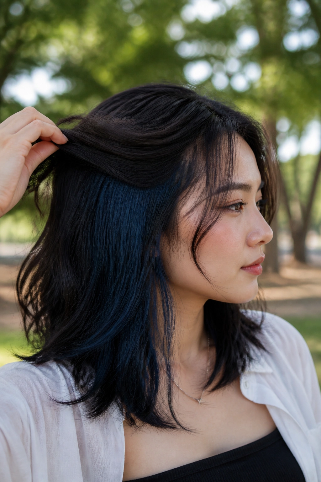
Picture dark hair that looks almost plain until you turn your head and a blue-black panel flashes underneath. That hidden hit of color is one of my favorite moves for round faces.
Why? Because it keeps the eye moving downward and inward instead of straight across the cheeks. The top layer stays dark and clean, while the peekaboo section gives you surprise and depth. It also works nicely if you wear your hair half-up or tuck one side behind the ear.
Try placing the panel under the crown and through the mid-lengths, not at cheek level. A color block sitting too high can puff up the face shape. A lower flash feels slimmer, and honestly, a little cooler too.
4. Sapphire Babylights Across the Top Layer
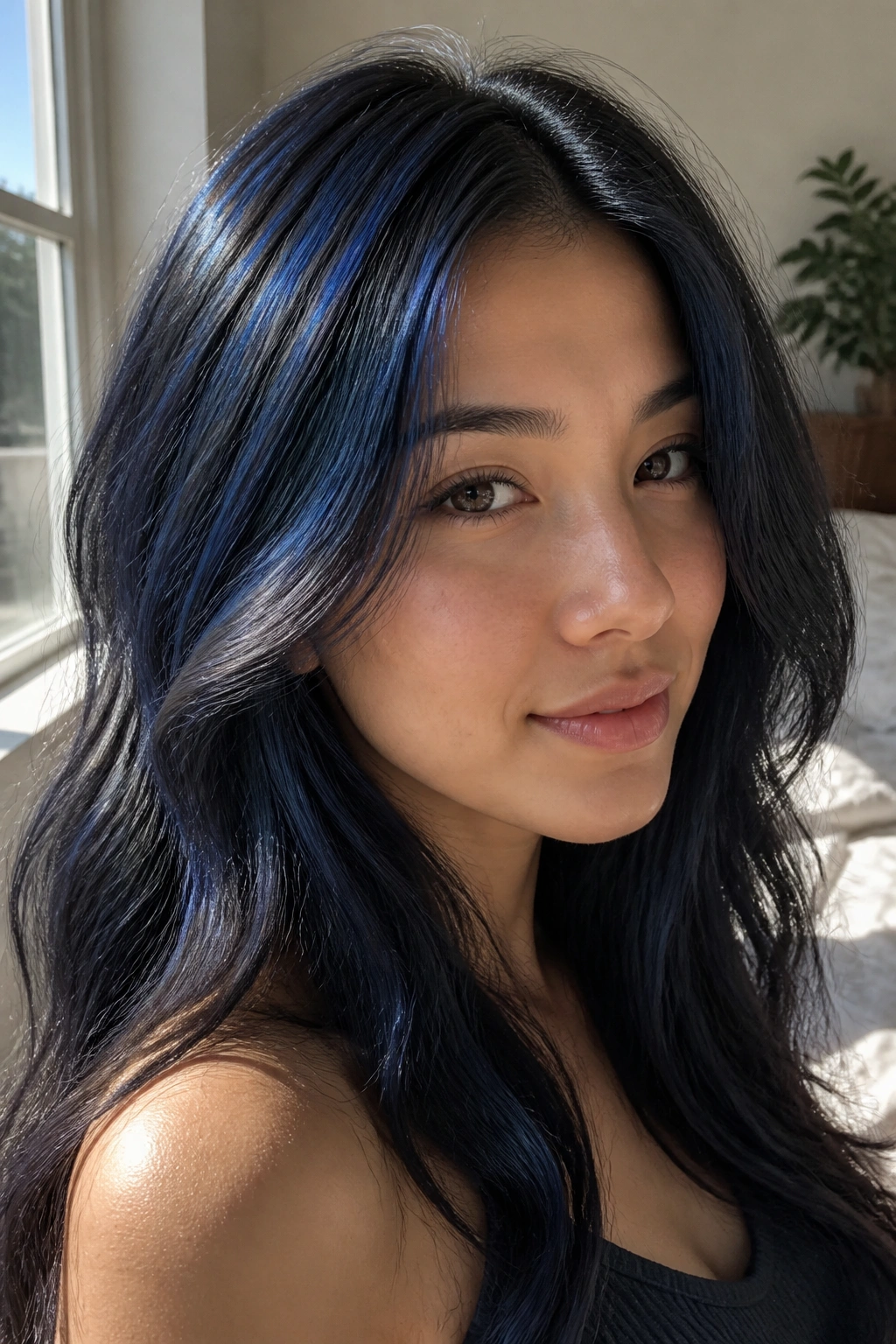
Babylights are not boring here. They’re one of the smartest ways to add blue-black dimension to a round face without building heavy contrast.
The trick is to keep them ultra-fine and scattered across the top layer, especially around the crown and just past the part line. That gives the hair a lighter, airier finish up top, which helps the face read longer. You do not want a thick, obvious stripe. You want shimmer.
How to ask for it
Tell your colorist you want very fine foils with blue-black toner, concentrated on the top third of the head. Ask them to keep the sides softer and lower. That keeps the shine where it helps most.
Babylights like this are subtle on purpose. They are the hairstyle equivalent of good tailoring.
5. Diagonal Blue Black Streaks That Slim the Cheeks
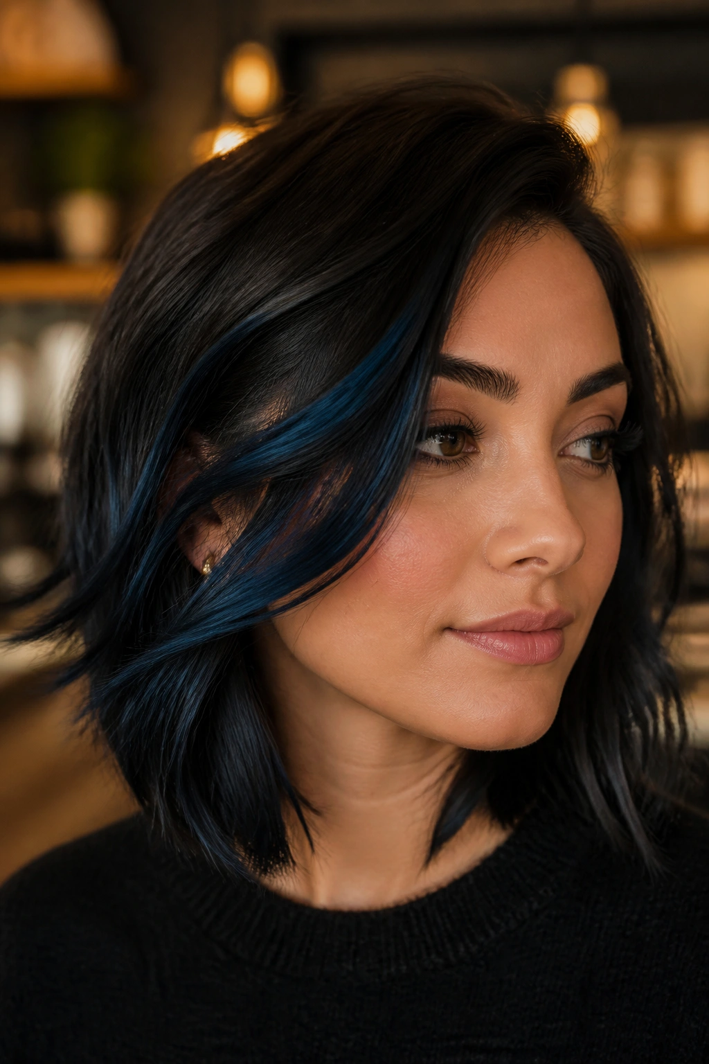
Diagonal placement beats a straight horizontal line almost every time on a round face. That’s the whole trick here.
When a blue-black streak angles from the temple toward the jaw, the eye reads movement, not width. The face gets a more lifted feel, and the hair looks less like one solid block. I’d choose this over blunt front highlights if the goal is to narrow the cheek area a bit.
You can keep the streaks soft and blended, or let them read a little more graphic. Either works. The part that matters is the angle. Straight across is the problem. Downward diagonal is the fix.
6. Blue Black Balayage Starting Below the Cheekbone
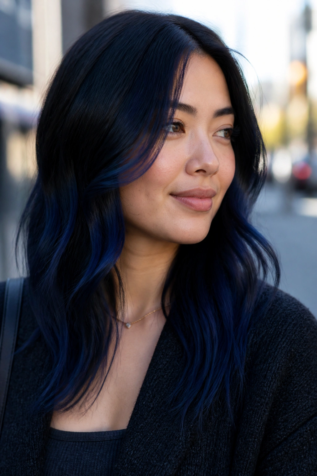
A lot of people place light pieces too high, and that’s where the trouble starts. On a round face, blue-black balayage usually looks better when it begins below the cheekbone.
That lower placement lets the color frame the face without widening the upper half. The eye drops along the length of the hair, which is exactly what you want. It also keeps the style from looking overly busy near the temples.
Best placement notes
- Start the lightened sections below the cheekbone.
- Keep the brightest saturation from mid-length to ends.
- Blend the transition so there’s no hard line at the face.
- Leave the root area deeper for more lift.
This is a calm, elegant version of the trend. It grows out well, too.
7. Charcoal Root Shadow With Indigo Ends
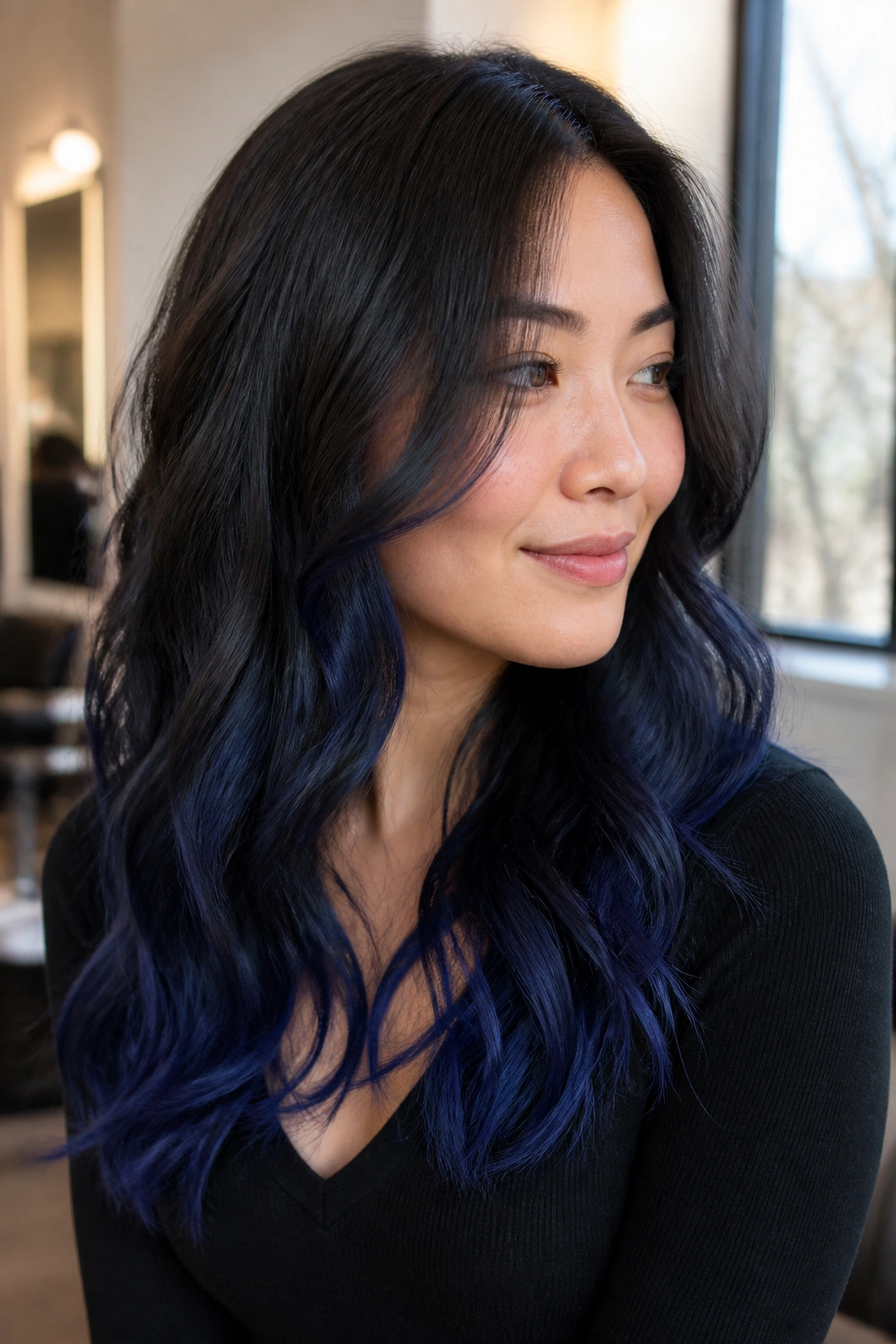
Why does a darker root help a round face? Because it creates height at the top and keeps the silhouette from looking wide.
A charcoal root shadow is especially useful if your natural base is already dark. The root stays in the black family, the mid-lengths pick up blue-black tone, and the ends shift into indigo. That fade gives the hair direction. The eye follows the darker top into the brighter ends, which makes the whole shape feel longer.
What to ask for
Ask for a root shadow that stays one shade deeper than the rest of the hair at the scalp, then soft indigo at the ends. Keep the front pieces narrow. Broad front sections can flatten the effect fast.
This is one of those looks that seems quiet until light hits it. Then it wakes up.
8. Chunky Front Streaks for Bold Contrast
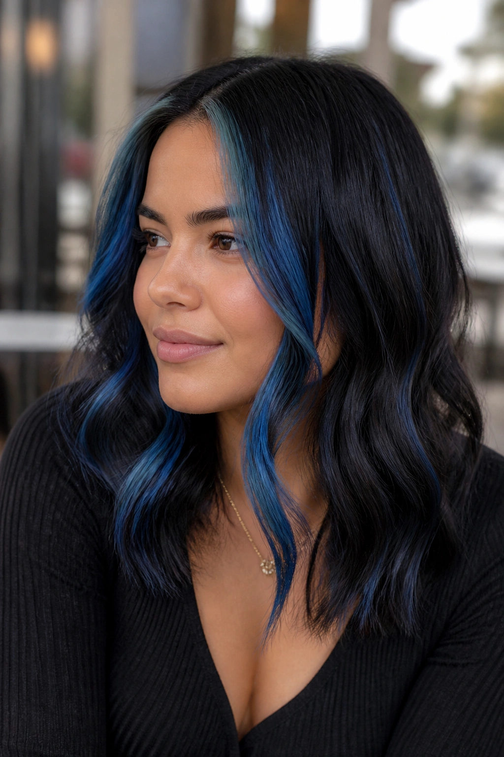
Chunky does not have to mean harsh. On a round face, chunky blue-black front streaks can work if the spacing is right.
I’d save this for thicker hair or for someone who likes a more visible style. The streaks should sit in front, but they should still be long enough to fall below the jaw. If they stop at cheek height, they widen the face. If they run down past the collarbone, the whole thing feels more balanced.
- Keep the chunks separated, not packed together.
- Leave some dark hair between each lighter section.
- Soft-blend the upper edge near the part.
- Let the ends stay the lightest.
The result is bolder, yes. But it still respects the face shape.
9. Fine Micro-Highlights Around the Hairline
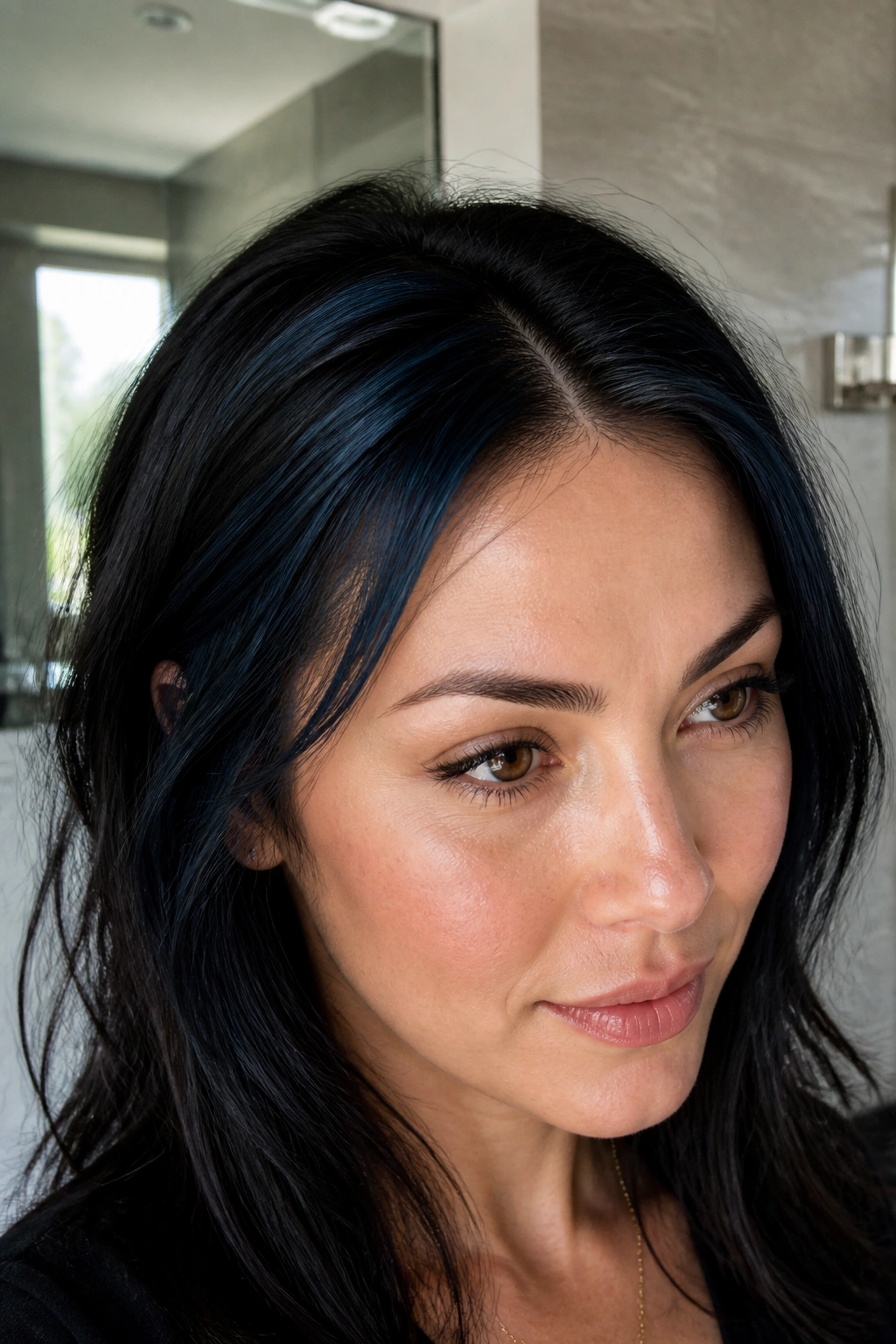
Tiny pieces around the hairline do more than people expect. They open the face a little, especially at the temples, where round faces sometimes need the most help.
Micro-highlights are best when you want a whisper of blue-black shimmer instead of obvious color blocks. The pieces should be almost threadlike. A few at each temple, a few near the part, and that’s enough. You’re not trying to repaint the whole front of the head.
This is also a good option if you wear glasses. Too much brightness near the frames can get busy. A few thin blue-black strands keep things polished and clean.
10. Glossy Blue Black Melt on Curly Hair
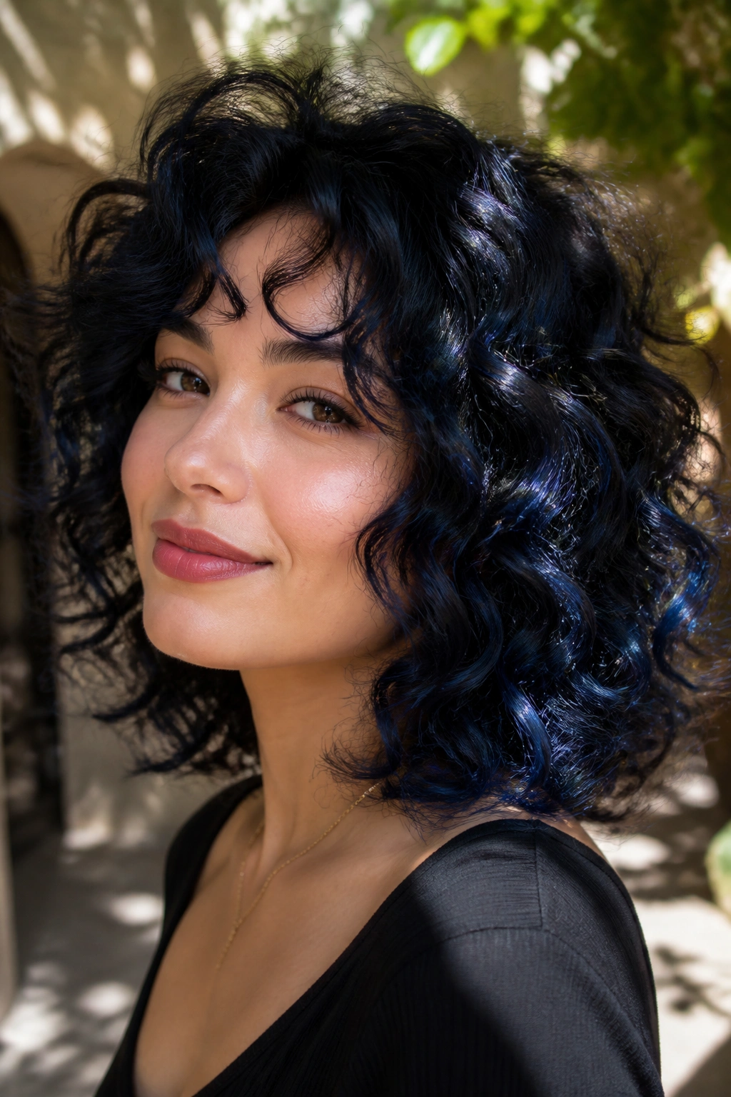
Curly blue-black highlights need to follow the curl pattern, not fight it. That’s where a lot of bad color jobs go wrong.
On round faces, curls already add width, so the highlights have to create shape instead of bulk. Place the lighter pieces on the outer bend of the curl, then let the darker base sit behind them. The contrast shows up best when the curls move, which is the whole point. Flat stripes just look heavy.
How to get the shape right
Ask for color that tracks the S-curve of the curl, not a straight foiled line. Keep the brightest curls below the cheekbone and around the jaw. That gives lift without puffing out the sides.
Curly hair loves this kind of dimension when it’s glossed properly. Without shine, the color can look muddy. With shine, it looks rich.
11. Hidden Underlayer Highlights for Movement
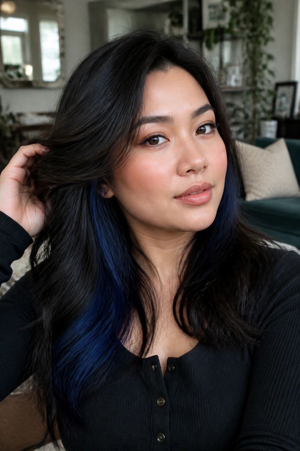
This is the move for anyone who wants color that shows when hair swings. Hidden underlayer highlights stay tucked away until they catch light.
For a round face, that’s useful because the visible surface remains sleek and narrow. The blue-black color flashes only when the hair separates, which keeps the front from feeling crowded. It’s a nice choice if you wear your hair down most days and want the surprise to feel private.
I’d place the underlayer under the crown and through the lower sides, not around the widest part of the cheeks. That keeps the shape lean. A little mystery goes a long way here.
12. Cool Navy Lowlights Mixed Into a Dark Base
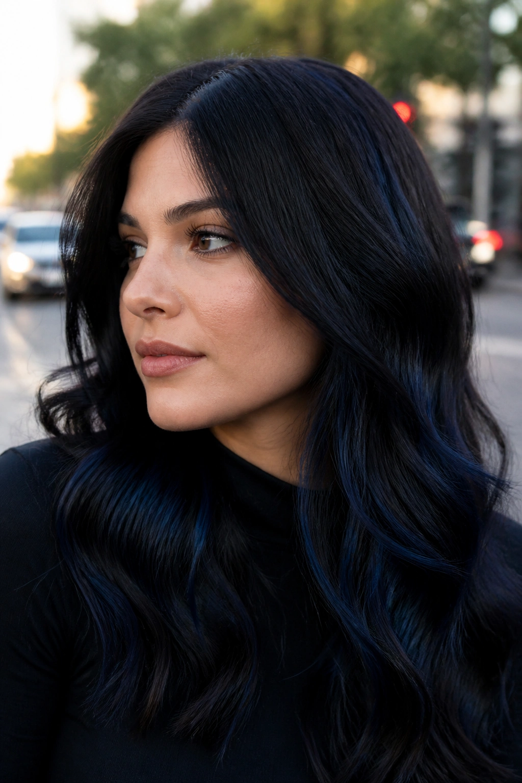
Not every flattering look needs more light. Sometimes the smartest move is adding lowlights to make the highlights work harder.
Cool navy lowlights break up a dark base and stop the color from turning flat. On a round face, that matters because one solid dark panel can look boxy. A few deeper navy strands create shape, and the remaining blue-black pieces look brighter by comparison.
Where lowlights help most
- Through the side panels if the hair feels too wide.
- Around the crown if the top looks flat.
- Behind the ears for quiet depth.
- Under the surface layers to keep the finish dimensional.
This is a useful choice if you want blue-black hair that feels expensive rather than loud. It’s a calmer look, but not a boring one.
13. Face-Hugging Pieces on Long Layers
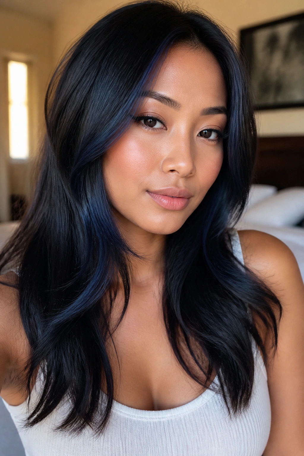
Long layers already do some of the work for a round face. Blue-black highlights should follow those layers, not fight them.
The best pieces hug the face from about the cheekbone down to the collarbone. That gives you movement at the sides without putting brightness at the widest point. If the pieces are too high, the face looks wider. If they start low and sweep forward, the shape feels longer and softer.
I prefer this placement on medium to long hair because it gives the color a place to breathe. The ends can be lighter, the roots darker, and the face gets a cleaner line.
14. Deep Side Part With Blue Black Contrast
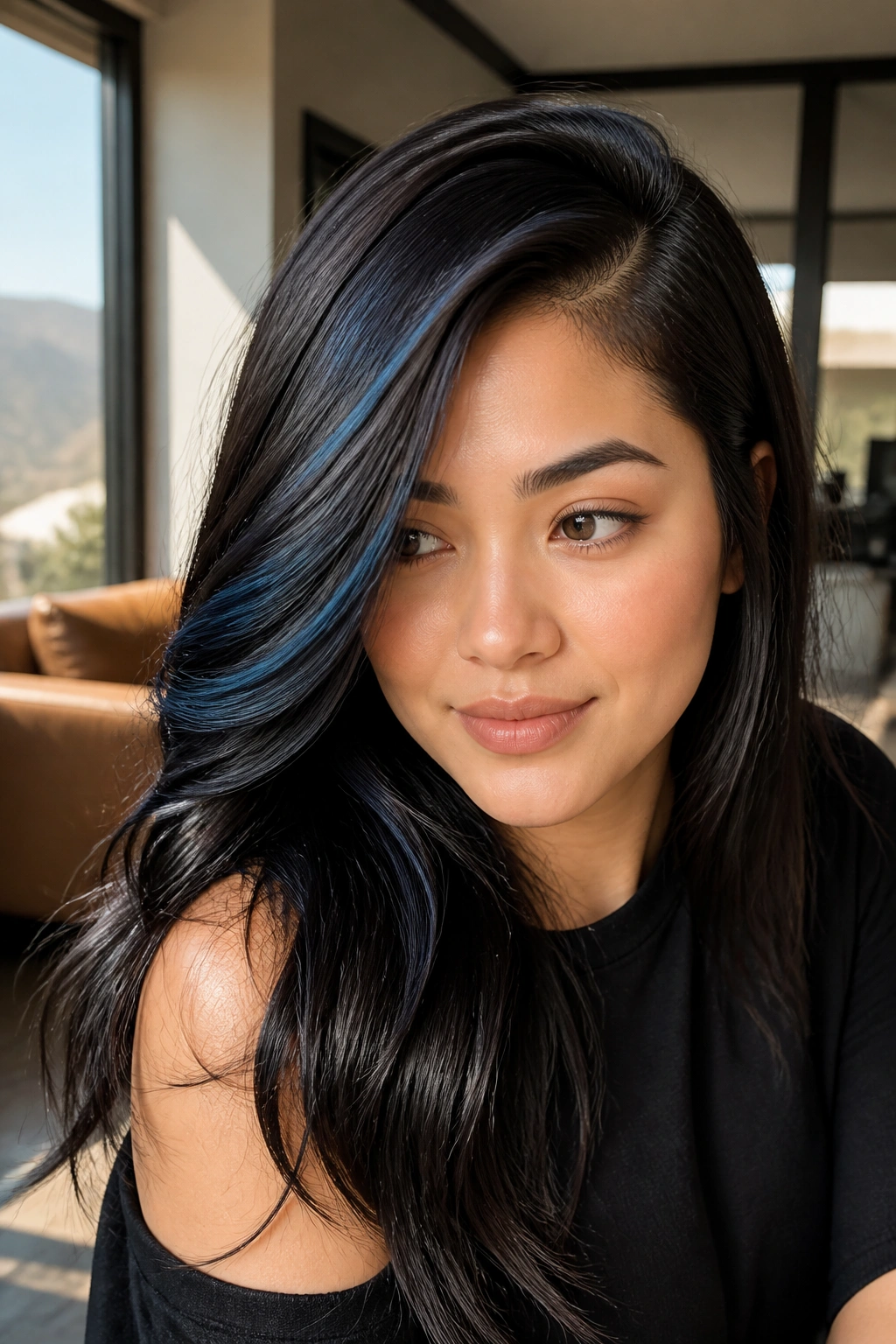
A side part does half the job before the color even gets there. On round faces, that asymmetry is gold.
When you pair a deep side part with blue-black highlights, the hair stops reading as perfectly symmetrical, which helps the face look less circular. Put a little more light on the heavier side and keep the opposite side darker. The contrast makes the style feel intentional, not stiff.
This works especially well if your hair has some natural bend. Straight hair can still wear it, but the part has to be clean and the highlights must stay narrow. Sloppy placement here shows fast.
15. Collarbone Lob With Ribboned Ends

A collarbone-length lob gives blue-black highlights a natural place to fall. The ends land low enough to pull the eye downward, which is exactly what round faces need.
Ribboned ends make the cut feel lighter without losing the dark mood of the base color. I like this on straight or slightly wavy hair, where the highlights can drape in clean lines. If the pieces are too chunky, the lob starts to look broad. Thin ribbons keep it sleek.
It’s also one of the easier looks to grow out. The shape stays flattering even when the color softens a bit. That’s a real bonus, because not every gorgeous look is easy to maintain.
16. Smoky Cobalt Tips for a Softer Finish
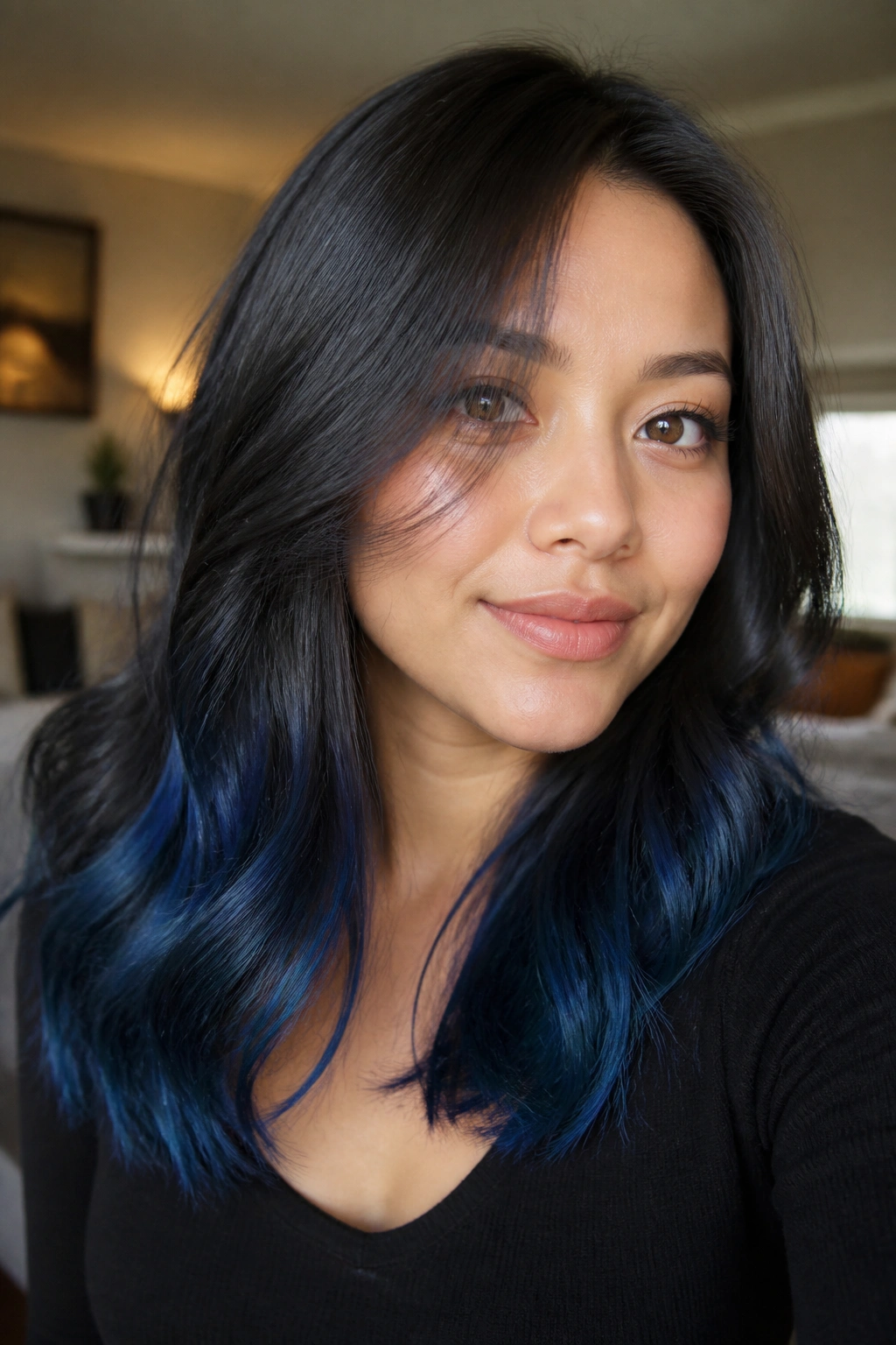
Smoky cobalt tips are a good option when you want color that feels playful but still polished. The brightness lives at the ends, so the face stays open and the silhouette stays long.
That lower placement helps a round face more than a bright front panel would. It directs attention toward the bottom half of the hair, which stretches the whole look. The cobalt should be smoky, not electric. If it turns too neon, the effect gets loud fast.
What the tips should do
They should look like the hair has picked up color at the edges, not like a hard dip-dye line. Keep the transition soft around the mid-lengths and let the tips carry most of the blue. That’s the sweet spot.
17. Feathered Highlights on Shaggy Cuts

Why do shags and blue-black highlights get along so well? Because both rely on broken-up lines.
A shag cuts away some of the width that round faces can pick up from blunt layers. Add feathered blue-black highlights through those chopped ends, and the whole style starts moving in different directions. That motion is what makes the face look less round. It’s also what keeps the style from feeling heavy.
The best pieces in a shag are never packed too neatly. Let them live in the feathered bits around the jaw, the collarbone, and the outer layers. The messier the cut, the more natural the color looks.
18. Blue Black Dimension on Wavy Bob Lengths
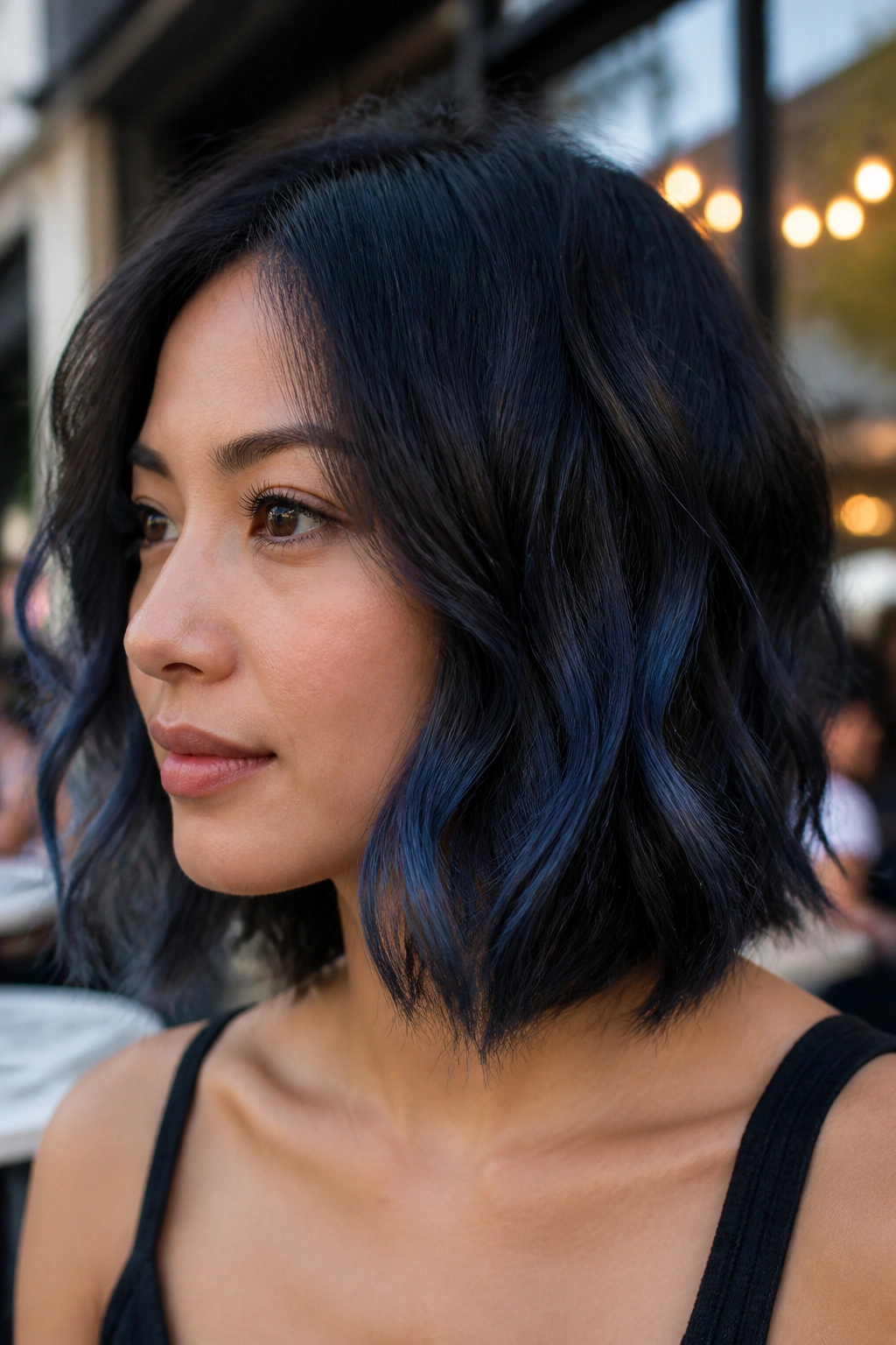
A wavy bob can carry more contrast than people give it credit for. The bend in the hair breaks up the color, which is a gift when you’re working with blue-black tones.
On a round face, I’d keep the lighter pieces in long, loose ribbons through the lower half of the bob. That keeps the color from sitting like a halo around the cheeks. A little depth near the roots and a little shine at the ends go a long way.
If the waves are soft and broad, go lighter with the placement. If they’re tighter, you can use a bit more contrast. Either way, the pattern should move downward, not spread outward.
19. Violet-Blue Black Ribbons for Cooler Undertones
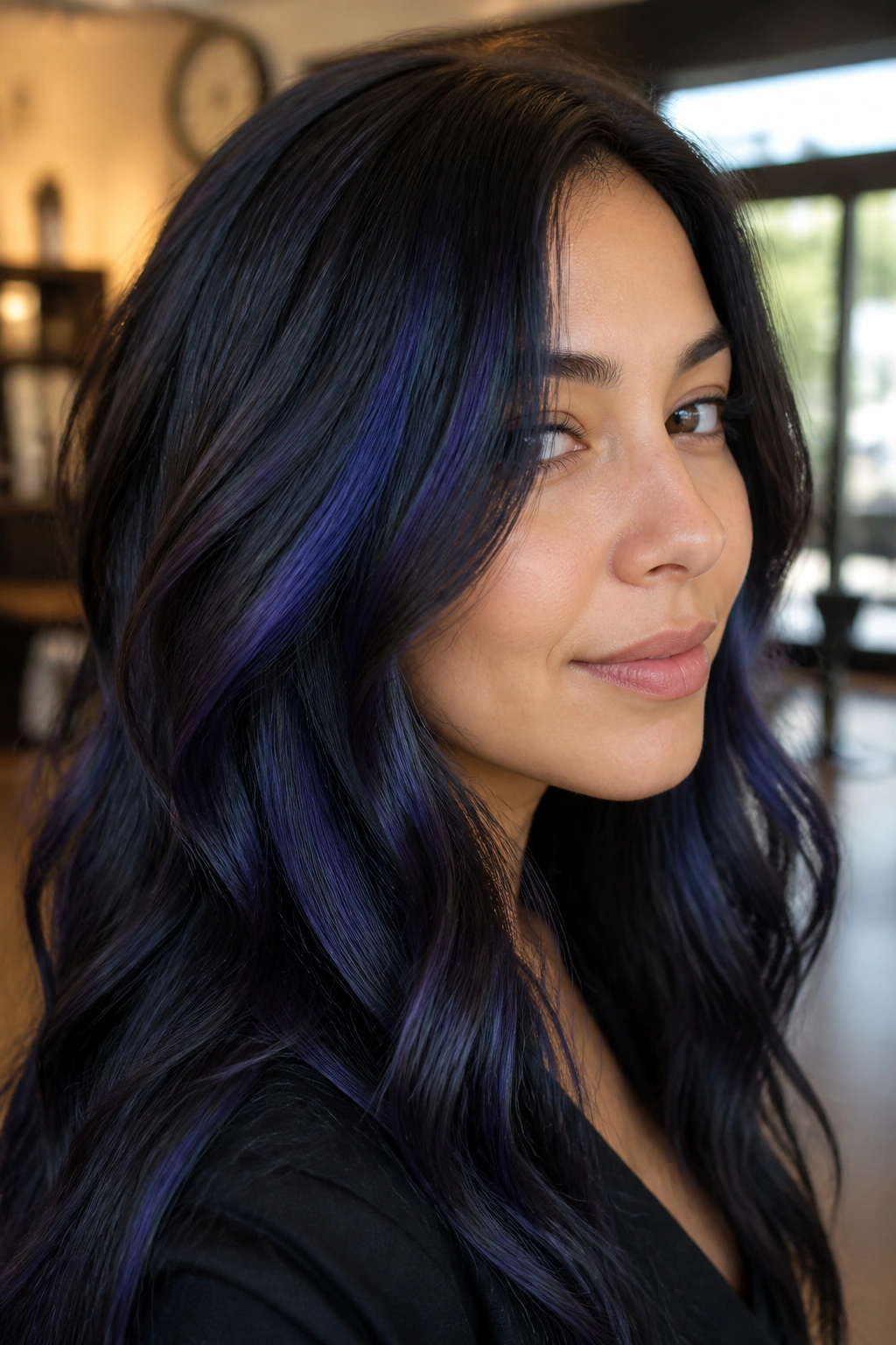
The color should read like ink with a plum edge, not like something that drifted green. Violet-blue black is lovely when you want a cooler finish with a touch more richness.
This version works especially well if your skin leans cool or neutral. The violet softness keeps the blue-black from looking harsh, while the placement still needs to stay narrow and lengthening for a round face. Put the ribbons too high and you lose the effect. Keep them lower and they start to contour the face in a gentle way.
I’d ask for the violet note to stay subtle, not purple-purple. The best result is one you notice in motion, not one that announces itself in a mirror from six feet away.
20. High-Contrast Panels for Thick Hair
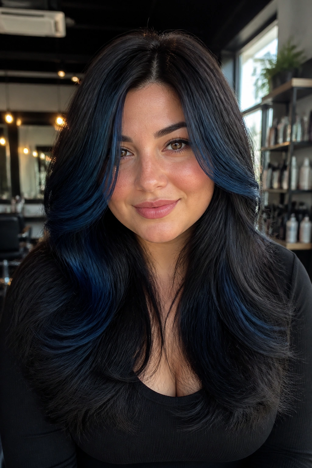
Thick hair can handle stronger contrast without falling apart visually. That’s why high-contrast blue-black panels can work so well on round faces with density.
The important part is spacing. You want enough dark hair between the panels so the style still has shape. If the bright pieces cluster too close together, the cheeks look wider. If they’re spread with intent, the face looks slimmer and the hair feels more controlled.
Smart placement for thick hair
- Put one brighter panel on each side of the front.
- Keep the crown darker for lift.
- Use longer panels instead of short blocks.
- Blend the edges so the color doesn’t look chopped.
This is a stronger look, no question. But thick hair can carry it.
21. Subtle Halo Highlights Around the Crown
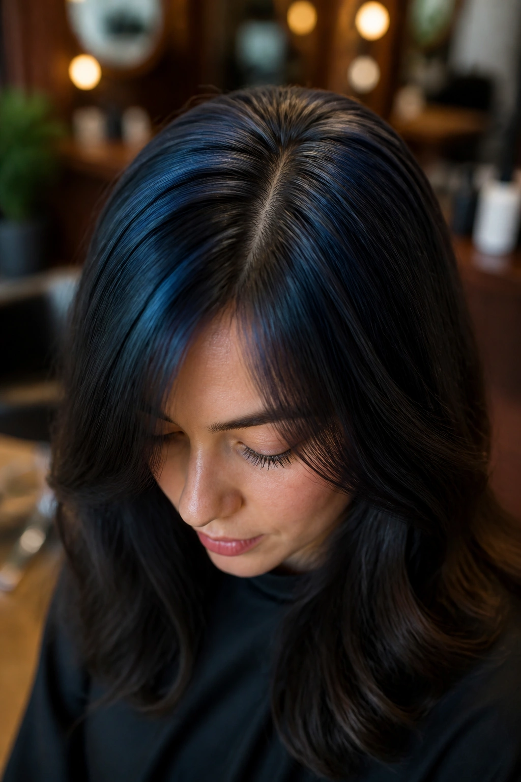
Crown brightness is not about making the top big. It’s about giving the eye a reason to travel upward.
A subtle halo of blue-black highlights around the crown can help a round face by adding lift near the part line and top layers. The key is restraint. You want the halo to stay narrow and soft, not like a ring. A wide band across the top can make the head look wider. A fine, lifted halo does the opposite.
Ask for the lightest pieces near the part and just behind it, then let the sides stay deeper. That contrast builds height without screaming for attention.
22. Deep Ocean Blue Black on Straight Hair
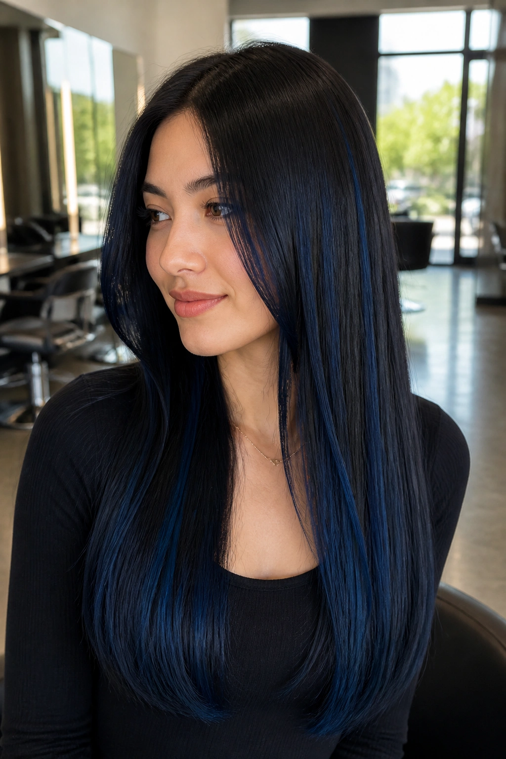
Straight hair is where blue-black highlights can look especially crisp. Every line shows, so every placement choice matters.
That’s good news for round faces, because straight hair can create long, clean verticals with very little fuss. Put the highlight pieces in elongated ribbons from mid-length to end, and keep the front soft. The result is sleek, not boxy. The eye sees long panels instead of width.
I’d avoid short, choppy bits at the temples here. Straight hair makes them too obvious. Long, smooth sections do the flattering work without much noise.
23. Layered Ends With Dimensional Light Catching
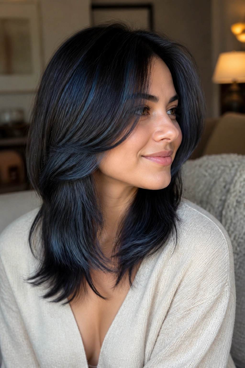
If you want your face to look longer, let the light live at the ends. That’s the whole idea here.
Layered ends give blue-black highlights somewhere to move, and movement is what keeps a round face from looking too full. The top can stay dark, the mid-lengths can soften, and the ends can catch the brighter blue-black tone. The effect is subtle until the hair swings. Then it really shows.
This works well on medium and long cuts, especially when the layers are light rather than choppy. Heavy layers can spread the width too much. Soft layers keep the shape narrow and the color clean.
24. Softly Blended Peekaboo Streaks for Everyday Wear
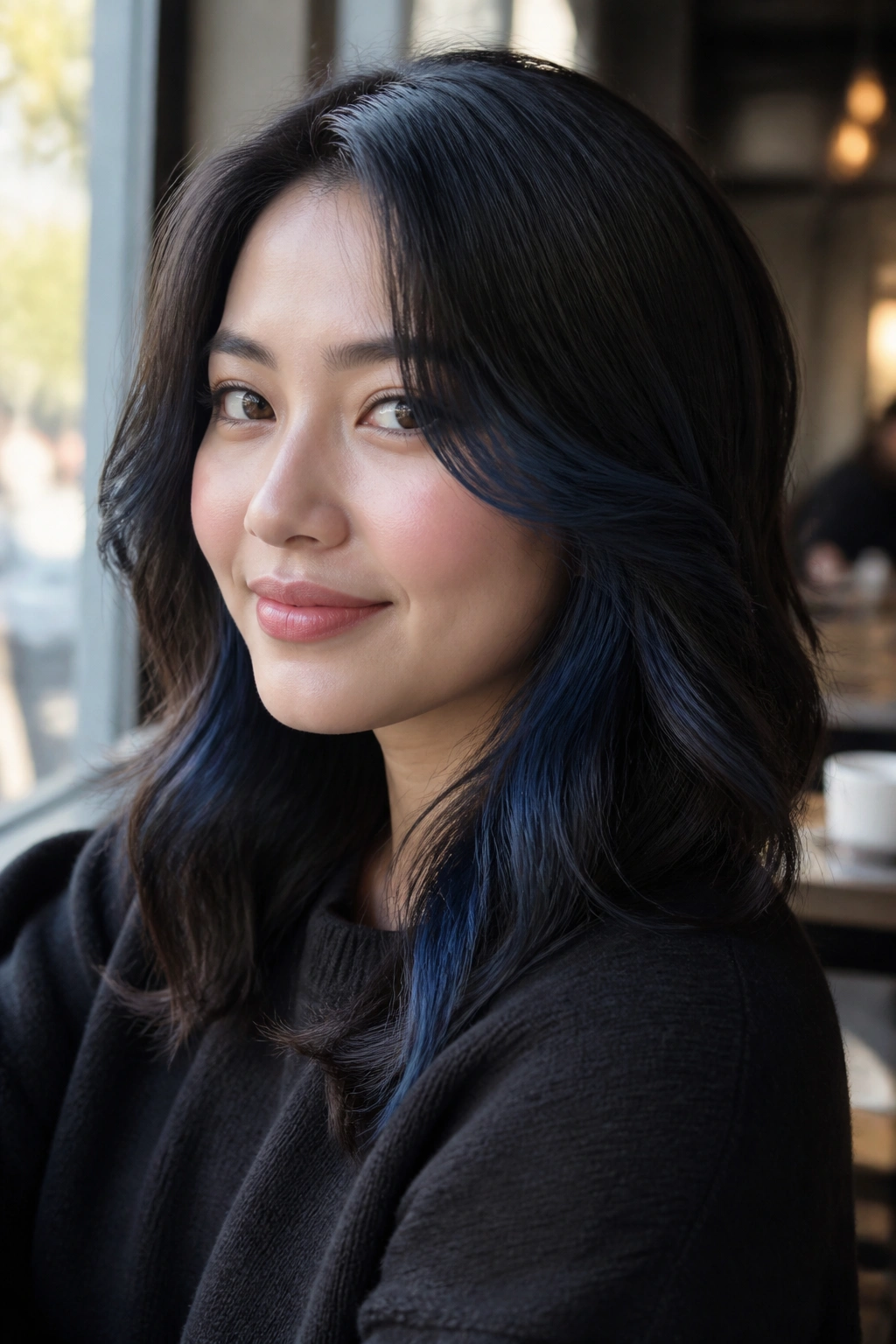
A softly blended peekaboo streak is the kind of detail that looks easy but took some thought. That’s why I like it.
For round faces, it’s a smart everyday option because the color stays mostly hidden. You get flashes of blue-black when the hair moves, but the front remains quiet and neat. That balance helps if you work in a setting where you want color without a lot of drama.
The streak should sit below the surface layer and stay smooth at the root. Keep the reveal low, around the mid-lengths and lower sides, so the face doesn’t feel crowded. It’s a gentle look. Never dull.
25. High-Shine Blue Black Highlights for a Sleek Finish
Blue-black highlights need shine. Without it, the color can drift into flat territory fast.
A sleek finish works beautifully on round faces because gloss creates a long, clean line from root to end. Keep the highlight pieces narrow, blend them well, and finish with a clear or blue-toned gloss so the color stays reflective. The shine is what makes the blue-black read as rich instead of heavy.
Ask for this finish at the salon
Tell your colorist you want reflective, narrow placement with a smooth gloss over the top. Ask them to keep the brightest pieces below the cheekbone and through the ends. That combination gives you the lift, the sheen, and the lengthening effect all at once.
This is the version I’d choose if I wanted the hair to look polished from every angle.
Final Thoughts
Blue-black highlights work on round faces when they create lines the eye can follow. That usually means narrow face-framing pieces, lower placement, a deeper root, or a side part that breaks up symmetry. Loud color can be fun, sure, but smart color wins here.
The best version is the one that makes your face look a little longer when you catch it in a mirror at arm’s length. That’s the test I’d use. If the color pulls the eye down and keeps the cheeks from feeling boxed in, you’re in the right territory.
Ask for placement first, shade second. That’s the part people forget, and it’s the part that changes the whole haircut-color relationship.